
Are you tired of presenting your data in boring tables or endless paragraphs? If you want to captivate your audience and make your information truly pop, then charts are the way to go! With the right tools, you can transform complex data into stunning visual representations that are not only informative but also engaging. In this article, we’ll explore the 11 best wordpress chart plugins that will help you create gorgeous, eye-catching charts with ease. Whether you’re a blogger, a business owner, or just someone looking to spice up your website, these plugins offer a range of features to suit your needs. Plus,we’ll guide you through the steps to get started on crafting your own dazzling charts. So, let’s dive in and discover how you can elevate your content and impress your visitors!
– Discover the Power of Visual Data with WordPress Chart Plugins
In the vast digital landscape, data is not just numbers; it’s a story waiting to be told.Utilizing WordPress chart plugins allows you to transform those mundane statistics into captivating visual narratives that engage and inform your audience.Whether you’re running a blog, an e-commerce site, or a corporate website, presenting data visually can enhance comprehension and retention significantly.
Imagine being able to turn complex datasets into vibrant charts and graphs that draw in your readers. With the right plugins, you can:
- Create interactive and responsive charts that adapt to different devices.
- Easily customize the design to match your site’s branding.
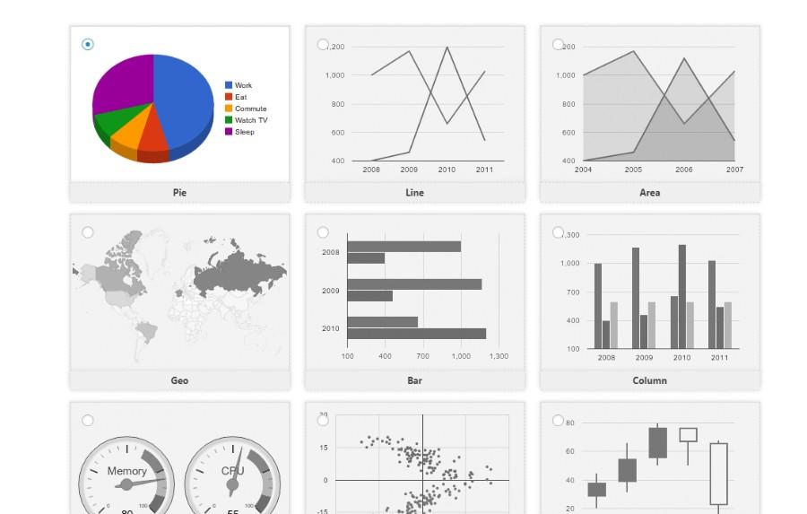
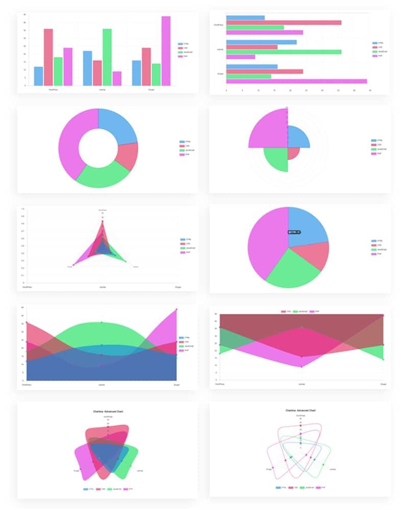
- Incorporate various chart types,from line graphs to pie charts,to best represent your data.
- Embed charts directly into posts and pages with simple shortcodes.
The beauty of using chart plugins lies not only in their functionality but also in their user-friendliness. You don’t need to be a coding wizard to create stunning visuals.Most of these plugins feature intuitive drag-and-drop interfaces, allowing you to build your charts visually. This makes it accessible for everyone, from bloggers to business owners.
| Plugin Name | Main Feature | Best For |
|---|---|---|
| Visualizer | Google Charts Integration | data-heavy Websites |
| Charts and Graphs | Multiple Chart Types | Bloggers |
| WPDataTables | Responsive Tables | Business Dashboards |
Moreover,integrating charts on your site not only makes the information digestible but also adds a layer of professionalism. Well-presented data can significantly boost your credibility, encouraging visitors to trust your insights and recommendations more. This is especially crucial in fields like education, finance, and health, where data-driven decisions are paramount.
Lastly, the ability to update your charts in real-time means you can keep your content fresh and relevant. This dynamic approach can help increase user engagement and encourage repeat visits, as audiences will return for updated insights and trends. With so many options available, the journey to finding the right chart plugin for your WordPress site could be the key to unlocking the potential of your data storytelling.

– Why You need Charts to Enhance Your blog or Website
In the digital landscape, capturing your audience’s attention is more crucial than ever. One effective way to do this is by incorporating charts into your blog or website.Charts not only make your content visually appealing but also enhance the understanding of complex data. When readers encounter graphs and visuals, they are more likely to engage with the content, leading to better retention and a higher likelihood of sharing your posts.
Here are some compelling reasons to consider using charts:
- improved Clarity: Charts distill complex information into digestible visuals, making it easier for readers to grasp key points.
- Increased Engagement: Visual content is more engaging than text alone. Readers are drawn to colorful graphs and data representations.
- Enhanced Credibility: Presenting data in a well-organized chart can lend authority to your arguments and bolster your credibility in your niche.
- better Storytelling: Charts can help you tell a compelling story by illustrating trends and patterns that may not be immediately obvious from raw data.
Moreover, integrating charts can significantly boost your site’s SEO.Search engines favor content that provides value to users, and visual data is a powerful tool to enhance the overall user experience. Imagine a reader finding your post through a search query, only to be met with a vibrant pie chart or a trend line that captivates their interest. This not only increases the time spent on your page but also encourages readers to explore further.
To illustrate the impact, consider the following table highlighting the differences between text-heavy content and visual data presentation:
| Aspect | Text-Heavy Content | Visual Data Presentation |
|---|---|---|
| Engagement Level | Low | High |
| Retention Rate | 30% | 70% |
| Readability | Complex | Simple |
| SEO Impact | Minimal | Notable |
Incorporating charts into your blog or website is no longer just a trend; it’s a necessity. With a variety of WordPress chart plugins available, creating beautiful, interactive visualizations has never been easier. Whether you’re displaying statistics, showcasing progress over time, or comparing data sets, charts can transform the way your audience interacts with your content. Embrace this powerful tool to enhance your message and elevate your online presence!
– Top Features to Look for in WordPress Chart Plugins
Key Factors to Consider When Choosing a WordPress Chart Plugin
When it comes to enhancing your WordPress site with charts,not all plugins are created equal. Choosing the right chart plugin can significantly impact the clarity, aesthetics, and functionality of your data presentations. Here are some critical features to look out for:
- ease of Use: A user-friendly interface is essential. Look for plugins that allow you to create charts without needing extensive coding knowledge. Drag-and-drop functionality can be a game-changer.
- Customization Options: You want your charts to match your website’s branding.Opt for plugins that offer a variety of themes, colors, and styles, enabling you to customize everything from fonts to chart types.
- Responsive Design: Ensure that the charts you create are mobile-friendly. A plugin that automatically adjusts its layout for different devices will enhance user experience across platforms.
- Data Import Capabilities: Look for plugins that support various formats, such as CSV, Excel, or Google Sheets. This feature makes it easier to update your charts with minimal hassle.
- interactive Features: Interactivity can bring your charts to life. Choose plugins that allow for tooltips,clickable elements,or animations to engage your audience.
- Integration with Other Tools: Consider how well the plugin integrates with other platforms you’re using, such as WooCommerce or analytics tools, for a seamless workflow.
Another aspect to evaluate is the support and documentation available for the plugin. A robust support system can be invaluable, especially if you encounter issues or need help with advanced features. Look for plugins with extensive documentation,tutorials,and active support forums.
| Feature | importance | Recommended Plugins |
|---|---|---|
| ease of Use | High | Chart.js, Visualizer |
| Customization Options | Medium | WPDataTables, amCharts |
| Responsive Design | High | Data Tables Generator |
| Data Import Capabilities | High | Visualizer |
| Interactive Features | Medium | Charts and Graphs |
| Integration with Other Tools | Medium | WPDataTables |
Lastly, consider the performance and speed of the plugin. A plugin that significantly slows down your site can detract from user experience and SEO rankings. Always check reviews and performance benchmarks before making your choice.
– An In-Depth Review of the Best Chart Plugins Available
When it comes to visualizing data on your WordPress site, the right chart plugin can make all the difference. Not only do these plugins help present complex information in an easily digestible format, but they also enhance the overall aesthetic of your posts and pages. Here’s a look at some of the best chart plugins you can use to create stunning visuals.
Top Chart Plugins to Consider
- Visualizer: This plugin stands out for its user-friendly interface and versatility. With options to create line, bar, and pie charts, Visualizer allows you to import data from various sources, including Google Sheets.
- WPDataTables: If you’re dealing with large datasets, this plugin excels at creating responsive tables and charts. Its built-in filters and search options make it easier for users to navigate through data.
- Chart.js: For those with a bit of coding knowledge, Chart.js is a powerful javascript library that integrates seamlessly with WordPress. It offers a wide variety of chart types and customization options.
- data tables Generator by Supsystic: This plugin allows you to create tables and charts without needing any coding skills. It’s perfect for beginners and includes drag-and-drop functionality.
Key Features to Look For
Choosing the right chart plugin involves considering a few essential features:
- Ease of Use: A plugin should be user-friendly, enabling you to create and customize charts quickly.
- Data Sources: Look for plugins that allow you to import data from various sources, such as CSV files, Google Sheets, or even APIs.
- Chart Variety: A good plugin offers multiple chart types,including bar,line,pie,and area charts,to suit different data visualization needs.
- Customization Options: The ability to customize colors, labels, and sizes can help your charts match your site’s branding.
comparison Table of Popular Chart Plugins
| Plugin | Ease of use | Chart Types | Data Import | Price |
|---|---|---|---|---|
| Visualizer | Very Easy | Multiple | CSV, Google Sheets | Free/Premium |
| wpdatatables | Moderate | multiple | CSV, Excel | Premium |
| Chart.js | Advanced | Varied | Custom API | Free |
| Data Tables Generator | Easy | Multiple | CSV | Free/Premium |
With these plugins,not only can you elevate the visual appeal of your website,but you can also ensure that your audience understands the data you’re presenting.Finding the right balance between functionality and aesthetics is vital, and with the options available, you’re bound to find a chart plugin that meets your needs.
– How to Choose the Right Chart Plugin for Your Needs
When it comes to selecting the ideal chart plugin for your WordPress site,there are several factors to consider that can significantly impact functionality and aesthetics. Your choice should align with your specific needs, whether you’re visualizing data for a blog post, an online store, or a business report.
First and foremost, identify your requirements:
- Type of Data: Determine what kind of data you need to represent. Are you focusing on financial statistics, survey results, or project timelines?
- Chart Types: Consider the variety of charts available. Do you need bar charts,pie charts,line graphs,or more advanced visualizations like heat maps?
- Customization Options: Look for plugins that offer customization features. Can you adjust colors, fonts, and layouts to match your branding?
Another critical factor is ease of use. A user-friendly interface can save you time and frustration. Look for plugins with:
- Drag-and-drop functionality: This can make chart creation intuitive.
- Pre-built templates: Having templates can simplify the design process and help you get started quickly.
- Comprehensive documentation: ensure that the plugin has ample resources for troubleshooting and guidance.
Performance is equally essential. A plugin that slows down your website can lead to a poor user experience. Check for:
- Lightweight design: Opt for plugins known for quick loading times.
- Mobile responsiveness: Ensure that charts look great on all devices.
- Regular updates: A plugin that is frequently updated is likely to be more reliable and secure.
consider the support and community around the plugin. A strong support network can be invaluable:
- Active forums: Check if there’s an active community where you can seek advice and share experiences.
- Support channels: Look for options like live chat, email support, or a ticketing system.
- User reviews: Read through reviews to gauge the experiences of other users.
| Plugin Name | Type of Charts | Customization Options | Support |
|---|---|---|---|
| Chartify | Bar, Line, Pie | High | Email & Forums |
| Visualizer | all types | Moderate | Live Chat |
| Data Tables Generator | Table & Graph | Low | Email Support |
the perfect chart plugin for your WordPress site should not only meet your data visualization needs but also provide a seamless user experience and robust support. Take the time to explore the options available so you can make an informed decision that enhances your site’s overall functionality and appeal.
– Step-by-Step Guide to Installing Your Chosen Chart Plugin
Step-by-Step Guide to Installing Your Chosen Chart Plugin
Installing a chart plugin on your WordPress site is a straightforward process that can greatly enhance your content’s visual appeal. Follow these simple steps to get started:
- Log into your WordPress dashboard: Begin by accessing your website’s backend.Enter your username and password to log in.
- Navigate to Plugins: In the left sidebar, find the “Plugins” section and click on it. this is where you’ll manage all your installed plugins.
- Add New Plugin: Click on the “Add New” button at the top of the page. This will take you to the plugin repository.
- Search for Your Chart Plugin: In the search bar, type the name of the chart plugin you wish to install. As a notable example, if you’re looking for “Chartify,” simply enter that.
- Install the Plugin: Once you’ve found your desired plugin,click the “Install now” button. WordPress will automatically download and install the plugin for you.
- Activate the Plugin: After installation, you’ll see an “Activate” button. Click it to enable the plugin on your site.
- Configure Settings: After activation, you might need to adjust the plugin settings. Go to the newly added section in the sidebar, typically found under “Settings” or the plugin’s name, and customize your chart preferences.
With your chart plugin installed and activated,it’s time to start creating stunning charts. Most plugins will provide a user-friendly interface that allows you to input data, choose chart types, and customize designs. here’s a quick overview of what to expect:
| Feature | Description |
|---|---|
| Chart Types | Choose from bar, line, pie, and more! |
| Customization | Modify colors, fonts, and styles to fit your theme. |
| Data Import | Easily import data from Excel or CSV files. |
| Responsive Design | Charts will look great on both desktop and mobile. |
Always remember to keep your plugins updated to ensure they run smoothly and securely. Now that you’ve successfully installed your plugin, you’re ready to engage your audience with beautiful, informative charts that tell your story effectively. Happy charting!
– Tips for Customizing Charts to Match Your Brand
Customizing your charts to reflect your brand’s identity can significantly enhance the overall presentation and effectiveness of your data. When your charts align visually with your brand, they not only look professional but also help reinforce your brand message. Here are some effective strategies for achieving that perfect look.
- Color Palette: Choose a color scheme that matches your brand’s colors. Most chart plugins allow you to customize colors easily. A consistent palette can improve brand recognition and make your charts visually appealing.
- Fonts and Typography: Select fonts that reflect your brand’s style. If your brand is more casual, opt for fun, playful fonts. for a corporate feel, go for sleek and professional typography. Ensure the text is readable and doesn’t clash with your chart colors.
- Logos and Watermarks: Incorporate your logo into the chart design, either in the header, footer, or as a watermark. This small addition can enhance brand visibility without overwhelming the chart’s data.
When customizing your charts, it’s essential to keep user experience in mind. Too many elements can clutter the visual, making it hard for your audience to focus on the data.Aim for a clean design by:
- Simplifying Legends: Use simple and concise legends that clearly explain what each color or symbol means.This makes it easier for viewers to understand your data without confusion.
- Removing Unnecessary Elements: Eliminate gridlines or additional backgrounds that may distract from your data. Focus on what’s essential to ensure clarity and comprehension.
Lastly, remember that the size and placement of your charts matter. Ensure they are appropriately sized for your content area and positioned where they naturally flow with the narrative of your post. Here’s a quick reference table for optimal chart sizes based on different devices:
| Device | recommended width | Aspect Ratio |
|---|---|---|
| Desktop | 800px | 16:9 |
| Tablet | 600px | 4:3 |
| mobile | 300px | 1:1 |
By applying these tips, you can create charts that not only convey your data effectively but also resonate with your audience on a deeper level, fostering a stronger connection with your brand.
– Creating Stunning Charts with User-Friendly Interfaces
When it comes to visualizing data, the right charts can transform complex information into digestible insights. A user-friendly chart plugin for WordPress can make all the difference, allowing you to create stunning visuals without needing extensive design skills. Imagine being able to present your data in a way that captures attention and drives engagement—all with just a few clicks!
- Easy Integration: Most chart plugins seamlessly integrate with your existing WordPress site, allowing you to focus on your data instead of technical details.
- Customizable Designs: tailor your charts to fit your brand’s aesthetic. Change colors, fonts, and styles to create a cohesive look across your website.
- Responsive Layout: Ensure your charts look great on any device. A responsive design is essential for keeping your audience engaged, whether they’re on a desktop or mobile.
Another great feature of many WordPress chart plugins is their ability to pull data directly from various sources. Whether you’re pulling from a google Sheet, an Excel file, or even your own database, these plugins simplify the process.This real-time data integration ensures your charts are always up-to-date, which is crucial for maintaining accuracy and relevance in your content.
| Plugin Name | Key Features | Ease of Use |
|---|---|---|
| WP Chart Builder | Drag and Drop Interface | ⭐⭐⭐⭐⭐ |
| Visualizer | import/Export Options | ⭐⭐⭐⭐ |
| Charts and Graphs | multiple Chart Types | ⭐⭐⭐⭐⭐ |
Interactivity is another aspect where user-friendly chart plugins shine. Many allow users to hover over data points for more detailed information, making the charts not just visually appealing but also informative. this level of engagement can help your audience better understand the story behind the numbers and encourage them to explore your content further.don’t underestimate the power of analytics. Some advanced plugins come with built-in tracking features, allowing you to see how your charts are performing. Are viewers interacting with them? Are they they clicking through to find out more? This data can be invaluable for optimizing your content strategy and ensuring you’re meeting your audience’s needs effectively.
In a world where information overload is rampant, having the ability to present data beautifully and intuitively can set your WordPress site apart. Investing time in the right chart plugin will not only enhance your visual storytelling but will also create a more enjoyable experience for your visitors.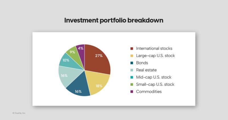
– Best Practices for Presenting Data Effectively
Best Practices for Presenting Data Effectively
When it comes to displaying data, clarity is king. The goal is to make the information accessible and understandable to your audience. Here are some effective strategies to enhance your data presentation:
- Choose the Right Chart Type: Different types of data require different representations. For instance,use bar charts for comparisons and line charts for trends. Always think about what best conveys your story.
- Simplify Your Visuals: avoid clutter. Too much information in one chart can overwhelm your audience. Stick to the essentials—focus on the key data points that support your narrative.
- Use Color Wisely: Color can guide your audience’s attention, but it can also confuse. Use a consistent color palette and ensure that colors are distinguishable for those who are color-blind. This enhances accessibility.
- Label Clearly: All axes, lines, and key data points should be clearly labeled. A well-annotated chart helps your audience understand the context without needing further clarification.
Consider using interactive charts if your WordPress site permits.They can engage users more effectively by allowing them to explore the data at their own pace. Here’s a simple comparison of static versus interactive charts:
| Feature | Static charts | Interactive Charts |
|---|---|---|
| Engagement | Lower | Higher |
| User Control | None | Full |
| Information Density | Limited | extensive |
Lastly, don’t forget to test your charts across different devices. What looks good on a desktop might not translate well to a mobile screen. Responsive design ensures that your data is always presented beautifully, no matter where it’s viewed.

– Real-Life Examples of Engaging Charts on WordPress Sites
Engaging charts can transform complex data into visually appealing insights on your wordpress site. many organizations have leveraged chart plugins to enhance their content and captivate their audience. Here are a few real-life examples that showcase the effectiveness of these tools:
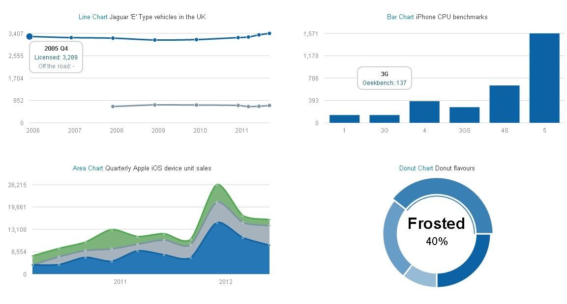
1. Educational Institutions: Universities and colleges often use charts to present statistical data regarding enrollment, graduation rates, or departmental performance. By employing interactive pie or bar charts, they allow prospective students and parents to quickly grasp important information. For instance,a university might display a pie chart illustrating the diversity of its student body,making it easy for visitors to see the variety of backgrounds represented.
2. E-commerce Stores: online retailers can utilize charts to showcase product performance, sales trends, or customer demographics. Imagine a bar chart charting monthly sales data; this not only provides insights into which products are performing well but also encourages customers to make informed purchases. A colorful line chart depicting the sales growth over time can also motivate potential investors or stakeholders to engage further.
3. Non-Profit Organizations: Non-profits frequently enough rely on data to communicate their impact. By integrating visually appealing charts into their websites, they can effectively convey the results of their initiatives. For example, a donation tracker in the form of a progress chart can illustrate how close they are to reaching their funding goals, fostering a sense of urgency for potential donors.An interactive map that shows locations of projects can also enhance engagement.
4. Health & Fitness Blogs: Fitness enthusiasts or health coaches can share progress charts to motivate their followers. A before-and-after weight loss line graph can serve as powerful visual proof for readers. Additionally, tracking workout progress through a series of bar charts allows users to visualize their improvements over time, making their journey more relatable and inspiring.
| Industry | Chart Type | Data Represented |
|---|---|---|
| Education | Pie Chart | Student Diversity |
| E-commerce | Bar Chart | Monthly Sales Data |
| Non-Profit | Progress Chart | Funding Goals |
| Health/Fitness | Line Graph | Weight Loss Progress |
These examples highlight just a few ways that engaging charts can enhance the storytelling aspect of a website. By displaying information visually, you not only make the content more digestible but also encourage interaction and retention. Whether it’s a simple bar graph or a complex interactive chart, the right tools can significantly boost user engagement and provide value to your audience.
– Troubleshooting Common Issues with Chart Plugins
When using chart plugins in WordPress, you might encounter some common issues that could hinder your ability to create stunning visualizations. here are some tips to help you troubleshoot these challenges effectively.
1. Plugin Compatibility Issues
Sometimes, chart plugins may not work well with other plugins or themes. To identify compatibility issues:
- Deactivate all other plugins temporarily and check if the chart plugin functions correctly.
- Switch to a default WordPress theme (like Twenty Twenty-One) to see if the issue persists.
- Check the plugin’s documentation for known conflicts or requirements.
2. JavaScript Errors
JavaScript is crucial for rendering charts.Any errors can prevent them from displaying. To troubleshoot:
- Open your browser’s developer console (usually F12) and look for errors.
- If errors are found, they may point to conflicts with other scripts or missing dependencies.
- Make sure that jQuery and other required libraries are properly enqueued in your theme.
3. Data Format Issues
Incorrect data format is another common pitfall. Charts require data in specific formats, and a small mistake can lead to visual errors. To resolve this:
- Double-check the data input in your chart settings. Ensure it’s in the correct format (e.g., CSV for many plugins).
- Use placeholder data to see if the chart displays correctly, then gradually replace it with your actual data.
4. Responsive Design Problems
Charts that look great on a desktop may not display well on mobile devices. To enhance responsiveness:
- Check the plugin’s settings for responsive options or modes.
- Use CSS to adjust chart widths and heights for different screen sizes.
- Test the charts on various devices to ensure consistent appearance.
By following these troubleshooting steps,you can tackle common issues with chart plugins and create the beautiful,functional charts you envision for your WordPress site.
– Boosting Engagement: How charts Can Transform Your Content
Charts are not just aesthetically pleasing; they are a powerful tool that can significantly enhance the way your audience interacts with your content.By transforming complex data into visual representations, you can simplify information, making it more digestible and engaging. This approach caters to visual learners and helps to retain attention longer, which is crucial in today’s fast-paced digital landscape.
Here are some compelling reasons why incorporating charts into your content can boost engagement:
- Enhanced Clarity: Charts distill intricate data into clear visuals, allowing readers to grasp key points quickly.
- Increased Shareability: Eye-catching visuals are more likely to be shared across social media platforms, expanding your reach.
- Better Retention: People tend to remember visual information better than text, leading to improved recall of your message.
- Interactive Elements: Many chart plugins allow for interactive features,inviting users to engage directly with the data.
When selecting a WordPress chart plugin, consider those that offer customization options to match your site’s aesthetics. A well-designed chart not only conveys information but also reinforces your brand identity. Look for plugins that allow you to choose colors, fonts, and styles that align with your overall theme.
Below is a simple comparison of popular WordPress chart plugins that can elevate your content:
| Plugin name | Key Features | Best For |
|---|---|---|
| Visualizer | Interactive charts, multiple data sources | Data-driven blogs |
| WP DataTables | Responsive tables, filtering options | Advanced data management |
| Chart.js | Customizable JavaScript charts | Developers |
| pChart | Complex visualizations, artistic charts | Design-focused sites |
Implementing charts also encourages deeper engagement. By inviting your readers to interact with the data—like hovering over points for more information or filtering options—you create an immersive experience that keeps them on your site longer. It’s all about creating a narrative that resonates through visuals.
In a world overflowing with text, leveraging charts can be your secret weapon. They not only simplify the delivery of information but also captivate your audience, turning casual visitors into loyal followers. So why wait? Start exploring the various plugins available to create stunning charts that will transform your content and elevate engagement!
Frequently Asked Questions (FAQ)
Sure! Here’s a Q&A format for an article titled “11 Best WordPress Chart Plugins + How to Create Beautiful Charts.” The style is conversational and persuasive.
Q&A: 11 Best WordPress Chart Plugins + How to Create beautiful Charts
Q: why should I use a chart plugin for my WordPress site?
A: Great question! If you want to present data in a way that’s visually appealing and easy to understand, chart plugins are a game-changer. They transform complex information into colorful, interactive charts that engage your audience.Plus, they help you convey your message more effectively, making your content more memorable.
Q: What are some key features to look for in a chart plugin?
A: When choosing a chart plugin, you’ll want features that make your life easier! Look for plugins that offer customizable templates, a user-friendly interface, responsive design, and integration capabilities with other tools.It’s also a big plus if the plugin supports various chart types—think line charts, bar charts, and pie charts—so you can choose the best one for your data.
Q: can you recommend some of the best WordPress chart plugins?
A: Absolutely! Here are a few standout options:
- WP Charts and Graphs – Simple and effective for quick chart creation.
- Visualizer – A fantastic choice for interactive charts with beautiful designs.
- Chart.js – It’s powerful and allows for highly customizable charts.
- Data Tables Generator by Supsystic – Perfect for combining tables and charts seamlessly.
- wpDataTables – Best for larger datasets and professional-looking charts.
- Easy Charts – Ideal for beginners, with a straightforward setup.
- AmCharts – Offers stunning charts with lots of customization.
- Google Charts – Leverage Google’s robust charting library directly in your site.
- Highcharts – If you need advanced features, this one’s for you.
- M Chart – Great for mobile-friendly designs.
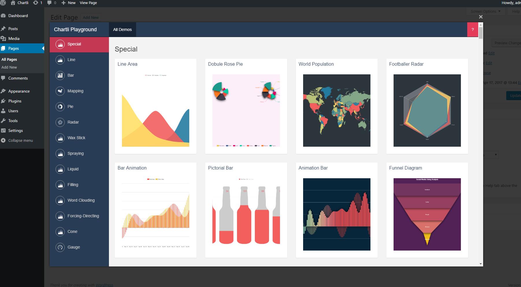
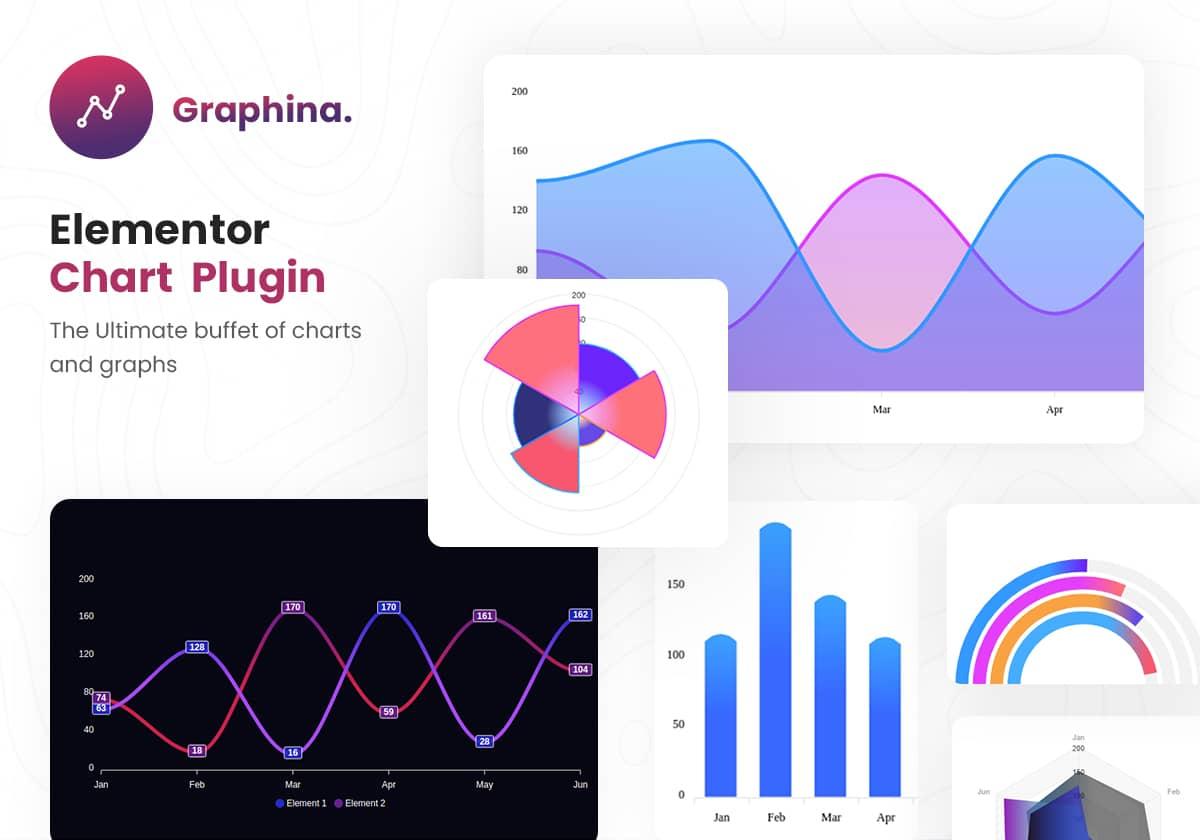
- Graphina – Offers a modern design with plenty of pre-built templates.
Q: How do I create a beautiful chart using a WordPress plugin?
A: Creating a stunning chart is easier than you might think! Start by installing your chosen chart plugin. Most of them will have a straightforward setup process. Simply:
- Gather Your Data: Organize the data you want to visualize.
- Select Chart Type: Choose the type of chart that best represents your data.
- Customize: Use the plugin’s customization options to adjust colors, labels, and styles until it aligns with your site’s aesthetic.
- Insert the Chart: Use shortcodes or blocks to place your chart exactly where you want it in your content.
- Preview and Publish: Always preview your chart to ensure it looks good across devices before hitting publish!
Q: Are these plugins beginner-friendly?
A: Definitely! Most of the plugins listed are designed with user experience in mind, making them accessible for beginners. They often come with tutorials or documentation to guide you through the process. so don’t worry if you’re not tech-savvy; you’ll be creating beautiful charts in no time!
Q: What’s the benefit of using charts in my content?
A: Using charts enhances your content in several ways. they break up text, making your posts easier to read. Charts also help clarify concepts and trends,making your data more relatable. Plus, engaging visuals can increase time spent on your page, boost shares, and ultimately drive more traffic to your site!
Q: Any final tips for choosing the right chart plugin?
A: Absolutely! Consider your specific needs—like the complexity of your data and the look you’re going for.Take advantage of free trials if available, and don’t hesitate to read user reviews to see how others feel about the plugin. Ultimately,choose one that fits seamlessly into your workflow and enhances your site’s aesthetic.
With the right chart plugin, you’ll not only captivate your audience but also present your data in a professional and engaging way. So why wait? Dive into the world of WordPress chart plugins and elevate your content today!
—
Feel free to adjust or expand on any section to better fit your article!
Future Outlook
As we wrap up our exploration of the 11 best WordPress chart plugins,it’s clear that the right tools can transform your data into compelling visuals that engage your audience and enhance your content. Whether you’re a blogger looking to spice up your posts, a business owner wanting to present key metrics, or an educator aiming to illustrate complex ideas, these plugins offer something for everyone.
Remember, creating beautiful charts is not just about aesthetics; it’s about conveying your message clearly and effectively. With the right plugin, you can elevate your WordPress site and make your data come alive. So why not give one of these plugins a try? Test the waters, play around with the features, and see how they can add value to your content.
if you found this article helpful,share it with fellow WordPress users who might benefit from a visual boost in their projects. And don’t hesitate to drop your thoughts or experiences in the comments below—after all, we’re all here to learn and grow together!
Happy charting!