
Are you ready to take your Eduma theme to the next level? If you’re looking to create a truly unique and user-kind experience for your website visitors, customizing your layout menu is a game changer. Whether you’re running an online school, a tutoring service, or any educational platform, a well-organized menu can make all the difference in helping your users find what they need. In this step-by-step guide, we’ll walk you through the process of using the Custom Layout Menu in Eduma, making it easier than ever to tailor your site to fit your vision. From simple tweaks to more advanced configurations, we’ve got you covered.Let’s dive in and unlock the full potential of your eduma theme together!
Understanding the Custom Layout Menu in Eduma
The Custom Layout Menu in Eduma is a powerful feature that allows you to tailor the appearance and functionality of your website to suit your unique educational needs. With just a few clicks, you can create a personalized navigation experience that enhances user engagement and improves accessibility. Here’s how to make the most of this feature.
To get started, navigate to the Appearance section in your WordPress dashboard. Here, you’ll find the Menus option. This is where the magic happens! You can create a new menu or edit an existing one. Selecting the right menu structure is essential, so think about how you want your users to interact with your site.
When constructing your menu,consider the following elements:
- Pages: Add essential pages like Home,Courses,and Contact to ensure users can easily find what they need.
- Categories: Group similar courses or articles together for a more organized feel.
- Custom Links: Link to external resources or critically important announcements directly from your menu.
One of the standout features of the Custom Layout Menu is the ability to create a mega menu. This allows you to feature multiple columns of links and images under a single menu item. To activate the mega menu, simply hover over a menu item and click on the settings icon.From there, you can specify the layout and content of the dropdown.
Here’s a quick look at some options you can include in your mega menu:
| Menu Item | Description |
|---|---|
| Featured Courses | Highlight popular courses directly from the menu. |
| Testimonials | Showcase student feedback to build trust. |
| Blog Posts | Link to your latest articles for added value. |
After customizing your menu, don’t forget to save your changes! Preview your website to see how the new layout enhances navigation. The Custom Layout Menu not only improves user experience but also reflects your brand’s personality, making your site more inviting to potential learners.
Getting Started with Your Eduma Theme
Getting started with the eduma theme can transform your educational website into a dynamic learning platform. One of the standout features of this theme is the Custom Layout Menu,which allows you to create a tailored navigation experience for your users.Here’s how you can effectively utilize this feature to enhance your site.
Step 1: Accessing the Custom Layout Menu
To begin, navigate to your WordPress dashboard and click on Appearance, then Menus. This is where you’ll manage your custom menus. You’ll first want to create a new menu specifically for your layout.
Step 2: Creating Your Menu
Click on Create a new menu, give it a name that reflects its purpose, like “Top Navigation” or “Footer Links,” and then click Create Menu. Now you can start adding pages,categories,and custom links that best suit your educational offerings.
- Add critically important pages like About Us, Courses, and Contact.
- Organize your courses by creating categories and adding them as menu items.
- Utilize custom links to direct users to external resources, like your social media profiles or partner sites.
Step 3: Organizing Your Menu Structure
Once you’ve added your desired items, you can drag and drop them to arrange them in a way that makes sense for your users. Consider grouping related items under a parent menu item for a more organized appearance.
Step 4: assigning Your Menu to a Location
After organizing your menu, you’ll need to assign it to a specific location on your website. Look for the Menu Settings section and select the location where you want your menu to appear. Eduma allows you to choose from a few diffrent menu locations, so pick the one that best fits your design.
Step 5: Customizing Your Menu Appearance
To further enhance your Custom Layout menu, explore the Customize option under the Appearance tab. Here you can change styles, colors, and hover effects to align with your brand identity. Making your menu visually appealing encourages better user interaction.
Consider adding icons to your menu items or using contrasting colors to draw attention to specific links. These small tweaks can significantly improve user experience.
Table of Menu Item Ideas
| Menu Item | Purpose |
|---|---|
| Courses | Directs users to your course catalog |
| Blog | Showcases educational articles |
| Events | Lists upcoming webinars and workshops |
| Testimonials | Builds trust with social proof |
with these steps, you’re well on your way to creating a Custom Layout Menu that not only enhances the usability of your educational website but also boosts user engagement. Take some time to experiment with different layouts and styles until you find the perfect fit for your audience!
Exploring the Layout Menu Options
When diving into the Custom Layout Menu of Eduma, you’ll discover a wealth of options designed to enhance your site’s visual appeal and user experience. Each feature as you navigate through the menu provides a different layer of customization that can make your educational platform stand out. Here’s a closer look at the various elements you can tweak and tailor to fit your needs.
header Options are often the first point of contact for visitors. In this section, you can:
- Choose from different header styles, whether you prefer a classic look or modern aesthetics.
- Adjust the height and alignment to ensure it fits perfectly with your overall theme.
- Add a custom logo to reinforce your brand identity.
Moving on to the Footer Settings,this area allows for similar customization. The footer is equally important as it provides essential navigation and can hold critical details. Here’s what you can adjust:
- Select the number of columns to display your links.
- Add social media icons to connect with your audience.
- Include a newsletter sign-up form to grow your mailing list.
One of the standout features is the Sidebar Layout, which can significantly impact user engagement. You can easily choose either a left or right sidebar layout, or even opt for a full-width display depending on your content focus. Consider the following options:
- Add widgets like recent posts, popular courses, or even a course calendar.
- Customize the sidebar background colour to ensure it complements your main content.
- Utilize sticky sidebars for better accessibility and continuous visibility.
another exciting aspect to explore is the Custom Page Layouts.This feature allows you to create unique page designs tailored to specific courses or subject areas. You can:
- Choose from pre-defined layouts or create your own from scratch.
- Mix and match elements such as galleries, video sections, and testimonials.
- Preview changes in real-time to ensure everything aligns with your vision.
to provide a clearer understanding of how these features interlink, you might find the following table useful:
| Feature | Description |
|---|---|
| Header Options | Customize the entry point with logos, styles, and heights. |
| Footer Settings | Provide essential links and social connections. |
| Sidebar Layout | Enhance engagement with widgets and custom colors. |
| Custom Page Layouts | Create unique designs for targeted content delivery. |
Engaging with the layout menu options in Eduma is not just about aesthetics but about creating a seamless and inviting user experience.The more you personalize and align your layout with your educational goals, the more effectively you’ll connect with your audience. So, dive in and start experimenting with these features to elevate your site’s layout!
Choosing the Right Layout for Your Needs
When it comes to selecting a layout for your educational website, it’s essential to consider how each option can enhance user experience.The right layout can make your content more accessible, engaging, and visually appealing. here are some factors to keep in mind:
- target Audience: Understand who will be visiting your site. Are they students, parents, or educators? Tailor your layout to meet thier needs.
- Content type: Consider the type of content you’ll be presenting. Will it be primarily text, images, or videos? Different layouts highlight different content types.
- visual Hierarchy: A good layout should guide visitors’ attention naturally. Use elements like headings, images, and buttons to create a clear path through your information.
- Mobile Responsiveness: Ensure your chosen layout looks great on all devices. A responsive design will help retain visitors who access your site via smartphones or tablets.
Another aspect to think about is the adaptability of your layout. You want a design that allows you to make adjustments as your content grows or changes. A customizable layout lets you experiment with different elements, colors, and styles without losing the essence of your brand. As an example:
| Feature | Benefits |
|---|---|
| Grid System | Organizes content efficiently, making it easy to navigate. |
| Sidebar Options | Utilize for additional links or information without cluttering the main content. |
| Custom widgets | Add functionality like calendars or testimonials to enhance user engagement. |
Lastly, don’t underestimate the power of visual appeal. Aesthetics can significantly impact how users perceive your site. Choose colors,fonts,and images that resonate with your mission and values.A clean, professional layout can build trust and encourage users to explore further.
selecting the right layout is a crucial step in enhancing the effectiveness of your educational website. By considering your audience, content type, and visual design, you can create an inviting space that encourages learning and interaction.
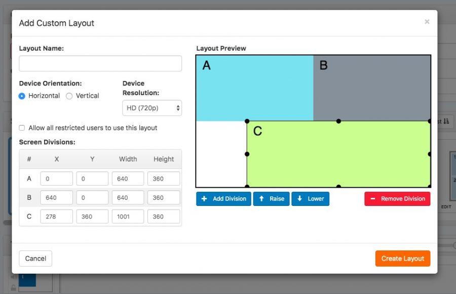
Step-by-Step Guide to Customizing Your Layout
Customizing your layout can significantly enhance user experience and engagement on your website. With the Custom Layout Menu in Eduma, you have the flexibility to create a visually appealing and organized layout that meets your specific needs. Let’s get started!
Accessing the Custom Layout Menu:
- Log in to your WordPress admin panel.
- Navigate to Eduma Options in the dashboard menu.
- Select the custom Layout tab to access the layout customization options.
Choosing a Layout Template:
Eduma offers a variety of pre-designed layout templates. To select one:
- Scroll through the available templates and preview them by clicking on Preview.
- Once you find a template you like, click Select to apply it.
Customizing Sections:
After selecting a template, you can further customize individual sections.Here’s how:
- Click on the section you want to edit (e.g., Header, Footer, Content Area).
- Adjust settings such as layout style, colors, and fonts directly from the options presented.
- Use the drag-and-drop feature to rearrange sections as needed.
Adding Widgets:
Widgets are a fantastic way to add functionality to your site. To include widgets:
- Go to the Widgets section in the Custom Layout menu.
- Drag your desired widget from the available options to the appropriate area on your layout.
- Configure each widget’s settings to ensure they align with your design and purpose.
Previewing and Publishing Your Layout:
Before finalizing your changes, it’s vital to preview your layout:
- click the Preview button to see how your customized layout looks on different devices.
- Make any adjustments as necessary to ensure a cohesive and responsive design.
- Once satisfied, hit Publish to make your layout live!
Tips and Best Practices:
| Tip | Description |
|---|---|
| Keep It Simple | A clutter-free layout improves user navigation. |
| Stay Consistent | Maintain uniform colors and fonts across sections. |
| Test Responsiveness | Ensure your layout looks great on mobile, tablet, and desktop. |
With these steps,you’re well on your way to creating a customized layout that not only looks professional but also enhances your site’s functionality. Dive in, experiment with different designs, and let your website reflect your unique style!
Adding and Rearranging Menu Items
Customizing your menu can significantly enhance the navigation experience on your Eduma site. To add new menu items, simply follow these straightforward steps:
- Go to your WordPress Dashboard.
- Select “Appearance” from the left sidebar, then click on “Menus.”
- Choose the menu you wish to edit or create a new one.
- On the left side,you will see various options like Pages,Posts,and Custom Links. Check the boxes next to the items you want to add and click “Add to Menu.”
After adding your desired items, they will appear on the right side under “Menu Structure.” Here, you can easily rearrange them to suit your preferences. Just drag and drop the menu items to organize them in your desired order.this feature allows you to create a logical flow for your visitors, making it easier for them to find the information they need.
To create sub-menus, simply drag a menu item slightly to the right under another item. This visual hierarchy helps visitors understand the relationship between different sections, enhancing user experience. Such as,under “Courses,” you might have sub-items like “Math,” “Science,” and “History.”
Once you’re satisfied with your menu structure, don’t forget to click the “Save Menu” button. Your changes will reflect promptly on your site, so take a moment to preview your menu on the front end. This will ensure that everything looks just the way you envisioned it.
If you want to delete an item from your menu, simply click the small arrow next to the item in the Menu Structure. this will expand options where you can select “Remove.” Don’t worry, removing it from the menu doesn’t delete the item from your site; it can be re-added anytime.
For a more dynamic menu, consider using Custom Links. This allows you to link to external sites or specific pages that might not be included in your regular page list.Just input the URL and the link text, and it’ll appear in your menu just like any other item.
Lastly, ensure that your menu works well on all devices. A responsive menu is crucial for users accessing your site via mobile.Many themes, including Eduma, automatically adjust menus for mobile views, so always check it from a mobile outlook to ensure everything functions seamlessly.
Utilizing Widgets to enhance Your Layout
Widgets can truly transform your website’s layout, providing both functionality and aesthetic appeal. By integrating various widgets into your custom layout menu, you can create a dynamic experience for your visitors. Here’s how you can make the most of widgets to enhance your site:
- Interactive Elements: Incorporate widgets like calendars, countdown timers, or image sliders. These elements not only engage users but also encourage them to interact with your content.
- Social Media Feeds: Embed social media widgets to showcase your latest posts and enhance your site’s credibility. This keeps your content fresh and connects visitors to your social platforms effortlessly.
- Contact Forms: A simple contact widget can streamline interaction for your users. Including a form in your layout makes it easy for visitors to reach out with queries or feedback.
Moreover, it’s essential to consider the placement of your widgets. Strategically positioning them can significantly impact user experience and navigation. For instance, placing a search bar widget prominently allows users to find information quickly.
When designing your layout, think about using a combination of different types of widgets. Here’s a quick look at the benefits of using various widgets together:
| Widget Type | Benefit |
|---|---|
| image Gallery | Showcases visual content effectively. |
| Testimonial Slider | Builds trust through social proof. |
| Newsletter Signup | Grows your email list effortlessly. |
It’s also critically important to ensure that your widgets are responsive and mobile-friendly. A significant portion of web traffic comes from mobile devices, so making sure your widgets adapt to different screen sizes is crucial.Frequently enough,WordPress themes are built with responsiveness in mind; though,always double-check how your widgets perform across devices.
Lastly, don’t forget to periodically review and update your widgets.A stale layout can make your site feel outdated. Regularly refreshing your widgets will not only keep your content relevant but also improve user engagement. Experiment with different configurations and pay attention to visitor behavior to see what works best for your audience.
Optimizing Your Menu for Mobile Devices
When it comes to mobile devices, your menu plays a crucial role in user experience. It’s essential to ensure that your custom layout menu is not only visually appealing but also functional and easy to navigate. Here are some strategies to optimize your menu for mobile users:
- Simplify Your Menu Structure: Instead of a long list of options, consider grouping similar items under broader categories. This reduces clutter and makes it easier for users to find what they need quickly.
- Prioritize Key Items: Identify which items are most important for your users and make them easily accessible. Place these at the top of your menu or use a prominent call-to-action button.
- Use Touch-Friendly Design: Ensure that your menu items are large enough to be tapped without frustration. Ideally,buttons should be at least 44 pixels tall to accommodate finger taps comfortably.
- Implement a Collapsible Menu: Consider using a collapsible or hamburger menu that expands when clicked. This approach saves space and keeps your mobile interface clean.
Additionally, don’t overlook the importance of visual cues. Icons can enhance your menu’s usability by providing instant recognition of different sections. However, ensure they are universally understood to avoid confusion. Here’s a quick comparison of different menu styles:
| Menu Style | pros | Cons |
|---|---|---|
| Customary | Familiar layout, easy navigation | Can be cluttered on smaller screens |
| collapsible | saves space, clean design | Can hide important options |
| Tab Navigation | Quick access to main sections | Limited space for options |
ensure that your menu is responsive. Test it across various devices and screen sizes to confirm that it adapts seamlessly. Utilizing tools like Google’s Mobile-Friendly Test can help you identify any issues that may arise.
By focusing on these strategies, you’ll create a mobile menu that not only looks good but also enhances the overall user experience, leading to higher engagement and satisfaction.
Tips for Maintaining a User-Friendly Experience
Creating a user-friendly experience is essential for keeping visitors engaged and satisfied. Here are some tips to enhance usability while using the Custom Layout Menu in Eduma:
- Simplify Navigation: Make sure your menu items are straightforward and intuitive. Use clear, descriptive labels that guide users to the content they’re looking for.
- Prioritize Important Links: Place the most critical links at the forefront. This ensures that users can easily access essential sections without excessive scrolling or searching.
- Incorporate Visual Elements: Use icons or images alongside text in your menu. This not only adds a visual appeal but also helps users quickly identify sections.
- responsive Design: Ensure your menu works seamlessly on all devices. Test the layout on desktops, tablets, and smartphones to confirm that it adapts well.
To further enhance user experience, consider the following:
- Consistent Style: Maintain a cohesive look throughout your website. Use consistent fonts, colors, and button styles that align with your brand identity.
- Feedback Mechanisms: Add features that allow users to provide feedback on their experience. Simple thumbs up/down buttons can definitely help you gauge satisfaction.
- Accessibility Features: Make your site accessible to all users by implementing features such as keyboard navigation and screen reader compatibility.
Lastly, regularly update your menu based on user behavior and feedback. Here’s a brief table to help visualize the ideal frequency of updates:
| Update Frequency | Reason |
|---|---|
| Weekly | To address minor usability issues and fix broken links. |
| Monthly | to incorporate new content and features based on user suggestions. |
| Quarterly | To evaluate overall user experience and make significant improvements. |
By following these tips, you can create a seamless user experience that encourages visitors to explore and interact with your content more deeply.
Previewing Your Custom Layout Changes
After you’ve made your custom layout changes in Eduma, it’s essential to preview them before going live. This ensures that everything appears as intended and that any necessary adjustments can be made. Here’s how you can effectively preview your work:
- Use the Preview Button: Most layout builders have a preview button located at the top or side of your editor.Clicking this allows you to see your customizations in real-time.
- Check Responsiveness: Make sure to switch between different device views (desktop, tablet, mobile) using the responsive design tools. This ensures your layout looks good on all devices.
- Test Interactive Elements: Click on any buttons,links,or forms to ensure they function correctly.Testing these elements helps catch any issues before your audience experiences them.
It’s also wise to consider the overall flow and usability of your layout. As you preview your changes,keep an eye out for:
- Visual Hierarchy: Confirm that headings and content are visually distinct and guide the users’ eyes effectively.
- Content Readability: Ensure text contrast is sufficient and that your font sizes are easily readable.
- image Placement: Check that images are well-placed and enhance, rather than detract from, the overall user experience.
To assist you further,take advantage of tools like browser developer tools to inspect elements and see how they adapt to different screen sizes. This can provide valuable insight into areas needing refinement.
| Preview Element | Checkpoints |
|---|---|
| Header | Visibility, Logo Alignment, Menu Access |
| Main Content | Text Formatting, Image Alignment, Call-to-Action |
| Footer | Social Links, Copyright Notice, Contact information |
By thoroughly , you can identify any potential issues and ensure that your website will make a lasting impression on visitors. Every small detail counts in creating a seamless user experience, so take the time to make those refinements! Remember, a well-prepared layout can significantly enhance engagement and conversion rates.
Publishing Your Custom Layout with Confidence
When it comes to showcasing your unique educational offerings, utilizing a custom layout is key to standing out. With the right configuration, your menus can guide users effortlessly through your site, emphasizing the courses and resources you provide. Here’s how to publish your custom layout with a sense of confidence.
1. Preview Your Layout
Before making your layout live, take full advantage of the preview feature.This allows you to see how everything looks together,and it provides a chance to make necessary adjustments. Make sure to check:
- visual Appeal: Are the colors and fonts consistent with your brand?
- User Experience: Is the navigation intuitive for your audience?
- Mobile Responsiveness: Does the layout adapt well on smaller screens?
2. Finalize Your Menu Items
Ensure that all menu items are relevant and categorized correctly. A well-structured menu not only helps with SEO but also keeps your users engaged. Consider the following:
- Group similar courses or resources together.
- Use descriptive labels that clearly indicate what users can expect.
- Limit the number of top-level menu items to avoid overwhelming visitors.
3. Implementing Functionality
After finalizing the visual aspects and menu structure, make sure that all links and buttons work seamlessly. This step is crucial to maintain a positive user experience. Here are some tips:
- Test all internal links to ensure they lead to the correct pages.
- Verify that external links open in a new tab to keep users on your site.
- Make use of call-to-action buttons that stand out and guide users towards registration or inquiries.
4. Go Live With confidence
Once you’re satisfied with the preview and functionality, it’s time to publish! Remember to monitor the layout post-launch. Consider using analytics tools to track user engagement with your new layout. Here’s a simple table of metrics you might want to observe:
| Metric | Importance |
|---|---|
| Page Views | Indicates interest in your offerings. |
| Click-Through rate (CTR) | Shows how compelling your links are. |
| bounce Rate | Reflects user engagement and content relevance. |
With these steps in mind, you can publish your custom layout with assurance. Embrace the journey of enhancing your site, and remember, the more you tweak and refine, the better your users’ experience will be!
Troubleshooting Common Layout Issues
When working with the Eduma theme’s custom layout menu, you may encounter a few common layout issues that can be easily resolved.Here are some tips to help you get your layout looking just right:
- Check Theme Settings: Ensure that you have the correct settings enabled in the theme options. Sometimes, a simple toggle or checkbox can make all the difference in how your layout appears.
- Inspect Page Builder Elements: If you’re using a page builder, double-check that the elements are properly aligned and not overlapping. Look for any spacing settings that may need adjustment.
- Review Custom CSS: If you’ve added custom CSS, it might be conflicting with theme styles. Disable or comment out sections of your custom CSS to identify any problematic styles.
- check for Plugin Conflicts: Plugins can occasionally interfere with layout adjustments. temporarily disable plugins to see if the issue resolves, then reactivate them one by one to locate the culprit.
Another common issue is the responsive design.If your layout looks great on desktop but not on mobile, consider the following:
- Media Queries: Ensure you are using appropriate media queries in your CSS to adjust elements for different screen sizes.
- Mobile View Settings: Check if there are specific settings for mobile views within the theme customizer that might need tweaking.
- Test Responsiveness: Use tools like Google’s Mobile-Friendly Test or browser developer tools to see how your site performs on various devices.
If you’re still facing issues, gather information before seeking help:
| Issue | Possible Cause | Solution |
|---|---|---|
| Content Overlap | Improper padding/margin settings | Adjust padding/margins in the page builder |
| Images Not Aligning | Image size issues | Ensure images are resized to fit their containers |
| Text Overflow | Fixed widths | Switch to responsive units (e.g., %, vw) |
By taking the time to troubleshoot these common issues, you can create a seamless and attractive layout that enhances the user experience on your site.Remember, small adjustments can lead to significant improvements, so don’t hesitate to experiment with different settings and configurations!
Frequently Asked Questions (FAQ)
Q&A: How To Use Custom Layout Menu Eduma - Step-by-step Guide
Q1: What is the Eduma theme, and why should I use it for my website?
A1: Great question! Eduma is a powerful WordPress theme designed specifically for educational institutions, online courses, and learning management systems. It’s packed with features that make it easy to create a stunning and functional website.By using Eduma, you can offer a professional look while ensuring a seamless user experience for your visitors—whether they are students, educators, or administrators.
Q2: What’s the custom layout menu, and how can it benefit my website?
A2: the custom layout menu allows you to personalize the navigation of your website, providing a tailored experience for your users. With Eduma’s custom menu options, you can create a unique layout that highlights important sections of your site, making it easier for visitors to find what they need.This not only enhances user experience but also keeps your site organized and visually appealing.
Q3: How do I access the custom layout menu feature in Eduma?
A3: Accessing the custom layout menu is super simple! Just log in to your WordPress dashboard, go to “Appearance,” and then select “Menus.” Here,you’ll find the option to create a new menu or edit an existing one. Select the “Custom Layout” option that comes with the eduma theme to start customizing your menu.
Q4: Can you walk me through the steps to create a custom menu?
A4: Absolutely! Here’s a quick step-by-step:
- Go to Appearance > Menus in your WordPress dashboard.
- Click on Create a new menu. Give it a name, and click Create Menu.
- Add the pages, categories, or custom links you want in your menu from the left-hand column.
- Drag and drop to arrange them in the order you prefer.
- Make sure to check the box that sets your menu as the primary menu, so it appears on your site.
- Click Save Menu,and you’re all set!
Q5: What kind of customizations can I make to my menu?
A5: You can customize your menu in several ways! You can choose different colors,fonts,and styles to match your brand. Additionally, Eduma allows you to create dropdown menus for better institution. You can also add icons next to menu items or even include custom CSS for further design tweaks. The possibilities are pretty much endless!
Q6: Will my custom menu work well on mobile devices?
A6: Definitely! Eduma is fully responsive, meaning your custom layout menu will look great on any device—be it a desktop, tablet, or smartphone. The theme is designed to adapt, ensuring your users have a smooth navigation experience, no matter how they access your site.
Q7: What if I encounter issues while setting up my custom menu?
A7: If you run into any bumps along the way, don’t worry! Eduma comes with extensive documentation and a support forum where you can ask questions and find solutions.plus, the Eduma community is active and helpful, so you’re likely to find answers quickly.
Q8: Any final tips for using the custom layout menu effectively?
A8: absolutely! Always keep your audience in mind. Make sure the most critically important sections of your site are easy to access. Use clear and concise labels for menu items, and don’t overcrowd your menu—simplicity is key! Regularly review your menu’s performance and adjust it based on user feedback to keep improving their experience.
With these insights, you’re well on your way to creating a fantastic custom layout menu that enhances your Eduma website. Happy customizing!
To Conclude
And there you have it—a comprehensive guide on how to make the most of the Custom Layout Menu in Eduma! By following these step-by-step instructions, you’re well on your way to creating a more engaging and user-friendly experience for your audience. Whether you’re looking to enhance navigation, showcase your courses, or simply add a personal touch to your site, the Custom Layout Menu offers endless possibilities.
Remember, the key to a prosperous online education platform is not just the content you provide, but also how seamlessly your users can interact with it. So, don’t hesitate to experiment with different layouts and features until you find the perfect fit for your needs.
Now that you’re armed with this knowledge, why not dive in and start customizing? Your learners will appreciate the effort, and you’ll likely see the positive impact on user engagement and satisfaction. If you have any questions or want to share your experiences with the Custom Layout Menu, feel free to drop a comment below. Happy customizing, and here’s to creating a captivating online learning environment!
