Every Hero Image Size You Need to Know: A guide for Designers and Marketers
Hey there! If you’ve ever stumbled upon a website that made you go, “wow, that looks amazing!” odds are, you were captivated by a stunning hero image. These powerful visuals are the first thing visitors see when they land on a page, and they play a crucial role in setting the tone and grabbing attention. But here’s the catch: not all hero images are created equal.The size and format of your hero images can make or break the user experience,impacting everything from loading times to visual appeal.
In this article, we’re going to dive into the essential hero image sizes you need to know, whether you’re a seasoned designer or just starting out in the world of web development. So, grab a cup of coffee, and let’s explore how to make your website shine with the perfect hero images!
Understanding the Importance of Hero Images in Your Design
Hero images are not just visually appealing elements; they play a crucial role in capturing attention and conveying your brand’s message at a glance. A well-chosen hero image can enhance user experience, drive engagement, and considerably improve conversion rates. Here’s why they are so essential in design:
- First Impressions Matter: Your hero image is often the first thing visitors see when they land on your site. A striking image can evoke emotions and create a memorable first impression, encouraging users to explore further.
- visual Storytelling: Images communicate messages instantly. By selecting a hero image that aligns with your brand story, you can convey complex ideas quickly and effectively, enabling users to grasp your message without reading extensive text.
- Boosts Conversion Rates: A compelling hero image can entice users to take action. Whether it’s signing up for a newsletter, making a purchase, or exploring your services, the right visuals can lead to higher conversion rates.
- Enhances Brand Identity: Consistency in your hero images helps reinforce brand identity.Using images that reflect your values and aesthetic contributes to a strong,cohesive brand presence across all platforms.
to fully leverage the potential of hero images, it’s essential to consider sizing and placement. Different devices require different image sizes to maintain quality and impact. Here’s a simple table to guide you through the recommended hero image sizes:
| Device Type | Recommended Size |
|---|---|
| Desktop | 1920 x 1080 px |
| Tablet | 768 x 1024 px |
| Mobile | 375 x 667 px |
Additionally, bear in mind the importance of image quality. A high-resolution image not only looks professional but also builds trust with your audience. Remember to optimize your images for faster loading times,as slow-loading pages can deter potential customers.
Incorporate text overlays that complement your hero image to further enhance its effectiveness. Use contrast to ensure legibility and choose fonts that align with your branding. A well-placed call-to-action within the hero section can guide users seamlessly toward what you want them to do next.
Ultimately, a thoughtfully designed hero image is more than just decoration; it’s an integral part of your website’s overall strategy. By investing time and effort into selecting the right images and understanding their impact, you can create a visually engaging experience that resonates with your audience and amplifies your brand message.

Choosing the Right Dimensions for Your Website Hero Images
When it comes to hero images, dimensions are everything. Choosing the right size can make a meaningful difference in how your website looks and performs. A well-optimized hero image can enhance user experience, boost engagement, and improve your site’s overall aesthetic. Here are some key considerations to keep in mind:
- Aspect Ratio: Most hero images use a 16:9 or 4:3 aspect ratio. The 16:9 ratio is popular for widescreen displays, while 4:3 works well for tablets and older monitors.Always consider were your audience is accessing your site.
- Screen Resolution: With devices ranging from smartphones to 4K monitors, using high-resolution images (at least 1920 x 1080 pixels) ensures your visuals look sharp on any screen. Though, balance quality with load times to keep your site fast.
- Responsive Design: Your hero images should adapt to various screen sizes. Use CSS media queries to serve different dimensions based on the user’s device. This approach optimizes load times and ensures a seamless experience across all platforms.
consider the following table for common hero image dimensions:
| device | Recommended Size | Aspect Ratio |
|---|---|---|
| Desktop | 1920 x 1080 px | 16:9 |
| Laptop | 1366 x 768 px | 16:9 |
| Tablet | 1536 x 2048 px | 4:3 |
| Smartphone | 750 x 1334 px | 16:9 |
Another critical component is file size.Aim for a balance between quality and performance. Compress images without losing clarity using tools like TinyPNG or ImageOptim. A smaller file size can significantly reduce load times, enhancing your SEO and user satisfaction.
Lastly, don’t forget about the focal point of your hero image. Ensure that the most vital elements are visible in both desktop and mobile views. A good practice is to centre your subject and leave space around it,so it doesn’t get cropped on smaller screens. Creating a visually appealing hero image is not just about dimensions; it’s about composition too.

Exploring the Optimal Hero Image Size for Mobile Devices
When it comes to mobile devices, the hero image serves as a critical visual anchor for your website. However,getting the size just right can be a bit tricky.A hero image that’s too large can slow down your page load time, while one that’s too small might fail to capture attention or convey your brand’s message effectively. So, what’s the sweet spot?
Most experts recommend a hero image size of 750px by 1334px for mobile screens. This size strikes a balance between quality and performance, ensuring that your images are crisp without burdening the loading speed. Here’s why this size works:
- It maintains high resolution on various mobile devices.
- It fits well within the standard dimensions of most smartphones.
- It allows for easy responsive design, adapting seamlessly to different screen sizes.
Keep in mind that aspect ratio also plays an essential role. A 16:9 ratio is commonly favored for hero images as it provides a cinematic feel while ensuring that no critical content gets cropped out. If you opt for this aspect ratio, a popular size for high-quality images is 1280px by 720px. The key is to ensure that your image remains visually appealing across all devices.
To illustrate the best practices,consider the following table that summarizes optimal hero image sizes for various mobile screen resolutions:
| Device Type | Recommended Size | Aspect Ratio |
|---|---|---|
| Smartphones | 750px by 1334px | 16:9 |
| Tablets | 1200px by 800px | 16:10 |
| Large Smartphones | 1080px by 1920px | 16:9 |
Moreover,to optimize the performance of your hero images on mobile,consider using formats like WebP or JPEG XR,which help compress the images without sacrificing quality. This simple adjustment can lead to faster loading times, enhancing user experience.
Lastly, remember that testing is vital. Always preview your hero images on multiple devices to ensure they look great everywhere. Utilize tools that allow you to check how your images render across various screen sizes, making adjustments as necessary to keep your site engaging and visually appealing.

Balancing Quality and Load Time: Best practices for Hero Images
When it comes to hero images, striking the right balance between quality and load time is essential for creating an engaging user experience. A stunning hero image can captivate visitors, but if it takes too long to load, it may lead to increased bounce rates. Here are some strategies to ensure your hero images enhance your site without causing delays:
- Optimize Image Size: before uploading, always compress your images. Tools like tinypng or ImageCompressor can drastically reduce file sizes without noticeable quality loss.
- Choose the Right Format: Depending on your image’s content, select the most efficient format. For photographs, JPEG is often best, while PNG is ideal for images requiring transparency.
- Use Responsive Images: Implement
srcsetto serve different image sizes based on the user’s device. This ensures mobile users don’t download large files that slow down their experience. - Lazy Loading: Consider implementing lazy loading so that images only load when they enter the viewport. This technique can significantly improve initial page load times.
- Content Delivery Network (CDN): Leverage a CDN to deliver images from the server closest to the user,enhancing load speed while maintaining quality.
To illustrate how different image sizes affect loading times, take a look at the following table:
| Image Size (KB) | load Time (Seconds) | Quality Rating |
|---|---|---|
| 50 KB | 0.1 | High |
| 150 KB | 0.3 | Medium |
| 300 KB | 0.5 | Low |
As the table demonstrates, smaller image sizes lead to quicker load times and higher quality ratings when optimized properly. Always test your hero images across various devices and connection speeds to ensure they deliver the best possible experience.
Lastly, keep in mind that a hero image serves not just as a visual element, but as a critical component of your website’s storytelling. Quality should never be sacrificed entirely, but with the right techniques, you can maintain visual appeal while ensuring your site remains fast and responsive. After all, your audience deserves the best of both worlds!
adapting Hero Images for Different Screen Resolutions
When it comes to hero images, adapting them for different screen resolutions is crucial for maintaining visual appeal and functionality. A hero image should not only look stunning but also serve its purpose—capturing attention and conveying your message effectively,regardless of the device used to view it.
Responsive Design is your best friend here. Utilize CSS media queries to ensure that your hero images resize gracefully across various screen sizes. This might include defining different sizes for mobile, tablet, and desktop views.here’s a quick breakdown of common sizes to use:
| Device type | Recommended Width | Aspect Ratio |
|---|---|---|
| Mobile | 375px | 16:9 |
| Tablet | 768px | 16:9 |
| desktop | 1920px | 16:9 |
In addition to sizing,consider the file format of your hero images. JPEGs are great for photographs, while PNGs can be ideal for images that require transparency or have text overlays. For more complex graphics or animations, SVGs can keep your visuals sharp on high-resolution screens, ensuring that they always look crisp.
Don’t forget about loading times. Large image files can significantly slow down your website, affecting user experience and SEO.Use tools like ImageOptim or TinyPNG to compress images without sacrificing quality. Implementing these optimizations ensures that your hero images load quickly, keeping visitors engaged and reducing bounce rates.
Lastly, always perform testing across devices. Utilize browser developer tools and real devices to see how your hero images appear on various screens. Make adjustments based on what you observe—sometimes, a slight crop or repositioning can make all the difference in visual impact.
crafting Compelling Calls to Action with Your Hero Images
Hero images are more than just stunning visuals; they are powerful tools for driving user engagement and conversions. To make the most of your hero images, integrating compelling calls to action (CTAs) is essential. Think of your hero image as a stage, and the CTA is the star performer that guides visitors on what to do next.
Here are a few best practices for crafting CTAs that resonate with your audience:
- Clarity is Key: make sure your message is clear and easy to understand. A straightforward CTA like “Get Started” or “Learn More” removes ambiguity and encourages action.
- Use Action-Oriented Language: Verbs are your best friends here. Phrases like “Join Now,” “Download Today,” or “Shop the Collection” create a sense of urgency and excitement.
- Design for Visibility: Your CTA should stand out. Use contrasting colors, larger fonts, or buttons that pop against the hero image to draw attention instantly.
Another effective strategy is to create a sense of exclusivity or urgency.Phrases like “Limited Time Offer” or “join Our VIP List” in your CTA can motivate users to act promptly. This taps into the psychological principle of scarcity,making your audience feel like they might miss out if they don’t act quickly.
Now, let’s look at how to effectively position your CTAs within hero images:
| Position | Best Practice | Example |
|---|---|---|
| Center | Maximizes visibility and focus | “Shop Now” in the center of a lifestyle image |
| Bottom Right | Common reading pattern, unobtrusive | “Get Started” in a subtle, elegant font |
| Overlay | Creates a bold statement, immersive | “Discover Our New Line” overlayed on product imagery |
Integrating your CTAs with dynamic visuals allows you to tell a story while guiding your users towards action. Use imagery that relates directly to the action you want them to take. If you’re promoting a webinar, for example, show an engaging image of someone engaging in the webinar. This not only captivates attention but also creates a visual link between the image and the action.
don’t forget to test and optimize your CTAs regularly. A/B testing different phrases, colors, and placements can yield valuable insights into what resonates best with your audience. The more you refine your approach, the more effective your hero images will be at converting visitors into customers.
SEO Considerations for Your Hero Image Choices
Choosing the right hero image isn’t just about aesthetics; it plays a crucial role in your site’s SEO. When your hero image is optimized, it can significantly enhance your page’s loading speed and overall user experience, both of which are key ranking factors for search engines.
Here are some essential SEO considerations to keep in mind:
- File Size: Aim to keep your hero images under 200 KB without compromising quality. Large file sizes can slow down your page,negatively impacting your SEO.
- Image Format: Use formats like JPG for photographs and PNG for images requiring transparency.Consider newer formats like WebP for better compression and quality.
- Alt text: Write descriptive alt text for your images. This not only improves accessibility but also helps search engines understand the content of your image, which can contribute to better rankings.
- Responsive Design: Ensure your hero image looks great on all devices. Use CSS and responsive techniques to adjust the image size based on the user’s screen.
Another important aspect is the image naming convention.Search engines also analyse the file names. Rather of using generic names like “image1.jpg,” consider more descriptive names that incorporate relevant keywords, such as “summer-sale-hero-image.jpg.”
here’s a quick reference table to help you with image dimensions for various devices:
| Device Type | Recommended Size |
|---|---|
| Desktop | 1920 x 1080 pixels |
| Tablet | 768 x 1024 pixels |
| Mobile | 375 x 667 pixels |
consider the context of your hero image. Align it with your content’s message and purpose.A well-chosen image can decrease bounce rates and increase engagement, which sends positive signals to search engines about your content’s value.
Using Aspect Ratios Wisely: What You Need to Know
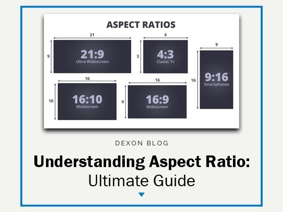
Understanding aspect ratios is crucial for creating eye-catching hero images that not only enhance the visual appeal of your website but also align perfectly with the design and functionality.When used wisely, aspect ratios can dramatically influence user engagement and conversion rates. Here are some key points to consider.
First, let’s define what aspect ratio means.essentially, it’s the proportional relationship between the width and height of your images. as an example, a common hero image size is 16:9, ideal for creating a cinematic feel, making it perfect for showcasing stunning visuals. Though, different platforms and devices may require different ratios, so here’s a handy reference:
| Device/Platform | Recommended Aspect Ratio | Common Sizes |
|---|---|---|
| Desktop | 16:9 | 1920 x 1080 |
| Mobile | 9:16 | 1080 x 1920 |
| Social Media | 1:1 | 1080 x 1080 |
| Blog Header | 3:1 | 1200 x 400 |
Another critically important factor to consider is how aspect ratios impact loading times and performance. Images that are too large or improperly sized can slow down your site, negatively affecting user experience.To mitigate this,always optimize your images before uploading them. Tools like Adobe Photoshop or online platforms like TinyPNG can definitely help compress your images without sacrificing quality.
Moreover, remember that the visual hierarchy of your site plays a significant role in how your audience interacts with your content. for example, a larger hero image with a 4:3 aspect ratio can draw attention effectively, while smaller images can support the main content without overshadowing it. Always test different sizes and ratios to find what resonates best with your audience.
Lastly, don’t forget about responsiveness. With an increasing number of users accessing websites from mobile devices, ensuring your hero images adapt well to various screen sizes is vital. Using CSS techniques such as object-fit and media queries can help maintain the integrity of your images no matter the device.
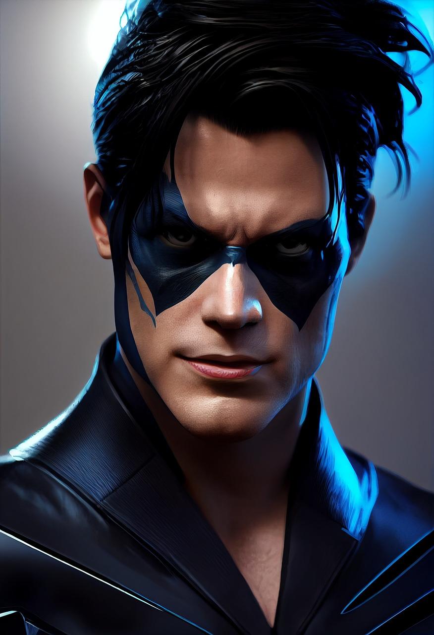
Creating Visual impact: Color and Composition in Hero Images
When it comes to hero images, the use of color and composition can make or break the visual impact of your website. A hero image serves as the first impression for your audience, and strategically chosen colors can evoke emotions and drive engagement. For instance,warm colors like reds and oranges can create a sense of urgency,while cooler tones like blues and greens often convey tranquility and trustworthiness.
Alongside color, the composition of your hero image plays a vital role in how effectively it communicates your brand message. Consider the following elements:
- Focal Point: Where do you want the viewer’s eye to go first? Ensure your subject is placed prominently.
- Negative Space: Utilize empty areas to enhance your subject, allowing for a cleaner and more impactful design.
- Rule of Thirds: Divide your image into a 3×3 grid and position crucial elements along these lines or at their intersections for a balanced look.
Choosing the right size for your hero image is equally essential. It not only affects load times but also the overall user experience. Here’s a quick overview of popular hero image sizes:
| Device | Recommended Size (pixels) |
|---|---|
| Desktop | 1920 x 1080 |
| Tablet | 768 x 1024 |
| Mobile | 375 x 667 |
It’s important to ensure your hero image is responsive. Utilize CSS media queries to adjust the image dimensions seamlessly across different devices. This not only enhances visual appeal but also retains the focus on your message, regardless of screen size.
don’t underestimate the power of contrast. Implementing contrasting colors can help your hero image stand out, making sure it captures attention promptly. Pairing dark text on a light background or vice versa can improve readability and draw the viewer’s eye toward the most important elements of your design.
Testing and Tweaking: How to Optimize Your Hero Images
Optimizing your hero images can significantly enhance user engagement and improve your site’s performance. Here are some effective strategies to ensure your hero images not only look stunning but also function effectively:
- Choose the Right Size: Different platforms and devices display images in various sizes.Consider using a responsive design that adapts to the user’s screen. Common dimensions include:
| Device | Recommended Size |
|---|---|
| Desktop | 1920 x 1080 px |
| Tablet | 768 x 1024 px |
| Mobile | 375 x 667 px |
Additionally, ensure that your images are optimized for fast loading times. This can be achieved by:
- Compressing Images: Utilize tools like TinyPNG or ImageOptim to reduce file size without sacrificing quality.
- Using the Right File Format: JPEG is great for photos, while PNG is ideal for images that require transparency. WebP is a modern format that provides excellent quality at smaller sizes.
Another critical factor is visual hierarchy. Your hero image should complement the content rather than overshadow it. Consider the following:
- Ensure text overlays on the image are readable. Use contrasting colors or a subtle background overlay.
- Test different images to see which resonates best with your audience. A/B testing can provide insights into what captures their attention.
don’t underestimate the power of relevance. Your hero image should align with your brand’s message and the content it supports. Aim for images that evoke the desired emotion and reflect your brand’s personality.
By applying these techniques, you’ll not only enhance the aesthetic appeal of your website but also drive higher engagement and conversions. It’s time to put your best foot forward with your hero images!
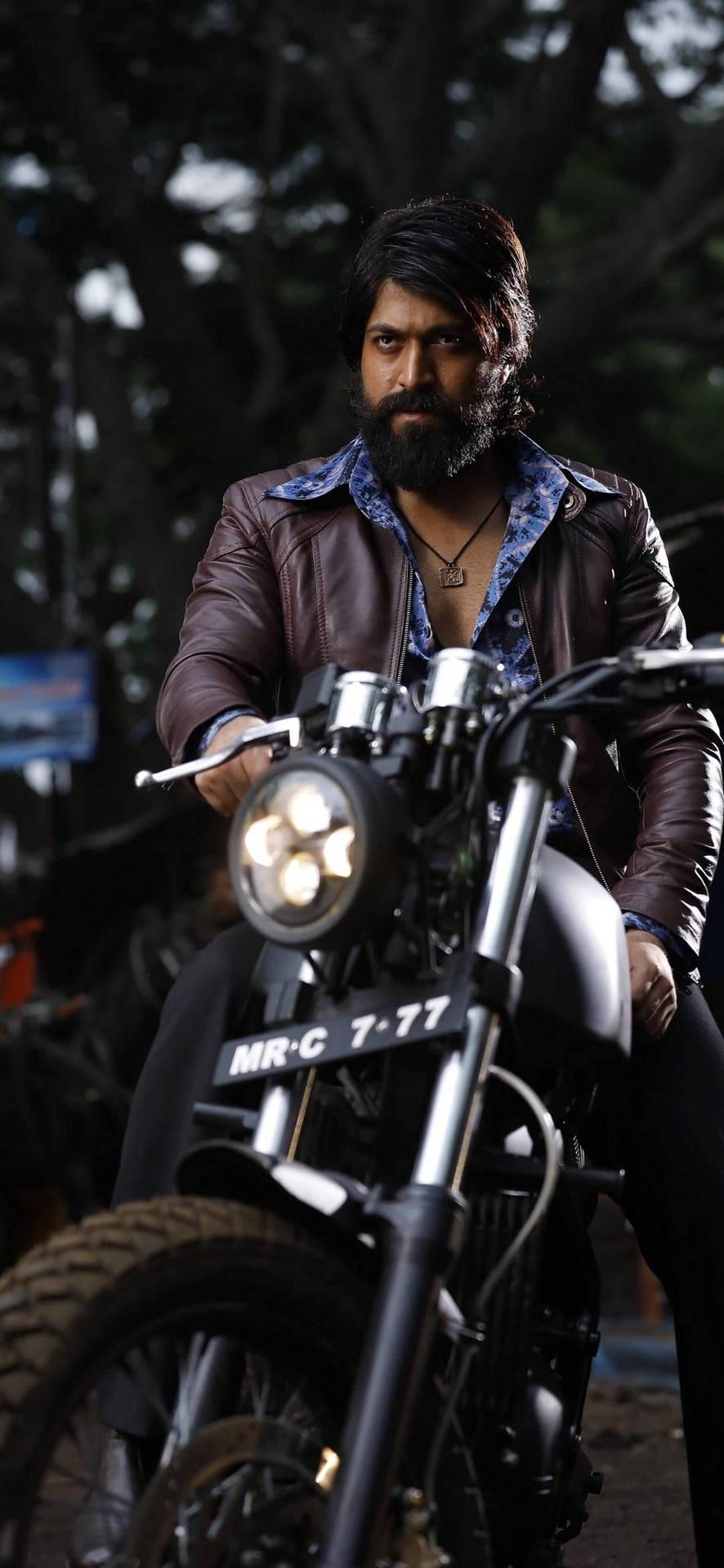
Real-World Examples of Effective hero Images
When it comes to captivating an audience, a hero image can be the key to making a strong first impression. Let’s dive into some real-world examples that showcase the power of effective hero images.
1. airbnb
Airbnb’s homepage features breathtaking images of unique accommodations.Their hero image effortlessly communicates the idea of adventure and exploration.using vibrant colors and captivating visuals, they inspire users to imagine their next getaway.
2.Apple
Apple’s website often showcases their latest products with sleek hero images that emphasize design and functionality. For example, the launch of the iPhone features stunning visuals that highlight the device’s features while maintaining a clean aesthetic. The minimalist approach ensures that the product is the focal point.
3.National Geographic
National Geographic uses powerful imagery that captures the essence of nature and wildlife. Their hero images are frequently enough dramatic and thought-provoking, inviting users to explore their content further. by using high-quality visuals, they evoke emotions and promote a sense of wonder.
4. Nike
Nike’s use of athlete-focused hero images is a great example of motivation in action. Their campaigns often feature dynamic photographs that convey movement and energy. This visual storytelling connects with their audience and encourages them to push their limits.
5. Shopify
Shopify effectively employs hero images that reflect successful businesses using their platform. By showcasing real shops and entrepreneurs,they build trust and inspire potential customers. The visuals combined with concise messaging create a compelling narrative that resonates with budding business owners.
Table of Key Elements in Effective Hero Images
| Brand | Hero Image Style | Key Element |
|---|---|---|
| Airbnb | breathtaking Landscapes | inspiration for Adventure |
| Apple | Sleek Product Showcase | Minimalist Design |
| National Geographic | Dramatic Nature Shots | Emotional Connection |
| Nike | Dynamic Athlete Imagery | Motivation and Energy |
| Shopify | Entrepreneurial Success Stories | Building Trust |
Final Thoughts on Maximizing the Impact of Your hero Images
When it comes to hero images,the key to success lies in understanding how to leverage their power effectively.A hero image is more than just a visual; it’s the first impression that can captivate your audience and guide them through their journey on your site. To maximize its impact, consider these essential strategies:
- Choose the Right Size: Different platforms and devices require specific image dimensions. by optimizing for various screen sizes, you ensure your hero image looks stunning whether viewed on a desktop, tablet, or smartphone.
- Focus on Quality: High-resolution images are a must. They convey professionalism and enhance user trust. Avoid pixelation and blurriness at all costs.
- Think About Composition: A well-composed image draws the eye. Use the rule of thirds and ensure that the most critical elements are aligned in an engaging manner.
- Incorporate Text Wisely: If you add text to your hero image, make sure it’s legible. Choose contrasting colors and fonts that reflect your brand’s personality.
- Test for Load Speed: While high-quality images are critically important, they shouldn’t slow down your website. Optimize file sizes without sacrificing quality for a seamless user experience.
Another vital aspect is ensuring your hero image aligns with your brand’s message.The visuals you select should resonate with your audience’s emotions and expectations. A powerful image can evoke curiosity and prompt visitors to explore further, creating a deeper connection with your content.
| Device | recommended size (px) |
|---|---|
| Desktop | 1920 x 1080 |
| Tablet | 1280 x 800 |
| Mobile | 720 x 1280 |
Remember, the ultimate goal is to create a seamless experience that encourages action. Whether it’s signing up for a newsletter or making a purchase, your hero image should act as a gateway to conversion.Regularly review and update your images to keep them fresh and aligned with your evolving brand narrative.
Frequently Asked Questions (FAQ)
Q&A: Every Hero Image Size You Need to Know
Q: What exactly is a hero image?
A: great question! A hero image is that large, eye-catching visual you often see at the top of a webpage. It’s designed to grab visitors’ attention and convey a strong message about what the site or brand is all about. Think of it as the digital equivalent of a billboard!
Q: Why is the size of a hero image so critically important?
A: size matters in the digital world! A well-optimized hero image can significantly enhance user experience. If the image is too large, it might slow down your site and frustrate visitors. On the other hand, if it’s too small, it can look unprofessional and fail to engage your audience. Finding that sweet spot is crucial for making a great first impression!
Q: what size should I use for a hero image on my website?
A: It depends on your website’s layout and design, but a common size is around 1920 x 1080 pixels for a full-width hero image. This dimension is perfect for most screens and ensures your image looks sharp on both desktops and larger devices. Though, it’s always an excellent idea to check responsiveness to maintain that stunning look on mobile devices, too!
Q: Are there different hero image sizes for different platforms?
A: Absolutely! Each platform has its own recommended sizes. For example, a hero image on a WordPress site might differ from one on Shopify. It’s essential to research and find the ideal sizes for the platforms you’re using. this way, you ensure that your images look fantastic wherever they’re displayed!
Q: what file formats should I use for hero images?
A: The most common file formats are JPEG, PNG, and, increasingly, WebP. JPEGs are great for photographs because they balance quality and file size well. PNGs are perfect for images with text or logos as they maintain sharpness. WebP is a newer format that offers superior compression,allowing for smaller file sizes without sacrificing quality—definitely worth considering!
Q: How can I ensure my hero images load quickly?
A: Optimizing your images is key! Use tools like TinyPNG or ImageOptim to compress your images without losing quality. Additionally, consider using lazy loading techniques so that images load only when they’re in the viewport. This not only speeds up your site but also enhances user experience!
Q: Do hero images really impact conversion rates?
A: Yes, they do! A compelling hero image can significantly influence your visitors’ emotions and decisions. It sets the tone and can guide them towards taking action—be it signing up for a newsletter, making a purchase, or exploring more of your site. Invest in high-quality visuals that align with your brand, and watch those conversion rates climb!
Q: Any final tips for selecting the perfect hero image?
A: Definitely! Always keep your target audience in mind when selecting an image. Choose visuals that resonate with them and reflect your brand’s message. Also, don’t be afraid to test different images to see which performs best. A/B testing can provide invaluable insights into what truly captivates your visitors. Remember,the right hero image can be a game-changer for your website!
Hope this Q&A helps you understand the ins and outs of hero images and why they’re essential for your website’s success! Happy designing!
In Summary
And there you have it! By now,you should have a solid understanding of the various hero image sizes you need to know to make your website shine. Choosing the right dimensions not only enhances your site’s aesthetics but also boosts user engagement and ensures a seamless experience across devices.
Remember, an impactful hero image can be the difference between a visitor staying on your site or clicking away. So take the time to implement these size guidelines and watch your online presence transform!
Whether you’re revamping your existing site or starting from scratch, don’t underestimate the power of a well-optimized hero image. So go ahead, grab your design software, and let your creativity flow! Your audience is waiting to be wowed.Happy designing!

