

Introduction
navigating a website should feel like a leisurely stroll through a well-organized store—smooth, intuitive, and free of frustration.Yet, how frequently enough have you found yourself lost in a digital maze, clicking aimlessly and wondering if you’ll ever find what you’re looking for? The truth is, great website navigation can make or break a user’s experience. It’s not just about aesthetics; it’s about functionality,clarity,and,ultimately,conversion.
in this article, we’ll explore 10 essential website navigation design tips that can elevate your site from mediocre to majestic. These proven strategies will help streamline user experience, direct traffic where it matters most, and keep visitors coming back for more. But we won’t stop there—in addition to the tips you should embrace, we’ll also highlight 5 navigation pitfalls to avoid at all costs. By steering clear of these common mistakes, you’ll ensure that your website remains a welcoming space for users, not an obstacle course. So, if you’re ready to transform your site and improve user satisfaction, let’s dive in!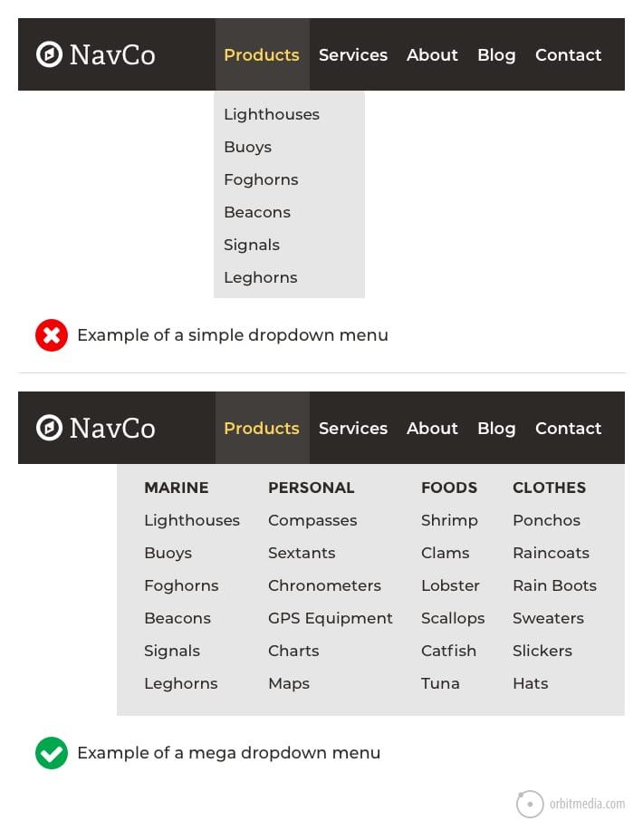
Understanding the Importance of Effective Website Navigation
Effective website navigation is crucial to providing a positive user experience. When users land on your website, they should be able to find what they’re looking for quickly and effortlessly. Poor navigation can lead to frustration and ultimately cause visitors to leave your site, which is why understanding its importance cannot be overstated. A well-structured navigation system enhances usability and encourages users to explore more of what your site has to offer.
Clear Hierarchy is foundational for good navigation. Organizing your content into categories and subcategories helps users understand the structure of your website. By using a logical hierarchy, you can guide visitors from broad topics down to specific content, making their journey through your site intuitive. Consider using drop-down menus for subcategories to keep your navigation clean and uncluttered.
Another key aspect is Consistent Labeling. Make sure the terms you use in your navigation are familiar to your audience. Avoid jargon or overly creative labels that may confuse visitors. consistency in labeling not onyl improves usability but also reinforces the overall branding of your site. This familiarity builds trust and encourages users to engage further with your content.
don’t underestimate the power of Visual Cues. Utilizing icons, colors, and hover effects can enhance the navigation experience. These elements can draw attention to key areas, making it easier for users to identify where they are and where they can go next. Just remember to keep the design simple and not overwhelm visitors with too many visual elements.
Lastly, consider implementing a Search Functionality as part of your navigation. Even with the best navigation design, users may still struggle to find specific information. A search bar allows users to directly input their queries,increasing the likelihood of them finding exactly what they need,thereby improving their overall experience on your site.
| Aspect of Navigation | Importance |
|---|---|
| Clear Hierarchy | Guides users intuitively through content |
| Consistent Labeling | Builds familiarity and trust |
| Visual Cues | Enhances user engagement through design |
| Search Functionality | direct access to desired content |
Crafting a User-friendly Navigation Menu
When it comes to creating a website that users can navigate with ease, the navigation menu is your first line of defense. Think of it as the map to your content, guiding visitors to their desired destinations. A well-crafted menu not only enhances user experience but also keeps visitors engaged longer. Here are a few essential tips to consider.
Simplicity is Key: Avoid cluttering your navigation with too many options. Aim for a clean, simple design that highlights the most important pages. Users should immediately recognize where they can find what they’re looking for.Limit your main menu items to between five and seven, ensuring that each one serves a clear purpose.
- Use Descriptive Labels: Clear and concise labels help users understand what they can expect when they click a link.
- Prioritize Important Pages: Place the most visited pages at the beginning of your navigation. This could include your homepage, services, or contact information.
- Incorporate Drop-Down Menus Wisely: If you have subcategories,consider using drop-down menus for a cleaner look. Just ensure they don’t become overwhelming.
Consistency Matters: Maintain a consistent navigation menu throughout your site. This helps users develop a mental map of your website,making it easier for them to find their way around. Use the same layout, colors, and fonts across all pages to create a cohesive experience.
Responsive Design is Essential: With users accessing websites on various devices, a responsive navigation menu is crucial. Ensure your menu adapts seamlessly to different screen sizes. This often involves creating a mobile-friendly version, such as a hamburger menu, which keeps your design clean while still providing access to all important links.
| Tip | Benefit |
|---|---|
| Use Clear Labels | Enhances user understanding |
| Prioritize Links | Increases engagement with key pages |
| Keep It Simple | Reduces user frustration |
| Responsive Menu | Improves mobile user experience |
Test and Iterate: don’t forget to test your navigation. Use tools like heatmaps or user session recordings to see how visitors are interacting with your menu.Gather feedback and make necessary adjustments. Continuous advancement ensures that your navigation remains user-friendly as your content evolves.
Prioritizing Clarity: Why Labels Matter
When it comes to website navigation, labels play a critical role in guiding users through their online experience. Clear and intuitive labels act as signposts, allowing visitors to find what they’re looking for without frustration. Imagine entering a new city without street signs; the same confusion can occur on a website that lacks well-defined navigation labels.
Using precise and recognizable terms not only enhances user experience but also builds trust. Visitors are more likely to engage with a site that clearly communicates where to go and what to expect. Here are some essential considerations for crafting effective navigation labels:
- Be Descriptive: use labels that accurately describe the content. As an example, instead of using generic terms like “Products”, specify “Men’s Clothing” or “Outdoor gear”.
- Keep It Simple: Avoid jargon or overly elaborate phrases.Users should feel confident in what they’re clicking.
- limit the Word Count: Aim for brevity. One to three words are often enough to convey the message.
- Prioritize Consistency: Ensure that similar categories use uniform language; this helps in creating a predictable navigation experience.
Another key aspect of navigation labels is their visual hierarchy. Users scan pages quickly, so it’s vital to make important labels stand out. Use CSS styles to increase the font size or employ contrasting colors for primary navigation items.This not only draws attention but also enhances usability.
| Effective Labeling Strategy | example |
|---|---|
| Descriptive Labels | “Blog” rather of “Updates” |
| Action-Oriented Language | “Get Started” rather than “Information” |
| Clear Hierarchies | “Support” under “Customer Service” |
ultimately, the goal is to create a seamless journey for your users. By prioritizing clarity through effective labeling,you not only enhance navigation but also improve the overall satisfaction of your visitors. Remember, a well-labeled site isn’t just user-friendly; it reflects professionalism and attention to detail that audiences appreciate.
The Power of Consistency in Navigation Design
When designing a website, one of the most critical aspects to focus on is consistency in navigation. The way users interact with your site should be seamless, guiding them effortlessly through their journey. Consistency in navigation design ensures that users can predict where to find information, thereby enhancing their overall experience.
Imagine visiting a site where the menu layout changes on every page.Users would feel lost and frustrated, likely abandoning their search. To prevent this disorientation,it’s essential to maintain a uniform navigation structure throughout your site. This means using the same menu labels, button styles, and layout across all pages. Such predictability not only increases usability but also builds trust with your audience.
Furthermore, consistent navigation design can substantially improve your site’s accessibility. When users know exactly where to look for information, they can navigate more efficiently, which is especially beneficial for those with disabilities. By adhering to familiar patterns and standard conventions, you create an inclusive habitat that caters to all users.
Consider the following best practices for maintaining consistency in your navigation design:
- Use a fixed navigation bar: This keeps important links accessible no matter where users are on your site.
- Maintain uniform page hierarchy: Ensure that your main categories remain the same across all pages to prevent confusion.
- Limit the number of menu items: Too many options can overwhelm users. Aim for a clean, focused set of links.
| Best Practices | Description |
|---|---|
| clear Labels | Use straightforward terms that accurately describe the content users will find. |
| Consistent Style | All buttons and links should look and function the same across your site. |
| Predictable Flow | Design your navigation so that users can anticipate where links will lead. |
Incorporating these elements into your navigation design will not only enhance user experience but also lead to higher engagement and retention rates. Remember, the goal is to create a space where users feel cozy exploring, finding what they need without unnecessary hurdles. A consistent navigation design is a powerful tool in achieving that goal.
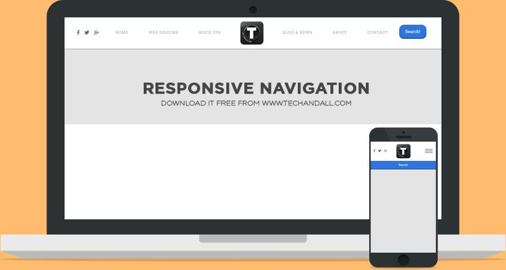
Creating a Responsive Navigation for All Devices
In the era of mobile browsing, creating a responsive navigation system is crucial for enhancing user experience across all devices. A well-structured navigation not only guides users through your site but also keeps them engaged, reducing bounce rates and increasing conversions.
To achieve a seamless navigation experience, consider implementing the following strategies:
- Simplified Menu Structure: Keep your menu concise.Limit the number of top-level items to 5-7, making it easy for users to quickly find what they need.
- Hamburger Icons: for mobile devices, utilize hamburger icons to condense your navigation. This allows for a clean interface while still providing access to all necessary links.
- Sticky Navigation: Make your navigation bar sticky so that it remains visible as users scroll down the page. This ensures that essential links are always within reach.
- Touch-Friendly Design: Ensure that buttons and links are large enough for users to tap without difficulty. Aim for a minimum touch target size of 44×44 pixels.
- Prioritize Important Links: Highlight the most critical links.Use visual cues like color,size,or bold fonts to draw attention to these elements.
Another essential aspect is testing your navigation across different devices and screen sizes. Make use of browser developer tools to simulate various environments. This ensures that your navigation adapts appropriately and provides the same level of functionality on desktops, tablets, and smartphones.
when designing your navigation, keep accessibility in mind. Implement keyboard navigation and ensure that screen readers can correctly interpret your menu items. This inclusivity not only broadens your audience but also improves SEO and overall site performance.
| Device Type | Navigation Style | Key Feature |
|---|---|---|
| Desktop | Horizontal Menu | Dropdowns for Subcategories |
| Tablet | Collapsible Menu | Side Navigation panel |
| Mobile | Hamburger Menu | Swipe Gesture for Easy Navigation |
Lastly,don’t forget to analyze user behavior. Utilize tools like Google Analytics to track navigation patterns. Understanding how users interact with your navigation can guide future adjustments, making your website even more user-friendly.
Utilizing Visual Cues to Enhance Navigation
Visual cues play a pivotal role in guiding users through your website, making navigation not only intuitive but also enjoyable.By incorporating strategic design elements, you can create a seamless experience that encourages visitors to explore further. Here are some effective strategies to harness visual cues for better navigation:
- Use Color Contrast: High contrast between text and background enhances readability and draws attention to key navigation elements.Consider using your brand colors to maintain consistency while ensuring visibility.
- Incorporate Icons: Icons can convey meaning quickly and efficiently. Using universally recognized symbols next to menu items can help users navigate without having to read every label.
- Implement Hover Effects: Subtle animations or color changes when users hover over buttons or links provide immediate feedback, indicating that the element is interactive. This encourages exploration and reduces uncertainty.
- Establish a Clear Hierarchy: The arrangement of elements on your site should reflect their importance. Use size, color, and spacing to create a visual hierarchy that directs users’ attention to primary navigation options first.
In addition to the basic elements, consider the following advanced strategies:
- Breadcrumbs: These not only help users understand their location within your site but also allow them to navigate back seamlessly. Breadcrumbs should be clearly styled and positioned to remain prominent as users scroll.
- Visual Grouping: Group related navigation items together using borders, background colors, or whitespace. This method helps in organizing content, making it easier for users to find what they need.
- Call-to-Action Buttons: Use bold colors and distinct shapes for CTAs to make them stand out.This drives users towards desired actions, such as signing up or making a purchase.
Here’s a simple table to illustrate effective color contrasts for navigation elements:
| Element | Background Color | Text Color |
|---|---|---|
| Main Menu | #0073AA | #FFFFFF |
| Submenu | #F1F1F1 | #333333 |
| Button | #FF5722 | #FFFFFF |
By thoughtfully implementing these visual cues, you can significantly enhance the navigational experience on your website. The key is to balance aesthetics with functionality, ensuring that every design choice serves a purpose while contributing to an engaging user journey.

Exploring the Benefits of Breadcrumbs for User Experience
When it comes to enhancing overall user experience on a website, breadcrumbs stand out as a subtle yet powerful navigation tool. They not only assist users in understanding their current location within a website’s hierarchy but also offer a clear path back to previous sections. Picture this: a user lands on a complex e-commerce site and wants to explore subcategories of products. With breadcrumbs, they can easily navigate back to parent categories without hitting the back button multiple times.
Implementing breadcrumbs can significantly contribute to reducing bounce rates. When users can see the path they’ve taken, it encourages them to explore further instead of opting out of their visit. By reinforcing a sense of orientation, breadcrumbs cultivate a more engaging browsing experience.They act as a visual cue,reminding users that they are in control of their navigation and can access any part of the site effortlessly.
Another compelling reason to incorporate breadcrumbs is their ability to enhance SEO performance. Search engines favor websites that prioritize user experience, and breadcrumbs can play a crucial role in this aspect. They provide clear signals to search engines about the structure of your site, which can lead to better indexing. Moreover, breadcrumbs frequently enough appear in search engine results as rich snippets, enhancing visibility and click-through rates. This can be particularly beneficial for e-commerce websites that want to showcase product categories directly in search results.
When designing breadcrumbs, it’s essential to consider mobile responsiveness. A well-structured breadcrumb trail should be just as functional on small screens as it is on desktops.Using a compact design, such as a dropdown menu or inline links, ensures that mobile users can navigate seamlessly. Here’s a swift comparison table illustrating mobile-friendly breadcrumb designs:
| Design Type | Features | Ideal for |
|---|---|---|
| Inline Links | Simple, text-based links | Static websites |
| Dropdown Menu | Compact navigation with submenus | E-commerce sites |
| Icons with Text | Visual cues alongside text links | Interactive content |
Moreover, breadcrumbs can also serve as a branding chance. By customizing the visual design of breadcrumbs to match your brand’s aesthetic, you can create a cohesive experience that reinforces brand identity. Whether it’s through unique fonts, colors, or hover effects, breadcrumbs can be seamlessly integrated into your overall design strategy while still maintaining their functional purpose.
incorporating breadcrumbs into your website’s navigation system is more than just a design choice; it’s a strategic decision that can significantly enhance user experience, improve SEO, and bolster your brand image. By prioritizing this feature, you empower users to explore your website with confidence and ease, ultimately driving engagement and conversion rates. So why not take advantage of this simple yet effective navigation aid?

Avoiding Overcomplicated menus That Confuse Users
When it comes to website navigation, simplicity is the name of the game. Overcomplicated menus can leave users feeling overwhelmed and frustrated, leading to increased bounce rates and missed opportunities. A streamlined navigation structure enhances user experience and keeps visitors engaged. Here are some key strategies to avoid creating menus that confuse your users:
- Limit Menu Items: Aim for a maximum of seven main menu items. This helps users easily digest the information and reduces cognitive load.
- Use Clear Labels: Menu labels should be intuitive. Instead of jargon or technical terms, opt for language that resonates with your audience.
- Prioritize Content: Place the most important items at the beginning of the menu or highlight them in some way. Users often skim menus, so make it easy for them to find what they’re looking for.
Another effective approach is to group related items together. This not only aids in association but also helps users navigate more efficiently. for instance, if your website features products, consider categorizing them into broader groups like “Men’s,” “Women’s,” and “Accessories.” This hierarchical structure acts as a signpost, guiding users through their journey on your site.
| Complex Menu Structure | simplified Menu Structure |
|---|---|
| Home | About Us | Services | Blog | Contact | FAQ | Testimonials | Home | Services | Blog | Contact |
| Products > Electronics > Mobile phones > latest Models | Products > Mobile Phones |
Don’t underestimate the power of visual hierarchy in your menus. Use font size, bold text, and color to draw attention to key links. Such as, a larger font size for primary sections, coupled with a contrasting color for call-to-action buttons, can significantly improve user interaction. Remember, menus are not just about function; they’re also about aesthetics.
Lastly, consider mobile users.As more people access the web from their smartphones, it’s crucial that your navigation is mobile-friendly. A responsive design that condenses menu items into a simple hamburger icon can enhance usability on smaller screens. Always test your menu across different devices to ensure it remains functional and user-friendly.
keeping your navigation menu straightforward is essential for user satisfaction. By focusing on clarity, organization, visual appeal, and mobile usability, you can create a seamless experience that encourages users to explore your website instead of leaving in confusion.

The Pitfalls of Hidden Navigation Elements
When it comes to website design, hidden navigation elements can be a double-edged sword. While they may seem like a clever way to declutter your interface or create a sleek design, they can lead to significant user experience issues. It’s important to remember that users value convenience and clarity above all else when browsing a website.
Here are some notable pitfalls associated with hidden navigation elements:
- Increased User frustration: Users expect to find navigation easily. When they can’t locate menu options, they may feel frustrated and leave your site. This leads to higher bounce rates and potential loss of business.
- Poor Accessibility: Hidden navigation can create barriers for individuals with disabilities. screen readers may struggle to interpret hidden menus, making it challenging for visually impaired users to navigate your site.
- Mobile Usability Issues: While hidden menus are often used on mobile sites to save screen space, they can sometimes be counterproductive. Users might not realize there’s more content available, leading to missed opportunities for engagement.
- SEO Challenges: Search engines rely on accessible navigation to index your content effectively. If your navigation is hidden, it might not be crawled properly, resulting in lower visibility for your site.
To illustrate the impact of hidden navigation,consider the following table that compares user engagement metrics for sites with visible navigation versus those with hidden menus:
| Website Type | Bounce Rate (%) | Average Session Duration (min) | Conversion Rate (%) |
|---|---|---|---|
| Visible Navigation | 40 | 4.5 | 5 |
| Hidden Navigation | 65 | 2.0 | 2 |
As this table shows, the differences in user engagement are striking. Websites that prioritize visible navigation not only retain users longer but also convert them at a higher rate. It’s a clear indicator that the accessibility of your navigation directly impacts the success of your site.
The key takeaway? While simplified designs may appeal to aesthetics, prioritizing user experience through clear and accessible navigation should always be the ultimate goal. by ensuring your navigation is straightforward and visible, you set the stage for a more enjoyable browsing experience that keeps users coming back for more.
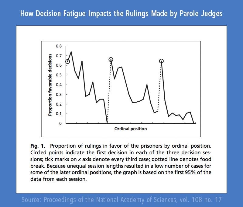
Why too Many Options can Lead to Decision Fatigue
In our fast-paced digital world, users are constantly bombarded with choices. While options can create a sense of freedom and personalization, they can also lead to an overwhelming experience that ultimately results in decision fatigue.This phenomenon occurs when an individual feels mentally drained from making too many decisions, which can diminish their ability to make further choices or lead to suboptimal decisions.
Imagine visiting a website with an extensive menu that boasts dozens of categories and links. Initially,it might seem appealing,but as a user scrolls through endless options,frustration can quickly set in. This feeling often leads to hurried decisions, where users might abandon their original intent or settle for a less satisfying choice simply to escape the pressure of choosing.
To mitigate the risk of decision fatigue, consider implementing a more streamlined navigation design.Here are some strategies:
- Limit Choices: Aim for a smaller, more curated selection of options. This can help users focus on what truly matters without feeling overwhelmed.
- Use Clear Labels: ensure that menu items are labeled clearly to guide users intuitively through their choices.
- Group Similar Items: Organizing related options together allows users to navigate more efficiently,reducing the cognitive load of decision-making.
Another effective approach is to provide users with visual cues or filters to help them narrow down their options. For example,a filtering system can allow users to select preferences based on categories like price,features,or popularity. This not only enhances user experience but also fosters a sense of control that counters decision fatigue.
Moreover, consider the power of defaults. People often stick with pre-selected options when faced with numerous choices. By thoughtfully designing default settings that reflect common user preferences, you can guide users toward suitable options without overwhelming them.
Lastly, be mindful of the overall layout and design of your website. An aesthetically pleasing and organized interface can make a significant difference in how users perceive their choices. A cluttered design can exacerbate feelings of anxiety and confusion, while a clean, straightforward layout promotes ease of navigation and decision-making.
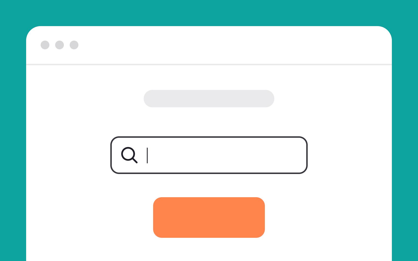
Mastering the Art of Search Functionality
Search functionality is often the unsung hero of website navigation. When implemented thoughtfully, it acts as a powerful tool that enhances user experience and encourages deeper engagement with your content. To truly master the art of search, you need to focus on a few key elements that can make or break the effectiveness of your site’s search feature.
Prioritize Visibility: Ensure your search bar is easy to find. Place it prominently on your homepage and throughout your site. Consider using a contrasting color or bold design to draw attention. Users should see it as soon as they land on your page, ideally at the top right or centre, where their eyes naturally gravitate.
Implement Autocomplete Suggestions: As users begin typing, providing suggestions can significantly enhance their experience. This feature not only saves time but also helps users refine their searches. Use predictive text that includes titles, tags, and popular queries related to your content.
Refine your Search Algorithm: A powerful search bar is only as good as the algorithm behind it. Ensure your search function returns relevant results by prioritizing keywords, content type, and recency.Performing regular audits and updates to your search algorithm can keep your results fresh and pertinent.
Include Filters and sorting Options: Allow users to narrow down results by categories, date, or relevance. This can be especially beneficial in sites with extensive content. A well-structured filter interface can help users find what they’re looking for without feeling overwhelmed.
| Feature | Benefit |
|---|---|
| Search Bar Visibility | Instant access to search functionality |
| Autocomplete Suggestions | Faster and more accurate searches |
| Refined Search Algorithm | Relevant and timely results |
| Filters and Sorting | Enhanced user control and experience |
Mobile Optimization is Key: In an age where mobile browsing is predominant, ensure your search functionality is optimized for smaller screens. A responsive design will improve usability and accessibility, allowing users to search effortlessly, irrespective of the device they are using.
Lastly,don’t forget to analyze user behavior. Utilize analytics tools to monitor how users interact with your search function. This data can provide valuable insights into what’s working and what isn’t,allowing you to make informed adjustments. Remember, a well-designed search feature doesn’t just serve content; it connects users with their desired information seamlessly.
Staying Updated: Regularly Reviewing Your Navigation Design
In the fast-paced world of web design, staying updated is crucial for maintaining an effective navigation system on your website.Regularly reviewing your navigation design allows you to adapt to changes in user behavior,keep up with emerging trends,and ensure that your website remains user-friendly. here are some key points to consider during this process:
- User Feedback: Collect feedback from your users to understand their navigation experience.Utilize surveys, polls, or direct questions to gather insights about what works and what doesn’t.
- analytics Review: Dive into your analytics to see how users interact with your navigation. Identify pages with high bounce rates or low engagement to pinpoint areas needing improvement.
- Trend Monitoring: Keep an eye on design trends within your industry. Navigation styles evolve, and what was once effective may become outdated. Stay inspired by browsing competitor websites or popular design galleries.
- Mobile Responsiveness: As mobile usage continues to rise, ensure that your navigation works seamlessly across all devices. Regularly test your navigation on various screen sizes and resolutions to maintain a consistent user experience.
Another critical aspect of reviewing your navigation design is to assess functionality. It’s important to routinely check for broken links, outdated content, or any elements that may hinder usability. A simple audit can help you identify:
| Element | Status | Action Required |
|---|---|---|
| Menus | Functional | Update with new categories |
| Search Bar | Unresponsive | Reconfigure or redesign |
| Breadcrumbs | Missing | Add for improved navigation |
By approaching your navigation design with a mindset of continuous improvement,you not only enhance user satisfaction but also boost engagement and conversion rates. A well-maintained navigation system reflects a commitment to your users, making their journey through your website smoother and more enjoyable.
set a schedule for regular reviews—whether it’s quarterly or bi-annually—and stick to it. This proactive approach will ensure that you stay ahead of the curve and maintain a navigation design that meets the evolving needs of your audience.
Frequently Asked Questions (FAQ)
Q&A: 10 Required Website Navigation design Tips + 5 to Avoid
Q1: Why is website navigation so important for user experience?
A1: Great question! Website navigation is like the roadmap for your site. If it’s clear and intuitive, users can easily find what they’re looking for, leading to a better experience. If it’s confusing or cluttered, visitors may leave out of frustration. So, solid navigation not only keeps users engaged but can also boost conversions!
Q2: What’s the first tip for effective website navigation?
A2: Start with a clear structure! Your main navigation should reflect the hierarchy of your content. Think categories and subcategories. A well-organized layout helps users understand where they are and what they can find.
Q3: Should I consider mobile users in my navigation design?
A3: absolutely! With more people browsing on their phones, responsive design is a must. Make sure your navigation adapts smoothly to smaller screens. This means larger buttons, simplified menus, and easy-to-tap links. Mobile optimization can significantly enhance user satisfaction.
Q4: How can I make my navigation more user-friendly?
A4: Use descriptive labels! Avoid jargon and stick to clear, actionable words. Instead of “Products,” try “Shop Now.” This tells users exactly what to expect, making their journey easier and more enjoyable.
Q5: What’s a common mistake to avoid in website navigation?
A5: Overcomplicating your menu is a big no-no. If your navigation has too many options, users can get overwhelmed. Stick to a few key categories and avoid deep nesting. Simplicity is key!
Q6: What about search functionality? Should I include that?
A6: Definitely! A search bar is a handy tool for users, especially on content-rich sites. Make sure it’s easy to find and functional, so users can quickly locate specific information without having to navigate through multiple pages.
Q7: Do visuals play a role in navigation design?
A7: Yes! Visual cues like icons can enhance navigation. Though, use them sparingly and ensure they are intuitive. Too many graphics can clutter your menu and confuse users. Balance is vital!
Q8: How can I test if my navigation is effective?
A8: User testing is fantastic for this! Gather some real users to navigate your site and watch where they struggle. Feedback from actual users provides valuable insights into what works and what doesn’t.You might be surprised by what you learn!
Q9: Are there any specific design styles to avoid?
A9: Yes! Avoid using “hidden” navigation (like hamburger menus on desktop sites) — it can frustrate users. Also, steer clear of using too many fonts or colors, which can distract from your navigation’s purpose. Consistency is key!
Q10: what’s the takeaway for website navigation design?
A10: Keep it simple, user-centered, and visually appealing! Following these 10 required design tips and avoiding the five common pitfalls will not only improve your site’s usability but also enhance overall user satisfaction. Remember, a well-designed navigation can be the difference between a happy visitor and a lost opportunity. Happy designing!
In Retrospect
And there you have it! We’ve explored the essential elements of effective website navigation and highlighted the pitfalls you definitely want to avoid. Remember, your website is often the first impression potential customers get of your brand, so making navigation intuitive and user-friendly is crucial.
By implementing these 10 required tips,you’ll not only enhance the user experience but also boost engagement and conversions. After all, when users can find what they need easily, they’re more likely to stick around and explore all that you have to offer.
On the flip side, steering clear of those five navigation missteps will save you from frustrating your visitors and losing valuable traffic.
So, take a moment to review your current navigation design. Are there areas for improvement? Don’t hesitate to make changes—every little tweak can lead to a significant impact on your site’s success.With a thoughtful approach to your website navigation, you’ll be well on your way to creating a seamless experience that keeps users coming back for more. Happy designing!
