Are you ready to elevate yoru WordPress site to the next level? If you’ve been feeling a bit overwhelmed by the endless customization options available, you’re not alone! The WordPress Customizer can seem like a labyrinth at first glance, but once you get the hang of it, it’s an incredibly powerful tool for bringing your unique vision to life. In this complete guide, we’ll walk you through the ins and outs of the Customizer—demystifying its features and showing you how to make your website not only visually stunning but also uniquely yours. Whether you’re a blogger, a business owner, or just someone who loves to tinker with design, this article will empower you to take full control of your site’s appearance. So,grab your favorite beverage,get cozy,and let’s dive into the world of WordPress customization together!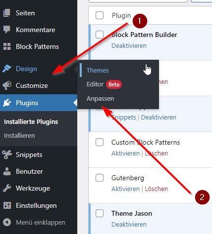
Understanding the WordPress Customizer and Its Importance
The WordPress Customizer is a powerful tool that allows users to make real-time changes to their website’s appearance and settings. This intuitive interface is not just a design tool; it’s a gateway to tailoring the look and feel of your site without needing to dive into complex coding. by using this feature, you can see how changes will look instantly, which makes the design process much more efficient and enjoyable.
One of the most significant advantages of the Customizer is its user-pleasant nature. It enables even non-technical users to modify their website with ease. Here are some of the key components you can adjust:
- Site Identity: Change your site title, tagline, and logo to reflect your brand.
- Colors: Customize the color scheme of your site, from backgrounds to text colors.
- Menus: Create and manage your navigation menus effortlessly.
- Widgets: Add or remove widgets in your sidebars and footer areas.
- Homepage Settings: Define what your homepage displays, whether it’s your latest posts or a static page.
The Customizer also supports a variety of themes and plugins that add even more functionality. Many themes come with additional options in the Customizer, allowing you to tweak layouts, fonts, and other aesthetic elements. Furthermore, plugins like WooCommerce integrate seamlessly, enabling online store owners to customize their shop’s appearance directly from the Customizer.
Another critical aspect of the Customizer is its ability to preview changes before they go live. This feature is invaluable for those who wont to ensure the aesthetic consistency of their website. The live preview functionality allows you to experiment freely, so you can try different colors, fonts, and layouts without the fear of making irreversible changes. Once you’re happy with the new look, it’s just a click away to publish the edits.
| Feature | Description |
|---|---|
| Live Preview | See changes in real-time before saving. |
| custom CSS | Add custom styles to personalize your theme. |
| Accessibility | User-friendly interface for all skill levels. |
utilizing the WordPress Customizer is essential for creating a unique online presence. It empowers users by making customization accessible and straightforward, ensuring that your website not only looks great but also aligns perfectly with your brand identity.

Navigating the Customizer Interface with ease
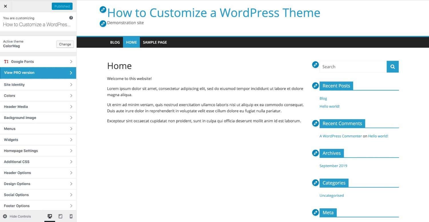
Getting acquainted with the Customizer interface is your gateway to unleashing the full potential of your WordPress website. The Customizer provides a user-friendly environment where you can modify various aspects of your site, giving it a personalized touch without needing to write a single line of code.Here’s how to make the most of this intuitive tool.
When you enter the Customizer, you’ll find a sidebar filled with options. Each section represents different areas of your site that you can customize. Let’s break down some of the main components:
- Site identity: Here, you can upload your logo, set your site title, and add a tagline. This is the first step in branding your site.
- Colors: Adjust your color scheme to match your brand identity. Choose primary and secondary colors that reflect your style.
- Header Image: Use this section to upload a captivating header image that draws visitors in and sets the tone for your site.
- Menus: Create and manage your site’s navigation menus.This is essential for enhancing user experience.
- Widgets: Add or remove widgets in your sidebar, footer, or other widgetized areas to add functionality and enhance the layout.
As you navigate through the options, you’ll notice a live preview of your site on the right side of the Customizer. This is one of the most powerful features,allowing you to see changes in real time before publishing them. You can switch between different device views (desktop, tablet, mobile) to ensure your design is responsive and user-friendly.
Another fantastic aspect of the Customizer is its ability to handle multiple themes seamlessly.you can switch between themes and see how they look with your existing content.This feature empowers you to experiment with different aesthetics without the commitment of activating a new theme right away.
| Feature | Description |
|---|---|
| Live Preview | See changes instantly as you make them. |
| Responsive Design | Check how your site looks on different devices. |
| Theme Switching | Try out new themes without making them live. |
| Accessibility Features | Customize for better accessibility options. |
Don’t forget to utilize the Publish button once you’re satisfied with your customizations. If you want to save changes for later, the save Draft option is your friend. This way, you can take your time to refine your design without losing any progress. Remember, the Customizer is not just about aesthetics; it’s about creating a seamless experience for your visitors.
Exploring Site Identity: Craft Your Brand’s First Impression
When it comes to establishing your brand’s online presence,the first impression is crucial. The WordPress Customizer is a powerful tool that allows you to shape how visitors perceive your website at first glance. By utilizing this feature, you can create an engaging and cohesive identity that resonates with your audience.
One of the first steps in the Customizer is to set your Site Title and Tagline. This is what visitors will see on your homepage and in search engine results. To make a lasting impression, ensure your site title reflects your brand accurately while the tagline captures the essence of what you offer. It should be catchy and informative—think of it as your brand’s elevator pitch.
Next, don’t overlook the importance of your Site Icon (also known as a favicon). This small image appears in the browser tab and is a key element of your brand identity. Choose an icon that is simple yet recognizable—whether it’s your logo or a unique symbol that represents your brand. This tiny detail can significantly enhance your site’s professionalism.
Every brand has a distinct color palette that conveys emotion and message. Use the Colors section in the Customizer to select hues that align with your brand’s personality. Consider the psychological impacts of colors, such as:
- Blue: Trust and reliability
- red: Passion and excitement
- Green: Growth and health
- Black: Luxury and sophistication
By consistently using your chosen colors across your site, you reinforce your brand identity and create a visually appealing environment for your visitors.
Typography is another area where the Customizer shines.The Fonts section allows you to select typefaces that enhance your website’s readability while reflecting your brand’s personality. whether you prefer classic serif fonts for a traditional feel or modern sans-serif for a clean look,make sure your choices are accessible and visually appealing across all devices.
Consider the layout and structure of your homepage as well. The Homepage Settings in the Customizer let you choose between displaying your latest posts or a static page. This decision can affect how visitors interact with your site. For instance,if your focus is on delivering content,a blog layout may be best. Alternatively, if you want to highlight a specific service or product, a static page can provide a more tailored experience.
| Customization Feature | Impact on Brand Identity |
|---|---|
| Site Title & Tagline | First impression, key messaging |
| site Icon | Recognition, professionalism |
| Color palette | Emotional connection, visual appeal |
| Typography | Readability, personality reflection |
| Homepage Layout | User engagement, focus on offerings |
always preview your changes before publishing. The Customizer allows you to see how your modifications will look in real time. Take this prospect to adjust and refine your settings until they align perfectly with your vision. Remember, creating a powerful brand identity is an ongoing process that reflects your unique story and values.
Tweaking Your Theme: Colors, Fonts, and Layouts Made Simple
When it comes to customizing your WordPress site, the Customizer is your best friend. This powerful tool allows you to adjust the look and feel of your website without needing to dive into any code. Start by accessing the Customizer through your dashboard: simply go to Appearance → Customize. From there, you can experiment with various elements such as colors, fonts, and layouts to create a cohesive brand identity.
One of the first areas you’ll want to explore is the colors. Choose a color palette that resonates with your brand. You’ll find options for:
- Background color – Set a strong foundation for your content.
- Text color – Ensure readability by selecting contrasting shades.
- Link color – Make sure your links stand out, guiding visitors seamlessly through your site.
Next up is the selection of fonts. Typography plays a crucial role in user engagement. The Customizer allows you to choose different fonts for headings and body text, ensuring you convey the right message.Consider the following:
- Font family – Select from Google Fonts or your theme’s predefined options.
- Font size – Adjust for readability across devices.
- font weight – Use bold and regular styles to create hierarchy in your text.
Layouts are another vital aspect of your site’s design. Depending on your theme, you may have various layout options available, such as:
- Sidebar position – Choose between left, right, or no sidebar at all.
- Header layout – Decide if you want a traditional header or a more modern, minimalist look.
- Content width – Control how wide your content appears on the screen for better readability.
| Element | Options |
|---|---|
| Colors | Background, Text, Links |
| Fonts | Font Family, Size, Weight |
| Layouts | Sidebar Position, Header, Content Width |
Remember, the key to a successful design is consistency. As you tweak thes elements, keep your overall branding in mind. Each adjustment you make in the Customizer can be previewed in real-time,so don’t hesitate to experiment until you find the perfect combination that reflects your brand’s personality. With just a few clicks, you can transform your site from ordinary to extraordinary!
Enhancing Your Site with Widgets: The Power of Customization
Widgets are more than just decorative elements on your website; they are powerful tools that can significantly enhance the functionality and user experience of your site. With the WordPress Customizer, you can easily add and customize widgets to suit your brand and audience. Let’s explore how you can harness this power to create a more engaging site.
To begin with, consider the various types of widgets available in WordPress. From social media feeds to recent posts, you can pick and choose widgets that align with your objectives. Here are some popular widget options to consider:
- text Widget: Perfect for adding custom HTML or plain text.
- Gallery Widget: Showcase your latest images in a visually appealing way.
- Social media Widget: connect your audience with your social profiles.
- Calendar Widget: Keep your visitors informed about upcoming events.
Customization is where the WordPress Customizer truly shines. You can easily drag and drop widgets into your desired sidebar or footer area, and make adjustments in real-time. This means you can see how changes affect your layout immediately, ensuring a seamless design process. Here’s how to get started:
- Navigate to Appearance > Widgets in your WordPress dashboard.
- Select the widget area you want to customize (e.g., Sidebar, Footer).
- Drag your chosen widget from the available widgets list into the selected area.
- Click on the widget to open customization options, adjust settings, and save your changes.
Moreover, to enhance user engagement, consider using widgets that encourage interaction. For example, a Newsletter Signup widget can definitely help grow your email list, while a Poll Widget can invite feedback from your audience. Here’s a quick comparison table of interactive widget options:
| Widget Type | Purpose | Benefits |
|---|---|---|
| Newsletter Signup | Capture emails | Builds audience, increases engagement |
| Poll Widget | Gather opinions | Boosts interaction, valuable insights |
| Testimonials | Showcase customer feedback | Builds trust, enhances credibility |
don’t forget to regularly review and update your widgets. As your site evolves, so should the elements you use to engage your audience. Regularly testing different layouts and widget combinations can provide insights into what resonates best with your visitors, helping you fine-tune your site for maximum impact.
Adding menus and Navigation for a seamless user Experience
In today’s fast-paced digital landscape, creating an intuitive navigation system is key to enhancing user experience on your WordPress site. The WordPress Customizer offers an array of tools that helps you set up menus that are not only functional but also visually appealing.Here’s how you can leverage this powerful feature to keep your visitors engaged.
Firstly, you can easily access the Menu settings through the Customizer.
- Navigate to Appearance in your WordPress dashboard.
- Click on Customize.
- Find the Menus section to start creating or editing your menus.
Once there, you can create a new menu by clicking Add a Menu. Be sure to give it a descriptive name that reflects its purpose, like Main Navigation or Footer links.
Next,you can add pages,posts,categories,or custom links to your menu. This flexibility means you can cater your navigation to suit the needs of your visitors.Here’s how to do it:
- Select Add Items to see a list of available content.
- Drag and drop items to organize them in your preferred order.
- Utilize Sub-menu options to create a hierarchical structure that enhances accessibility.
A well-structured menu is crucial for smooth navigation. Consider the following tips for optimal menu design:
| Tip | Description |
|---|---|
| Limit Menu Items | Keep it concise to avoid overwhelming users. |
| Use Clear Labels | Ensure labels accurately describe the content to avoid confusion. |
| Prioritize Vital Links | place the most important links at the top for easy access. |
Don’t forget about the visual aspect of your menus! The Customizer allows you to style your menus to match your brand. You can adjust:
- Font Size and Color to enhance readability.
- Background Color for visibility.
- Hover Effects to provide feedback when users interact with your links.
remember to test your navigation on various devices. Responsive design is crucial in today’s mobile-first world. The Customizer provides a live preview feature that allows you to see how your menus look on desktops, tablets, and smartphones. By following these steps, you’ll not only create a functional navigation system but also ensure a seamless user experience that encourages visitors to explore your site further.

Previewing Changes in Real-time: See Your Adjustments instantly
One of the standout features of the WordPress Customizer is its ability to show changes in real-time. This instant feedback allows you to see exactly how your adjustments impact the look and feel of your website without having to refresh the page or navigate away from the Customizer interface.
As you modify settings such as colors, typography, or layout options, the preview pane updates immediately. This feature is not only time-saving but also enhances your creative process. Here’s how you can make the most of this functionality:
- Experiment Freely: Try out different designs without fear. Any adjustments you make can be easily undone.
- Compare Changes: Use the preview to compare different configurations side by side,helping you choose the best option.
- Responsive Design View: Switch between desktop, tablet, and mobile views to ensure your site looks great across all devices.
In addition to basic settings, the Customizer allows you to preview changes for widgets, menus, and even custom CSS. Knowing that you’ll see changes immediately encourages experimentation, leading to a more engaging and visually appealing website.
| Action | Result |
|---|---|
| Adjust Color Palette | Immediate color change in preview |
| Change Font Size | See text size adjustments instantly |
| Toggle Widgets On/Off | Real-time widget visibility |
Ultimately, this real-time preview capability not only boosts your confidence in the design process but also ensures that you create a harmonious and user-friendly website. So go ahead, dive into the Customizer, and let your creativity flow with each click and adjustment!
Using the Additional CSS Feature to Fine-Tune Your Design
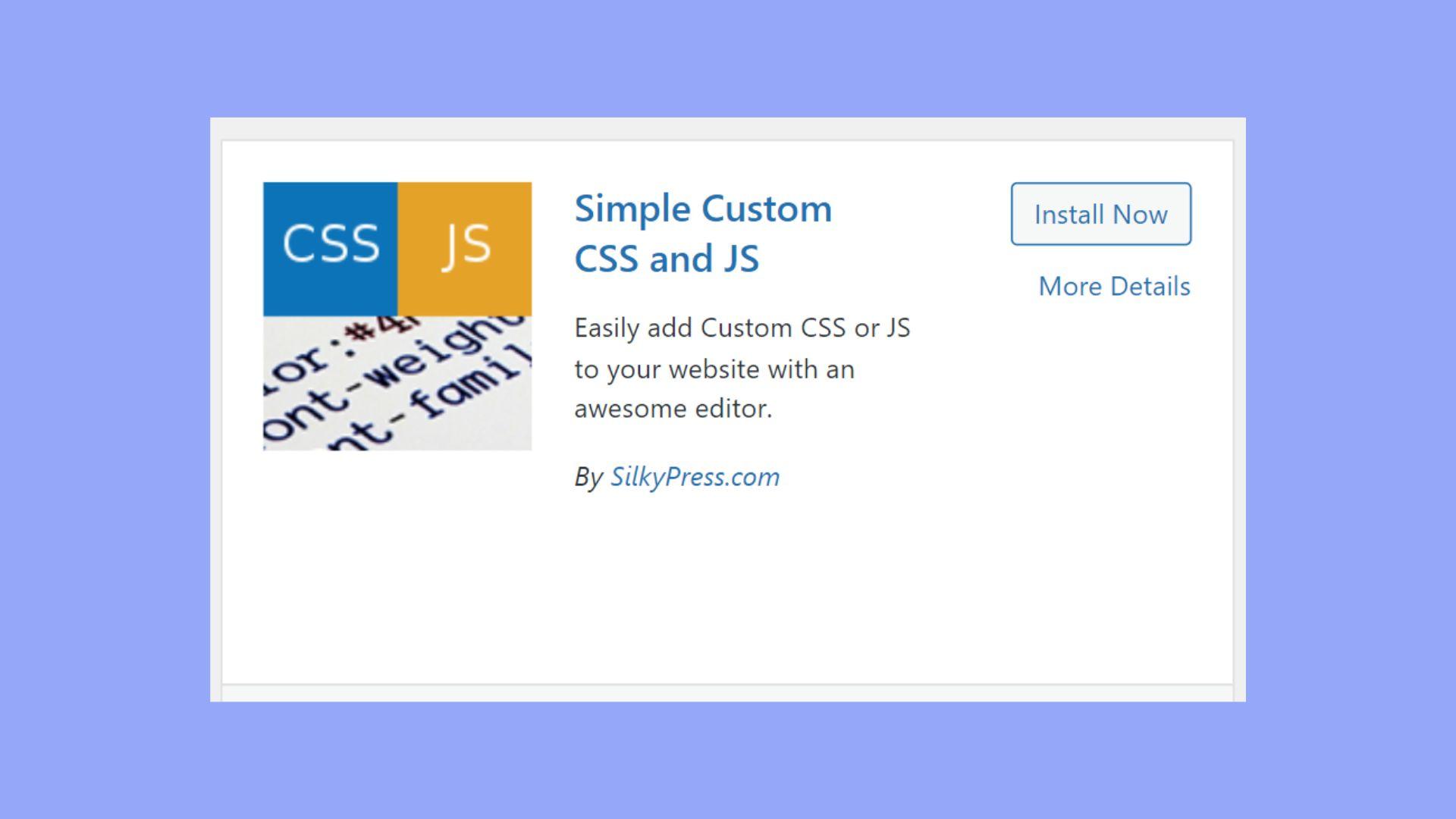
One of the most powerful features of the WordPress Customizer is the Additional CSS option, which allows you to make precise adjustments to your site’s appearance without needing to dive into theme files or code directly.This feature is perfect for those who want a personalized touch, whether you’re tweaking your site for better aesthetics or enhancing user experience.
To access this feature, navigate to Appearance > customize in your WordPress dashboard. Look for the Additional CSS section in the Customizer menu. Here, you can enter your custom CSS rules. Changes are previewed live, so you can see how each adjustment looks before saving it.This immediate feedback is invaluable when experimenting with styles!
Here are some common adjustments you might consider making:
- Change Font Sizes: Use CSS to modify typography to ensure your text is legible and matches your branding.
- Alter Colors: Update background, text, or link colors to create a cohesive color scheme across your site.
- Adjust Spacing: Fine-tune margins and padding to improve layout and readability.
- Customize Button Styles: Make your call-to-action buttons more engaging by changing their appearance.
For example, if you want to increase the font size of your headings, you can add this code in the Additional CSS area:
h1, h2, h3 {
        font-size: 2em;
        color: #333;
    }
If you’re looking for a quick reference on how to style different elements, consider this simple table:
| Element | CSS Example |
|---|---|
| Headings | h1 { color: #ff0000; } |
| Paragraphs | p { line-height: 1.5; } |
| Links | a { text-decoration: none; } |
Remember that while the Additional CSS feature is powerful, it’s best to keep your declarations straightforward and targeted. Overly complex CSS can lead to difficulties in managing styles later. Always check your site after making changes to ensure everything displays as intended across various devices.
With a little creativity and experimentation, you can significantly enhance the look and feel of your WordPress site using the Additional CSS feature, giving your visitors a unique and enjoyable browsing experience!
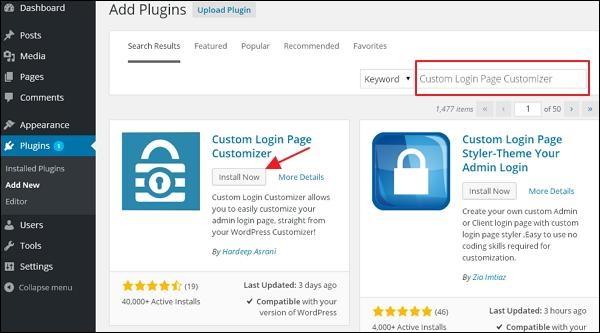
Integrating plugins with the Customizer for Extended Functionality
Integrating plugins with the WordPress Customizer opens up a world of possibilities for enhancing your website’s functionality without having to dive deep into code. This user-friendly interface makes it easy to tailor your site to meet specific needs while providing real-time previews of changes. By leveraging this powerful tool, you can create a cohesive experience for your visitors and streamline your design process.
Many popular plugins are designed to work seamlessly with the Customizer, allowing you to:
- Customize Appearance: Adjust colors, fonts, and layouts from a single interface.
- Manage Widgets: Easily place and configure widgets in live previews.
- modify Menus: Add, remove, or rearrange menu items without any hassle.
- Preview Settings: See changes in real-time, boosting your confidence in the design decisions.
To get started, you’ll first want to identify the plugins that support Customizer integration.Some of the most effective options include:
| Plugin Name | Functionality |
|---|---|
| SiteOrigin Page Builder | Drag-and-drop page building directly in the Customizer. |
| WooCommerce | Customize product pages and checkout settings effortlessly. |
| Elementor | Live editing and template customization. |
After selecting your plugins, the next step is to configure them within the Customizer. Each plugin may have its unique settings, but generally, you’ll find them under the Customizer’s menu. Look for sections labeled after the plugin name or related functionalities. as you make changes, always check the live preview to ensure that your adjustments align with your website’s design and user experience goals.
Don’t forget to save your settings! The Customizer allows you to publish changes immediately, or you can schedule them for a later time. This is especially useful for planning seasonal promotions or significant updates without disrupting your site’s current state.
Lastly, consider using Customizer hooks if you’re comfortable with coding. this allows developers to extend the Customizer’s capabilities even further, creating bespoke configurations that can enhance user engagement and provide a tailored experience. Whether you’re a developer or a site owner looking to refine your site, the opportunities are vast and rewarding.
Saving and Publishing Your Customizations Like a pro
Once you’ve made your desired changes in the WordPress Customizer, saving and publishing those customizations efficiently is key to maintaining a seamless online presence. Fortunately,WordPress provides a straightforward process to ensure your work is not only saved but also effectively launched for your audience to experience.
When you’re content with your adjustments, look for the “Publish” button located at the top of the customizer sidebar.This button will turn from gray to blue, indicating that you have unsaved changes ready for publication. Before hitting that button, consider these quick tips for a smoother experience:
- Preview Your Changes: Use the live preview feature to see how your adjustments look on different devices.
- Check Compatibility: Ensure your customizations don’t conflict with existing plugins or themes.
- Take Notes: Document any significant changes or settings adjustments for future reference.
After you click on “Publish,” your changes will be applied immediately. This is a great moment to double-check your site. Navigate through your pages to ensure everything appears as expected. In some cases, you may want to utilize the “Save & Publish” option to keep your edits while continuing to customize further.
| Action | Description |
|---|---|
| Save | Saves your changes as drafts without publishing them live. |
| Publish | Immediately applies your changes to the live site for visitors to see. |
| Preview | Shows how changes will look before making them live. |
Moreover, if you’re experimenting with multiple styles or layouts, consider using the “Save Draft” option. This allows you to keep your work in progress without exposing incomplete designs to your audience. It’s a handy feature for testing various ideas without commitment. After you feel confident about your design, you can easily come back and hit “Publish” when you’re ready.
remember that every theme has its quirks.Some might offer additional settings that need to be saved separately. Always check for any custom controls your theme may provide and ensure they are adjusted accordingly before you publish. By following these steps,you’re not just saving and publishing; you’re doing it like a pro!
Mobile Responsiveness: Ensuring Your Site Looks Great Everywhere
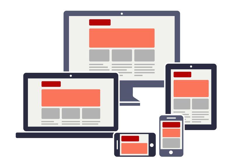
In today’s digital age, having a website that looks great on all devices is crucial. The WordPress Customizer makes it easy to ensure your site is mobile-friendly, allowing you to adjust settings and see changes in real time. This means your visitors will have a seamless experience whether they are on a desktop, tablet, or smartphone.
One of the first steps to achieving mobile responsiveness is to choose a responsive theme. Most modern WordPress themes are designed to adapt to different screen sizes. However, you can always tweak the settings in the Customizer to enhance this further:
- Adjust Layouts: Utilize the layout settings to optimize how content is displayed on smaller screens.
- Modify Typography: Choose font sizes and styles that improve readability on mobile devices.
- image Scaling: Ensure images are set to be responsive to provide a fluid layout.
To see how your changes look on mobile, use the preview options within the Customizer. You can toggle between desktop, tablet, and mobile views with just a click. This feature allows you to catch any design flaws before publishing your site, saving you time and effort down the line.
Another effective way to enhance mobile responsiveness is through the use of custom CSS. This allows you to fine-tune specific elements of your site. Here’s a simple example of CSS you might add to improve mobile views:
@media (max-width: 768px) {
    .example-class {
        font-size: 16px;
        padding: 10px;
    }
}
Additionally, consider the navigation menu. A cluttered menu can overwhelm mobile users, so simplify it as much as possible. You might opt for a hamburger menu or a collapsible version that expands when tapped. This keeps your site neat and user-friendly.
Here’s a quick reference table of key elements to check for mobile responsiveness:
| Element | Responsive Tip |
|---|---|
| Images | Use CSS to scale images appropriately. |
| Fonts | Choose legible font sizes for mobile devices. |
| Menu | Implement a mobile-friendly navigation structure. |
| Buttons | Ensure buttons are large enough to be tapped easily. |
By using the WordPress Customizer, you can create a site that not only looks great but also performs well across all devices. Remember, a mobile-responsive design is not just a trend; it’s essential for improving user engagement and boosting your site’s ranking on search engines. Make these adjustments today, and watch your site thrive!

Troubleshooting Common Customizer Issues and Solutions
Encountering issues while using the WordPress Customizer can be frustrating, but many common problems have straightforward solutions. Below, we outline some frequent challenges users face, along with practical steps to resolve them.
1. Changes Not Reflecting
One of the most common issues is when changes made in the Customizer don’t seem to appear on the front end of your site. Here are a few things to check:
- Clear your browser cache and refresh the page.
- Check for caching plugins that may be serving old content.
- Ensure that you are saving changes correctly before exiting the Customizer.
2. Customizer not Loading
If the Customizer fails to load, it can usually be attributed to a conflict with themes or plugins. Try the following:
- Disable all plugins and check if the customizer loads.
- Switch to a default theme temporarily to see if the issue persists.
- Inspect the browser console for any JavaScript errors that may indicate the source of the problem.
3. Missing Sections or Panels
Sometimes you might find that certain sections or panels are missing from the Customizer. This can happen due to:
- Theme limitations – not all themes support all Customizer sections.
- Custom code or modifications that may have inadvertently removed sections.
- Plugin interference that could be hiding specific options.
To resolve this, check the theme documentation or consider reaching out to the theme developer for clarification.
4. Inconsistent Settings Between Customizer and Editor
If you notice that the settings in the Customizer do not match what you see in the block editor, it could lead to confusion. To mitigate this:
- Understand that some settings are theme-specific and may not translate directly between the two.
- Regularly update your theme and plugins to ensure compatibility with the latest WordPress version.
- Consult the theme’s settings to see if there are hidden options you may have overlooked.
| Issue | Common Solution |
|---|---|
| Changes Not Reflecting | Clear Cache |
| Customizer Not Loading | Disable Plugins |
| Missing Sections | Check Theme Documentation |
| Inconsistent Settings | Update Theme and Plugins |
Addressing these common issues can significantly enhance your experience with the WordPress Customizer. By following the tips outlined above, you’ll be better equipped to troubleshoot and resolve problems efficiently, allowing you to focus more on creating a stunning website.
Frequently Asked Questions (FAQ)
Sure! here’s a Q&A section for your article on “How to Use the WordPress Customizer: A Complete Guide”:
Q&A: How to Use the WordPress Customizer
Q: What is the WordPress Customizer, and why should I use it?
A: Great question! the WordPress Customizer is a fantastic tool that allows you to make live changes to your website’s appearance. Think of it as a real-time preview for your site—any adjustments you make can be seen instantly! This is perfect for anyone looking to personalize their website without needing coding skills. With the Customizer, you can tweak your site’s colors, fonts, layout, and more, all in one place.
Q: how do I access the WordPress Customizer?
A: Accessing the customizer is super easy! just log into your WordPress dashboard, go to “Appearance,” and then click on “Customize.” Voila! You’re in! From there, you’ll see a menu on the left with all sorts of options to explore.
Q: Can I see changes in real-time?
A: Absolutely! One of the best features of the Customizer is that it shows you a live preview of your changes. As you adjust settings like colors or layouts, you can see exactly how they will look on your site without any guesswork. This makes it much easier to find the perfect design that fits your vision.
Q: What kind of changes can I make using the customizer?
A: The possibilities are pretty vast! You can adjust site identity (like your logo and site title), set your homepage settings, change colors and typography, modify menus, and even add widgets. Plus,many themes come with additional options,so the customizations can be as simple or as complex as you want!
Q: Will my changes be saved automatically?
A: Yes,but with a twist! While you’re making changes,they’re saved in the Customizer. Though, they won’t go live on your website until you hit the “Publish” button.This means you can experiment freely without worrying about affecting your live site until you’re completely satisfied with the look and feel!
Q: What if I don’t like the changes I made?
A: No worries at all! the Customizer gives you the flexibility to go back and forth. You can simply tweak your settings until you find the style you love. If you decide to abandon your changes, you can exit the Customizer without hitting “Publish,” and everything will remain as it was.
Q: Can I use the WordPress Customizer on mobile?
A: Yes, indeed! The Customizer is mobile-responsive, which means you can make adjustments right from your smartphone or tablet. This is super handy for on-the-go adjustments or for checking how your site looks on different devices.
Q: Is the Customizer available for all WordPress themes?
A: Most themes do support the Customizer, but the features can vary. Some themes offer more extensive customization options than others. If you’re considering a theme, take a peek at its compatibility with the Customizer to ensure it meets your needs!
Q: Any tips for making the most out of the WordPress Customizer?
A: Absolutely! Start by exploring all the sections in the Customizer to see what’s available. Don’t rush—take your time to play around with different settings. also, consider using a staging site if you’re making major changes, so you can test everything before it goes live. And remember, it’s all about finding the right look that resonates with your brand!
Feel free to use this Q&A section to enhance your article and engage your readers.Happy customizing!
In Summary
And there you have it! You’re now equipped with all the tools and knowledge to navigate the WordPress Customizer like a pro. Whether you’re tweaking your site’s colors, fonts, or layout, the Customizer offers a user-friendly way to make your website truly yours. Remember, it’s all about experimentation—don’t be afraid to play around with different settings until you find what feels just right.
So, why wait? Dive into the Customizer and start transforming your website today! Your visitors will appreciate the fresh look, and you’ll enjoy the satisfaction of creating something unique. If you have any questions or need further guidance, don’t hesitate to reach out. Happy customizing!

