
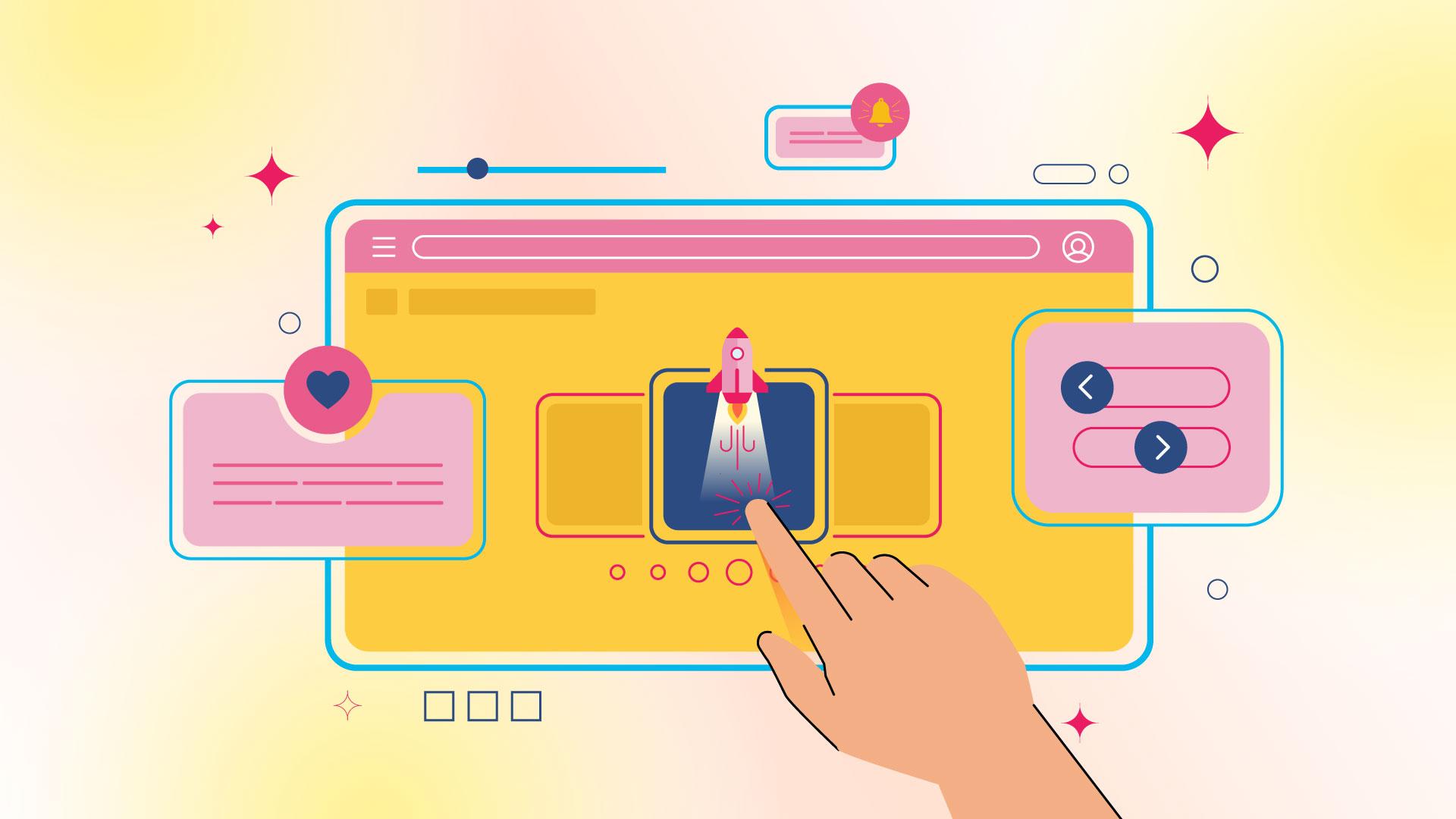
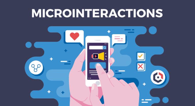
Mastering Micro Interactions: The Small UX Tweaks That Can Make a Big Difference
Have you ever felt a rush of satisfaction from a tiny animation when you click a button? Or perhaps, you’ve found yourself frustrated when a website doesn’t respond how you expect it to? Those little moments—frequently enough overlooked—are called micro interactions, and they play a crucial role in shaping our user experience. In a world where attention spans are shorter than ever, these subtle design elements can either make or break your digital product’s success.Imagine your favorite app or website: it’s not just the overall design that keeps you coming back, but the small, delightful details that enhance your interaction. Whether it’s a smooth transition, a satisfying sound, or a visual cue that tells you something has been successfully completed, these micro interactions are the secret sauce that keeps users engaged. By mastering them, you can elevate your user experience from good to unforgettable.
In this article, we’re going to dive into the fascinating world of micro interactions. We’ll explore what they are, why they matter, and how you can implement them effectively to create a more engaging and intuitive user experience. So, are you ready to learn how these small tweaks can lead to big impacts? Let’s get started!
Understanding the Power of Micro Interactions in UX Design
Micro interactions are the unsung heroes of user experience design. They are the subtle yet powerful tweaks that can transform a mundane interaction into something delightful. picture this: you’re filling out a form online, and as you input your email, a gentle checkmark appears to confirm that you’ve typed it correctly. That small animation provides instant feedback,reassuring you that your action has been recognized. This is the magic of micro interactions.
These small elements serve multiple purposes, enhancing usability and engagement. Here are some key benefits:
- Feedback: Micro interactions provide immediate feedback to users, letting them know their actions have been registered. This can be through animations,sound effects,or subtle changes in color.
- Guidance: They can guide users through processes, reducing confusion and improving overall navigation. For instance, a progress bar that animates as steps are completed makes a multi-step form feel more manageable.
- Delight: adding a touch of playfulness can create a memorable experience. Think of a button that bounces slightly when clicked or a notification that gently slides in from the side.
To effectively implement micro interactions, consider these essential components:
| Component | Description |
|---|---|
| Triggers | The action that initiates the interaction, like clicking a button or hovering over an icon. |
| Rules | Define how the interaction responds, such as showing a tooltip or changing color. |
| Feedback | The visual or audible cue that confirms the action has been recognized. |
| Loops | How the interaction ends, whether it fades out, resets, or leads to another action. |
Implementing micro interactions is not just about aesthetics; it’s about crafting a seamless experience.A well-designed micro interaction can subtly guide users through complex interfaces,making them feel more confident and in control. Such as, a shopping cart icon that fills up as items are added can visually reinforce the action of purchasing, transforming a simple task into a satisfying journey.
Ultimately, the beauty of micro interactions lies in their ability to connect with users on an emotional level. They might be small, but their impact is significant.As you refine your designs,remember to pay attention to these details—they are the threads that weave together a cohesive and compelling user experience.
Why Every Detail Matters: The Impact of Small Tweaks on User Experience
When it comes to user experience, the little things often have a disproportionately large impact. Micro interactions—those subtle animations, feedback sounds, or visual cues—are the unsung heroes of effective UX design. They may seem minor, but these small tweaks can significantly enhance the way users engage with a product. Let’s dive into how these details shape user perception and interaction.
First, consider the role of feedback. Users thrive on confirmation that their actions have been acknowledged. Think of a simple button click: if it changes color or provides a satisfying sound, the user feels a sense of accomplishment. This feedback loop keeps users informed and engaged,leading to a smoother experience. Without these indicators, users may feel lost or unsure, potentially leading to frustration.
Next up is the importance of transitions. Smooth transitions between states can make interactions feel more natural and less jarring.Such as, when a user submits a form, a gentle fade-out effect can signal that their action is being processed. On the other hand, abrupt changes can create confusion and diminish the overall flow. A well-timed transition can turn a mundane action into a delightful experience.
Moreover, visual hierarchy plays a crucial role in guiding users’ attention. Subtle tweaks to font size,color contrast,or spacing can dramatically shift how users navigate your interface.By emphasizing critically important elements effectively, you can lead users through their journey seamlessly. Here’s a quick comparison of visual hierarchy effects:
| Element | Effect |
|---|---|
| Bold Headlines | Grab user attention instantly |
| Subtle Shadows | Add depth, making buttons more clickable |
| Color Contrast | Improves readability and focus |
Don’t overlook the power of microcopy either. Crafting thoughtful, concise messages can create a kind atmosphere and guide users effectively.Whether it’s a tooltip that clarifies a feature or a playful message upon completion of a task, microcopy adds personality and warmth to your product. Engaging and approachable language fosters a sense of connection, making users feel understood and valued.
Lastly, consider the potential of personalization through micro interactions. Tailoring experiences based on user behaviour can significantly enhance satisfaction. A small tweak, like greeting users by name or remembering their preferences, can cultivate loyalty and increase engagement.users want to feel that their needs are understood, and personalization is a powerful way to achieve that.
In essence, every detail—no matter how small—contributes to the overarching user experience. By mastering these micro interactions,you can create a product that not only meets user needs but also delights them at every step of their journey. It’s often the smallest changes that lead to the greatest satisfaction.
Identifying Key Areas: where to Implement Micro interactions
Micro interactions are the subtle yet powerful elements of design that can significantly enhance user experience. When strategically placed,they can guide users,convey details,and add personality to your interface. To effectively leverage these tiny tweaks, it’s crucial to pinpoint the areas where they can have the greatest impact.
Here are some essential areas to consider for implementing micro interactions:
- Buttons and Calls to Action: Every interaction begins with a button. Adding hover effects,subtle animations,or color changes can make these elements more engaging and encourage users to take action.
- Form Fields: Micro interactions in forms, such as animated feedback messages for successful submissions or error indications, can greatly improve usability and reduce frustration.
- Loading Indicators: Instead of leaving users in the dark, use creative loading animations. These can keep users engaged, providing visual feedback that something is happening.
- Notifications: Utilize micro interactions for alert messages. A gentle slide-in effect or a color change can draw attention without being disruptive.
- onboarding Tutorials: Implement tooltips or animated guides during onboarding to help users navigate your application effectively, ensuring they understand key features without feeling overwhelmed.
To illustrate how micro interactions can enhance user experience, consider this simple table of common scenarios:
| Scenario | Micro Interaction Example |
|---|---|
| Form Submission | Success message fades in after submission |
| Profile Picture Upload | Photo previews with a zoom effect |
| shopping Cart | Item added ripple effect |
| Volume Control | Slider with animated feedback on adjustment |
Incorporating micro interactions should feel seamless and intuitive. They are not about flashy animations but rather enhancing the overall experience by providing feedback and guiding the user. Pay attention to areas where users might experience confusion or frustration, as this is where thoughtful micro interactions can shine the brightest. remember, the goal is to make users feel in control and informed at every step of their journey.
Crafting Meaningful Feedback: How Subtle Responses Enhance Engagement
In the world of user experience, it’s the little things that often matter most. When users interact with a digital product, their emotional and cognitive responses can significantly impact their overall experience. Subtle yet meaningful feedback can bridge the gap between a mundane interaction and a memorable one. When crafted thoughtfully, these micro-interactions create a sense of connection, leading to increased engagement and satisfaction.
Imagine a scenario where a user submits a form. Instead of a bland confirmation message that simply states, “Your form has been submitted,” consider a more engaging response. A playful animation that celebrates the action—like a confetti burst or a friendly thumbs-up—can elevate the experience. this kind of feedback not only acknowledges the user’s effort but also reinforces a positive emotional state.
Here are some key strategies to enhance feedback through micro-interactions:
- Use Visual Cues: Small animations or changes in color can convey status updates effectively. As an example, a loading spinner can suggest progress, while a color shift can indicate a successful completion.
- Personalize Responses: Tailoring feedback to the user’s actions—like using their name in a thank-you message—can create a more intimate experience.
- Maintain Consistency: Ensure that feedback mechanisms are consistent across the platform. This builds familiarity, allowing users to navigate with ease and confidence.
- Keep Messaging Clear: use concise, friendly language that resonates with your audience. A simple “You’ve got this!” can motivate users more than a formal notification.
The impact of these techniques can be quantified through user satisfaction metrics. Consider the following table that captures typical user responses based on varying feedback styles:
| Feedback Style | user Satisfaction (%) |
|---|---|
| basic Text Confirmation | 65% |
| Animated Confirmation | 85% |
| Personalized engagement | 90% |
| Gamified Feedback | 95% |
implementing these small tweaks can lead to significant improvements in user experience. When users feel acknowledged and appreciated, they are more likely to engage repeatedly with your product.Remember,the goal is to create an ecosystem where users feel valued,and subtle feedback plays a pivotal role in achieving that.
Elevating User Engagement: The Role of Visual and Audio Cues
In today’s digital landscape, capturing and maintaining user attention is paramount. Visual and audio cues serve as powerful tools that can enhance user experiences and significantly boost engagement levels. By integrating these elements into micro interactions, designers can create a more immersive and satisfying user journey.
Visual cues can range from subtle animations to vibrant color changes.They guide users seamlessly through tasks, providing instant feedback that feels intuitive. As a notable example:
- Hover effects: These can reveal additional information or highlight actionable items, allowing users to interact confidently.
- Progress indicators: A loading animation or a simple progress bar keeps users informed and reduces anxiety during wait times.
- Micro animations: Small movements or transitions can delight users and make mundane tasks feel more engaging.
On the other hand, audio cues can complement visual elements, adding another layer of interaction. Sounds can provide feedback in a way that visually might not be as effective. Consider the following audio strategies:
- Click sounds: A satisfying click or chime can enhance the feeling of accomplishment when users complete an action.
- Notifications: Subtle audio alerts can effectively grab attention without being overly intrusive, keeping users informed of updates.
- Background music: For certain applications,background music can set the mood and enhance the overall experience.
When designing micro interactions, it’s essential to strike a balance between visual and audio cues to avoid overwhelming users.Here’s a simple table illustrating some effective combinations:
| Interaction Type | Visual Cue | Audio Cue |
|---|---|---|
| Button Click | Color change with a slight animation | Satisfying click sound |
| Form Submission | Success message with a fade-in effect | Cheerful chime |
| Loading Screen | Spinning icon | Soft background music |
By carefully crafting these sensory cues, designers can create a delightful feedback loop that keeps users engaged and eager to interact more. The harmony of visual and audio elements not only enhances usability but also fosters a deeper emotional connection,making users feel valued and understood.
Ultimately, the goal of integrating these cues is to create an intuitive experience where users instinctively know what to do next. By mastering these small tweaks, you can transform routine interactions into memorable moments that resonate long after the user has left your platform.
Designing for Delight: Adding Personality Through Micro animations
When it comes to user experience, the little things can make a huge impact. Micro animations are a fantastic way to bring a touch of personality to your designs, making them not only functional but also delightful. These subtle animations provide feedback,guide users,and enhance engagement,transforming mundane tasks into enjoyable moments.Think of them as the icing on the cake—small additions that elevate the overall experience.
imagine a user clicking a button. Rather of just changing color, what if the button briefly enlarges and then settles back into place? This playful interaction not only confirms the action but also injects a sense of liveliness into the interface. Micro animations can:
- Guide navigation: Use animations to indicate transitions or changes in state, such as a menu expanding or a loading spinner.
- Provide feedback: Show success or error messages with subtle animations, like a checkmark that bounces or an error icon that shakes.
- Encourage exploration: Highlight new features or updates with animations that draw attention without overwhelming the user.
To effectively use micro animations, it’s essential to strike the right balance. Too much movement can distract or annoy users, while too little might go unnoticed. Here are some best practices to keep in mind:
| Best Practice | Description |
|---|---|
| Keep it Subtle | Animations should enhance, not overshadow. Aim for understated elegance. |
| Ensure Purpose | Every animation should serve a function,whether it’s informing or guiding the user. |
| Use Consistent Timing | Maintain uniform duration and easing to create a cohesive experience. |
One of the most significant advantages of micro animations is their ability to evoke emotions. When users feel an emotional connection with an interface, they’re more likely to engage and return. Consider incorporating playful elements like:
- Hover effects: Simple animations that react when users move their mouse can create an inviting atmosphere.
- Loading animations: Rather than a static spinner, consider a quirky animation that entertains while the user waits.
- Transitional animations: Smooth transitions between pages can make navigation feel seamless and intuitive.
Incorporating micro animations into your design is not just about aesthetics; it’s about creating a dynamic and engaging experience that resonates with users. By thoughtfully adding these playful touches, you can significantly enhance user satisfaction and loyalty. Remember, in the world of UX, it’s those delightful little moments that keep users coming back for more.
Testing and iterating: Fine-Tuning your Micro Interactions for success
Refining micro interactions requires a commitment to continuous testing and iteration. Once you’ve implemented initial designs, the real work begins. Gathering user feedback is essential to understand what resonates and what falls flat.Here are some strategies to help you fine-tune those small yet impactful elements:
- A/B Testing: Create variations of your micro interactions and present them to different user groups. Analyse which version performs better based on user engagement and satisfaction.
- Heatmaps: Utilize heatmap tools to track user behavior. This visual data helps pinpoint where users click, hover, or hesitate, offering insights into where improvements are needed.
- User Interviews: Directly asking users about their experiences can reveal nuanced insights. Inquire about pain points, preferences, and overall satisfaction to gather qualitative data.
After collecting data, the next step is iteration. This process should be agile and flexible.Here’s how to approach it:
- Prioritize Changes: Based on user feedback,prioritize which micro interactions need immediate attention. Focus on elements that significantly impact the user journey.
- Prototype Rapidly: Use tools like Figma or Adobe XD to quickly create prototypes of your new ideas. This allows for swift testing before full implementation.
- Incorporate Analytics: Utilize analytics to track the performance of your micro interactions post-launch. Metrics such as conversion rate, time on task, and user retention can guide your adjustments.
| User Insights | Action to take |
|---|---|
| Users find tooltips confusing | Simplify language and increase visibility |
| Feedback on button color preference | Test different color schemes |
| High drop-off rates on forms | Reduce the number of fields and simplify layout |
Remember, micro interactions are often the unsung heroes of user experience. They can significantly influence how users perceive and engage with your product. By embracing a cycle of testing and iterating, you not only enhance the functionality of these small interactions but also build a more intuitive and delightful user experience.
The balance Between Functionality and Aesthetics in Micro Design
In the realm of micro design, finding the perfect equilibrium between functionality and aesthetics is essential. when users interact with a product, they crave not just efficiency, but also an engaging experience that resonates with their emotions. This synergy can be achieved through meticulous attention to small details that enhance usability while also making the interface visually appealing.
One of the most effective ways to fuse functionality with aesthetics is through interactive feedback. This includes subtle animations and transitions that guide users seamlessly through their tasks. Such as, a slight bounce effect when a button is clicked not only signals that the action has been registered but also adds a layer of playfulness to the experience. Users are more likely to engage with a product that provides satisfying feedback, making the overall experience more enjoyable.
Another key aspect is the use of color psychology. Colors evoke emotions and can significantly influence user perception. Incorporating a well-thought-out color palette can enhance usability by highlighting critically important features or actions. for instance, a vibrant color for a call-to-action button can draw attention and encourage clicks, while softer hues can be used for background elements, ensuring they support rather than overwhelm the user’s focus.
| Design element | functionality | Aesthetic Impact |
|---|---|---|
| Responsive Buttons | Clear actions | Visual appeal |
| Hover Effects | Interactive cues | Enhanced engagement |
| Micro Animations | Feedback | Delightful experiences |
Moreover, a minimalist design can significantly enhance both functionality and aesthetics.By reducing clutter and focusing on essential elements,users can navigate the interface more intuitively. The simplicity allows for a more enjoyable experience, as users are not overwhelmed by unnecessary distractions. A well-structured layout that emphasizes key actions can lead to improved usability and a more polished overall look.
Lastly, typography plays a vital role in micro design. The choice of fonts,their sizes,and spacing can dictate readability and influence user interaction. Sans-serif fonts frequently enough lend a modern and clean feel, while serif fonts can convey sophistication.By carefully selecting typography that aligns with the product’s personality, designers can enhance both functionality and aesthetic appeal, ensuring that users are not only informed but also drawn to the content.
Ultimately, the blend of functionality and aesthetics in micro design is not just about looking good; it’s about creating an immersive user experience that feels natural and intuitive. When these elements work harmoniously, users are more likely to engage, explore, and enjoy the digital product, leading to lasting impressions and increased satisfaction.
Real-World Examples: Brands That Nail Micro Interactions
In the realm of user experience, micro interactions are the unsung heroes that enhance usability and create memorable connections. Several brands have effectively leveraged these small yet powerful elements to elevate their users’ experiences. Let’s dive into a few standout examples that illustrate how well-executed micro interactions can make a significant impact.
1. Slack: This popular communication tool is celebrated not just for its core functionality but also for its delightful micro interactions.one notable example is the subtle animations that occur when users send messages or reactions. The little “sending” animation followed by a smooth transition to the sent message provides instant feedback, keeping users informed and engaged without overwhelming them.
2. Mailchimp: The email marketing platform excels in creating a user-friendly experience through playful micro interactions. When users hover over certain elements,such as buttons or icons,they are greeted with gentle animations that provide visual feedback. As a notable example, the “send” button slightly enlarges and changes color, inviting users to click while making the action feel satisfying.
3. Dropbox: Dropbox combines functionality with a touch of flair through its use of progress indicators and visual confirmations. When uploading files, users see a charming animation that fills a progress bar, accompanied by a friendly message that acknowledges the action. This not only reassures users but also transforms a potentially mundane task into an enjoyable experience.
| Brand | Micro interaction Feature | User Experience Boost |
|---|---|---|
| Slack | Message Sending Animation | Provides instant feedback and engagement |
| Mailchimp | Button Hover Animations | Encourages action with a playful touch |
| Dropbox | Progress Indicators | Turns mundane tasks into enjoyable experiences |
4. Airbnb: Airbnb takes the lead with its use of micro interactions in search and booking processes. As users scroll through listings, subtle animations signal interactions, like saving a favorite or adjusting search filters. These small nudges are designed to guide users effortlessly,ensuring they feel in control throughout their journey.
5. Spotify: The music streaming giant enhances user engagement through its intuitive play/pause animations. When users interact with the interface, the buttons respond with fluid transitions and color changes, creating a tactile feel that resonates with users. This attention to detail not only makes navigation seamless but also cultivates a sense of enjoyment while listening to music.
by examining these brands, it’s clear that micro interactions are not merely decorative; they serve functional purposes that enhance user satisfaction. These small details can make the difference between a good user experience and a great one, encouraging loyalty and encouraging users to come back for more.
Common Pitfalls to Avoid When Designing Micro Interactions
When it comes to micro interactions, even small missteps can lead to significant user frustration.Here are some common pitfalls to watch out for:
- Neglecting Context: always consider where and how users will interact with your design. Micro interactions should enhance the experience, not confuse it.For instance, a button animation that works well on a desktop may be ineffective on mobile.
- Overcomplicating Animations: Simplicity is key. Users should intuitively understand what to do next. If an animation is too flashy or slow, it can detract from the functionality. Keep transitions smooth, and ensure they guide the user rather than distract them.
- Ignoring Feedback: Every interaction should provide clear feedback. If users don’t know whether an action was successful, they may feel lost. Use subtle cues like color changes or brief messages to confirm their actions.
- Forgetting Accessibility: Design should be inclusive. Consider color contrasts, text size, and animation durations for users with disabilities. Providing alternatives for users who may experience motion sensitivity is crucial for a good user experience.
Moreover, consistency is vital in micro interactions. If users encounter different styles or behaviors unexpectedly,it can lead to confusion. Establish guidelines for how interactions should behave across your platform. This not only aids in usability but also strengthens brand identity.
Lastly, always remember to test and iterate. What looks good on paper may not always translate well in practice. Conduct usability tests with real users to gather feedback on your micro interactions. This will help you identify any issues before launch and ensure that your design meets user needs effectively.
| Common Pitfall | Impact | Tip to Avoid |
|---|---|---|
| Neglecting Context | User confusion | Design for the specific platform |
| Overcomplicating Animations | Distracted users | Keep it simple and fluid |
| Ignoring Feedback | Frustration | Implement clear confirmation cues |
| forgetting Accessibility | exclusion of users | Follow accessibility guidelines |
Future Trends in Micro Interactions: What’s Next for UX Designers
As we look to the future of micro interactions, UX designers must stay ahead of the curve and anticipate the evolving needs of users.With technology advancing at a rapid pace, the way users interact with digital products is bound to transform. Here are some key trends to consider:
- Personalization at Scale: Users crave experiences tailored to their preferences. Micro interactions that adjust based on user behavior can create a more engaging and intuitive experience. Think of a music app that suggests playlists based on user listening habits, or an e-commerce site that highlights products aligned with past purchases.
- Voice and Gesture Interfaces: As voice recognition and gesture technology improve, micro interactions will increasingly be designed for hands-free use. Imagine controlling your smart home or navigating a website with simple voice commands or gestures, enhancing accessibility and convenience.
- Augmented Reality (AR) Enhancements: AR is set to revolutionize how users interact with digital content. Micro interactions within AR applications can offer users real-time feedback, such as visual cues or animations that respond to their movements, making experiences more immersive and interactive.
In addition to these trends, designers should focus on the emotional aspect of micro interactions. The incorporation of subtle animations and feedback mechanisms can significantly influence user satisfaction and engagement. such as:
| Micro Interaction | Emotional Impact |
|---|---|
| Loading animations | Reduces anxiety during waits |
| Button hover effects | Creates a sense of control |
| Progress indicators | Provides motivation and reassurance |
the role of data analytics cannot be overlooked. By leveraging user feedback and behavioral data, designers can refine micro interactions to better suit the audience. Continuous testing and iteration will allow for the optimization of these small yet impactful elements, ensuring they resonate with users long term.
the future of micro interactions is luminous and full of potential. By embracing these trends and focusing on user-centered design, UX designers can craft experiences that not only meet expectations but exceed them, creating lasting impressions that keep users engaged and coming back for more.
Taking Action: Practical Steps to Start Mastering Micro Interactions Today
To start mastering micro interactions, you don’t need to wait for a complete overhaul of your design. Small, incremental changes can lead to significant improvements in user experience. Here are some practical steps you can take right now:
- Analyze Your Current Interactions: begin by evaluating the micro interactions present in your existing designs. Identify areas where feedback is lacking or where users might feel confused. Tools like heatmaps can help you see where users click and where they lose interest.
- Define Key Actions: Focus on the most critical user actions in your interface. Whether it’s submitting a form or liking a post, ensure that these interactions are smooth and intuitive.
- Add Subtle Animations: A touch of animation can breathe life into your design. Consider adding transitions that indicate loading states or hover effects that provide visual feedback when a user interacts with buttons.
- Implement Microcopy: The words you use in your interface can make a big difference. Craft brief, clear messages that guide users through their journey, such as error messages or confirmation prompts.
To put these steps into practice,consider creating a simple table to track your progress. This will help you stay organized and focused on your micro interaction goals:
| Action Step | Status | Notes |
|---|---|---|
| Analyze Current Interactions | In Progress | Using heatmaps for insights |
| Define Key Actions | Not Started | List top 5 interactions |
| Add Subtle Animations | Completed | Implemented on buttons |
| Implement Microcopy | In Progress | Drafting messages for forms |
don’t forget to test your changes! Gather user feedback to see how the new micro interactions are perceived. Tools like A/B testing can definitely help you determine which tweaks have the most impact. Continuous iteration is key to refining these small yet powerful elements of your design.
Frequently Asked Questions (FAQ)
Q&A: Mastering Micro Interactions: The Small UX Tweaks That Can Make a Big difference
Q: What exactly are micro interactions?
A: Great question! Micro interactions are the small, subtle moments in user experience that enhance how we interact with an interface. Think of them as tiny animations, feedback messages, or even the way a button reacts when you hover over it. They might seem insignificant, but they play a crucial role in making digital experiences feel seamless and intuitive.
Q: Why should we pay attention to micro interactions?
A: Because they can dramatically elevate user experience! Imagine using an app where every tap and swipe feels responsive and satisfying. Micro interactions provide instant feedback, guide users, and even convey emotions. they can turn a mundane task into a delightful experience, helping to keep users engaged and more likely to return.
Q: Can you give some examples of effective micro interactions?
A: Absolutely! Some classic examples include:
- Button animations: When you click a button and it slightly enlarges or changes color, it confirms that your action was registered.
- Loading indicators: A simple spinning icon or progress bar informs users that something is happening in the background, reducing anxiety during wait times.
- Form feedback: When you fill out a form, seeing a small checkmark appear next to a completed field reassures you that you’re on the right track.
These little touches not only enhance functionality but also add personality to the product.
Q: How can a business implement micro interactions without overwhelming users?
A: The key is balance! Start by identifying areas where users may need reassurance or guidance. Then, implement micro interactions that complement the experience instead of distracting from it. For instance, timing is everything—animations should be quick and smooth, providing feedback without causing delays. And always test with real users to ensure your micro interactions enhance usability, not hinder it.
Q: What’s the potential ROI from improving micro interactions?
A: Investing in micro interactions can lead to a higher return on investment. When users feel cozy and engaged, they’re more likely to complete tasks, return to your app, and recommend it to others. Better user experience often leads to lower churn rates and increased customer loyalty, which can significantly boost your bottom line.
Q: Any final tips for those wanting to master micro interactions?
A: Certainly! Start by analyzing your existing user flows and pinpointing moments where micro interactions coudl add value. Keep your interactions subtle and context-sensitive. And don’t forget to iterate based on user feedback. The beauty of micro interactions is that they can continually evolve as you learn more about how users engage with your product.Remember, sometimes a small tweak can lead to monumental improvements!
So, ready to make those small tweaks that create big impacts? your users will thank you for it!
Final Thoughts
As we wrap up our exploration of micro interactions, it’s clear that these small yet significant design elements can elevate user experience in ways we frequently enough overlook. Think of them as the secret sauce that can transform a mundane interface into something engaging and delightful.Whether it’s a subtle button animation,a gentle notification sound,or a satisfying loading spinner,these tiny tweaks can make all the difference in how users perceive and interact with your product.So, the next time you’re designing or iterating on a project, remember that it’s the little things that count. Embrace the art of micro interactions and watch how they not only enhance usability but also create emotional connections with your users. After all, it’s these moments of joy and surprise that keep users coming back for more.
Don’t underestimate the power of the small; they might just be the key to turning your user experience from good to unforgettable. So get out there, experiment, and let those micro interactions work their magic! Happy designing!