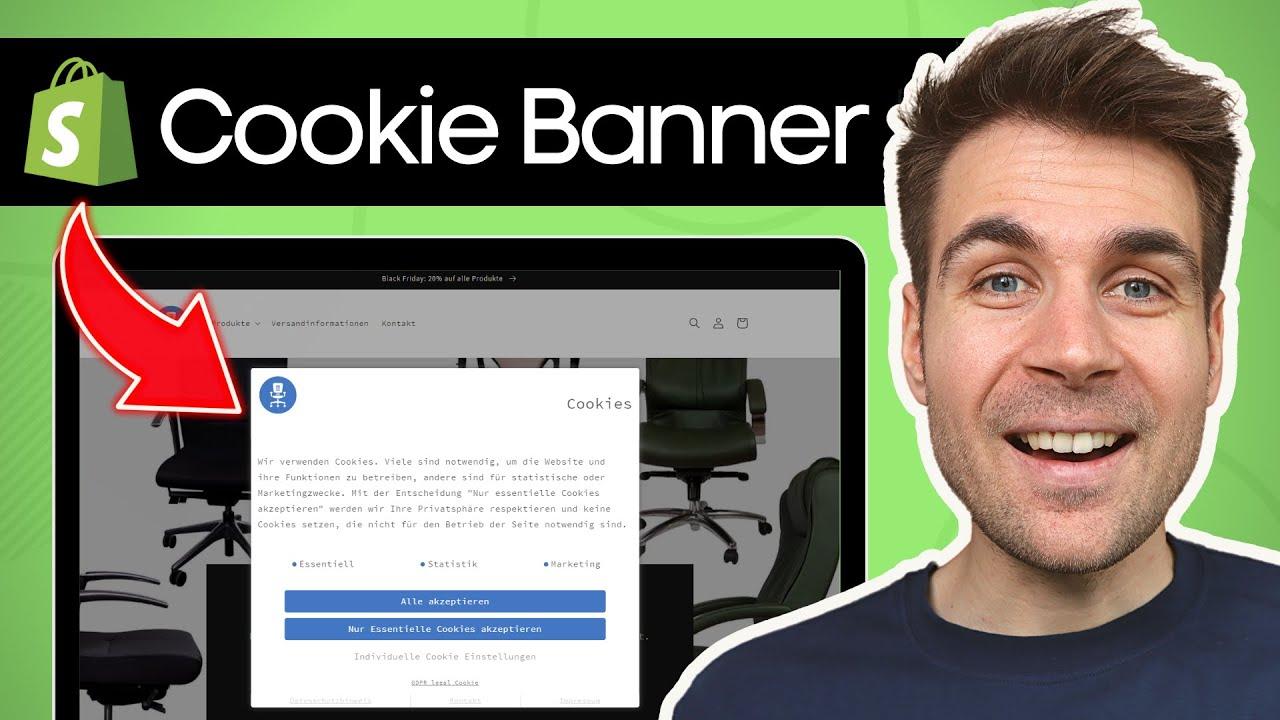
What to Put On a Cookie Banner So Visitors Aren’t Annoyed
We’ve all been there: you land on a website,ready to dive into some content,only to be met with an intrusive cookie banner demanding your attention. It can feel like an unwelcome guest at a party, disrupting the flow and causing more frustration than it should. But fear not! Crafting the perfect cookie banner doesn’t have to be a headache. In this article, we’ll explore how to strike the right balance between compliance and user experience. You’ll learn what essential information to include, how to present it in a friendly manner, and tips for making the whole experience feel seamless. Let’s transform that cookie banner from a nuisance into a helpful guide that respects your visitors’ preferences—and keeps them coming back for more!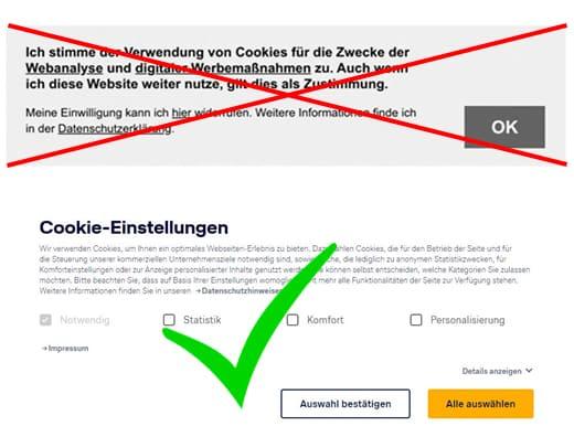
Understanding the Purpose of a Cookie Banner
Cookie banners have become a ubiquitous presence on websites, often eliciting mixed feelings from users. Understanding their purpose can significantly improve how they are perceived. At their core,cookie banners are designed to inform users about the cookies being used on a website and obtain their consent. this openness is not just a legal requirement in manny regions, but it also builds trust between the website and its visitors.
When crafting a cookie banner, clarity is essential. Users should easily understand what cookies are used, why they are necessary, and how they impact their browsing experience. Avoid jargon and use straightforward language that speaks directly to the visitor. Consider including the following key points:
- Types of Cookies: Clearly differentiate between essential cookies (which are necessary for the website to function) and non-essential cookies (like tracking and advertising cookies).
- Purpose: Explain why these cookies are being used. For instance, are they enhancing user experience, improving site performance, or serving targeted ads?
- Consent Options: Provide clear choices, allowing users to accept all cookies, reject non-essential ones, or customize their preferences.
Visual appeal also plays a role in how cookie banners are received. A cluttered or overly complex design can drive users away. Rather, opt for a clean layout that is unobtrusive yet noticeable. A simple colour scheme that aligns with your branding can help the banner blend into the overall site design without sacrificing visibility.
Moreover, offering an easy way for users to adjust their cookie preferences at any time goes a long way toward improving user satisfaction. Consider implementing a cookie management dashboard linked from the banner, where users can see their current settings. This not only enhances transparency but also empowers visitors, making them feel in control of their data.
remember that timing and placement matter. A banner that appears too soon can interrupt the user experience, while one that appears too late may be ignored. Finding the right balance can lead to better engagement. For example, consider using a subtle notification at the bottom of the page that allows users to continue browsing without promptly responding to the banner.
a well-crafted cookie banner serves its purpose by being informative,transparent,and user-friendly.By prioritizing clarity and design, you can create a banner that not only complies with legal requirements but also enhances trust and engagement with your visitors.

Crafting a Friendly and Approachable Message
When designing a cookie banner, the goal is to create a message that feels less like a requirement and more like a friendly nudge. You want your visitors to feel welcomed rather than overwhelmed. Here are some tips for crafting that perfect, approachable message:
- Use a Warm Tone: Opt for language that feels inviting. Phrases like “We’re glad you’re here!” or “Welcome back! We use cookies to enhance your experience” can set a friendly atmosphere.
- Be Transparent: Clearly explain what cookies do without getting bogged down in technical jargon. A simple statement like “Cookies help us understand how you use our site and improve your experience” makes things clear.
- Keep it Brief: Attention spans are short! Make your message concise. Aim for a sentence or two that gets straight to the point without unnecessary fluff.
Another effective strategy is to incorporate a touch of humor or lightheartedness. A playful line such as,“Not just for dessert! Cookies help us serve you better” can make your visitors smile while educating them about the necessity of cookies.
Consider using elements like buttons that engage visitors positively. Rather of the generic “Accept” button, try something more inviting, such as “Sure, I love cookies!” or “I’m in!” This small change can significantly affect how users perceive your request.
| Cookie Banner Elements | Friendly Alternatives |
|---|---|
| Accept | Sure, I love cookies! |
| Reject | No thanks, I’m sweet enough! |
| Learn More | Tell me more about these cookies! |
Lastly, consider including an option for users to customize their cookie preferences. A message like “You’re in control! Choose what cookies you’d like us to use” empowers users and adds a layer of friendliness to the interaction. Providing this option shows respect for their choices and builds trust.
Highlighting the Benefits of cookie Usage
Cookies might seem like a minor detail on your website, but they play a crucial role in enhancing the user experience.By clearly communicating the benefits of cookies, you can not only comply with legal requirements but also help your visitors understand the value they bring.Here are some of the key advantages you might want to highlight:
- Personalized Experience: Cookies allow your website to remember user preferences and settings,creating a tailored experience. This means returning visitors can enjoy a seamless browsing experience without needing to re-enter their information.
- Improved navigation: by tracking user behavior, cookies help in optimizing navigation. They enable you to understand which pages are popular and which might need betterment,ensuring visitors can find what they need quickly.
- Targeted Advertising: Cookies help deliver content and ads that are relevant to your audience. This not only enhances user satisfaction but also increases the effectiveness of your marketing strategies.
- Analytics and Insights: Understanding how users interact with your site through cookies allows for data-driven decisions. You can analyze user behavior, track conversions, and refine your content strategy accordingly.
When mentioning these benefits in your cookie banner, consider using straightforward language that resonates with your audience. Highlighting how cookies enhance their experience can turn a potentially irritating notice into a helpful reminder. For example:
| Benefit | Visitor Impact |
|---|---|
| Personalized Content | users receive recommendations based on their preferences. |
| Faster Load Times | Pages load quicker by storing user settings. |
| Relevant Ads | Ads that align with user interests lead to higher engagement. |
| Better Services | Feedback can be analyzed for continuous improvement. |
Additionally, consider including a call to action that encourages users to accept cookies for an enhanced experience. Phrases like “Accept cookies to enjoy a personalized experience!” can shift the tone from an obligatory message to an enticing invitation. By framing cookie usage as a beneficial feature rather than a hindrance,you can foster a positive relationship with your visitors.
Keeping It Simple: The Power of Clear Language
When it comes to cookie banners, simplicity is your best friend. Visitors are often overwhelmed by legal jargon and lengthy explanations, so it’s essential to get straight to the point. Here’s how to craft a cookie banner that informs without annoying:
- Be Direct: your message should clearly state what cookies are being used and why. A simple statement like, “we use cookies to enhance your browsing experience” goes a long way.
- Limit Options: Instead of bombarding users with choices, provide a clear “Accept” button along with a concise “Learn more” link for those who want detailed information.
- Use Everyday Language: Avoid technical terms. Use phrases like “We’re here to make your visit better!” instead of “We utilize tracking technologies to optimize user experience.”
Visuals can also play a important role in communication. A clean design with a contrasting color scheme helps your cookie banner stand out without being intrusive. Ensure the text is legible, and consider using icons to represent different cookie types. For example:
| Cookie Type | usage |
|---|---|
| Essential Cookies | for website functionality |
| analytics Cookies | To improve our services |
| Marketing Cookies | To personalize ads |
Don’t forget about accessibility! Ensure your cookie banner is easy to navigate for everyone, including those using screen readers. A simple checkbox that allows visitors to opt in or out of non-essential cookies can be a user-friendly addition.
remember that transparency builds trust. Make it clear that visitors can change their cookie preferences later. A phrase like “You can update your preferences anytime in our privacy settings” reassures them that they’re in control.
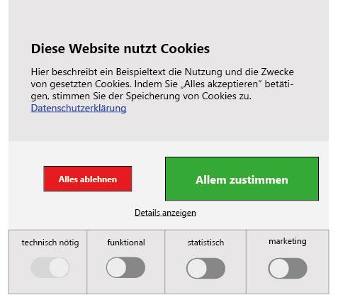
Offering Choices: Let Visitors Control Their Experience
In today’s digital landscape, offering visitors a degree of control over their browsing experience is not just a courtesy; it’s a necessity.When it comes to cookie banners, empowering users to make informed choices can significantly enhance their overall experience. Here’s how to effectively provide options that resonate with your audience:
First and foremost, make sure your cookie banner is clear and concise. Avoid jargon and legalese that can confuse users. Instead, use friendly, straightforward language that explains:
- What cookies are being used—but keep it simple!
- Why they are necessary—explain the benefits, such as personalization or improved functionality.
- How users can manage their preferences—link to more detailed settings if necessary.
Next, consider implementing a tiered consent system. This allows visitors to choose their cookie preferences based on their comfort levels. For instance, you might offer options like:
| cookie Type | Description | User Control |
|---|---|---|
| Essential | Necessary for basic site functions. | Always On |
| Performance | Helps improve site performance. | Opt-In |
| Marketing | Used for personalized ads. | Opt-Out |
This approach not only fosters trust but also enhances user engagement. Visitors appreciate having the flexibility to grant consent for only those cookies they are cozy with. Additionally, remember to include an easily accessible option for users to change their preferences at any time, reinforcing the notion that they are in control.
Moreover, consider the design of your cookie banner. It should be visually appealing yet unobtrusive. Use colors and fonts that align with your brand but ensure that the call-to-action buttons stand out.For example:
- Accept All Cookies
- Customize Preferences
- Reject Non-Essential cookies
don’t forget to test your cookie banner’s user experience. Gather feedback from real users to see how they interact with it. Doing so can provide invaluable insights and help optimize the banner further, ensuring visitors feel informed and respected while navigating your site.
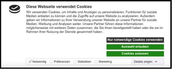
Transparency Matters: Explaining Data usage
When it comes to cookie banners, clarity is key. Users appreciate transparency about how their data is collected and utilized. A well-crafted cookie banner can create an atmosphere of trust, making visitors feel more comfortable engaging with your site. Here’s what you should include to keep your audience informed,without overwhelming them.
Key Information to Include
- Types of Cookies Used: Clearly categorize the cookies your site uses.For example, you could explain the difference between essential cookies, performance cookies, and marketing cookies.
- Purpose of Data collection: Let visitors know how their data contributes to their experience—be it for improving site functionality, personalizing content, or analyzing performance.
- user Control Options: Provide clear options for visitors to manage their preferences. A simple toggle for accepting or rejecting non-essential cookies can go a long way in enhancing user satisfaction.
- Link to Detailed Policy: Always include a link to your comprehensive privacy policy. This ensures visitors can dive deeper into your data practices if they wish.
Designing an Engaging Banner
The design of your cookie banner plays a significant role in user engagement. Aim for a banner that is visually appealing yet unobtrusive. Here are some tips:
- Use a color scheme that aligns with your brand but stands out enough to capture attention.
- Keep the wording concise—focus on essential information only.
- Consider adding a friendly tone to your message, making it feel less like a legal obligation and more like a conversation.
Example of a Cookie Banner
| Banner Element | Sample Text |
|---|---|
| Header | We use cookies to enhance your experience! |
| Body Text | By clicking “Accept All,” you agree to our use of cookies for personalization and analytics. |
| Button 1 | Accept all |
| Button 2 | Manage Preferences |
Remember, visitors respond better to cookie banners that respect their time and intelligence. Providing the right amount of information without overwhelming them creates a positive experience that can lead to better engagement and retention. A thoughtful approach to data usage communication not only meets legal requirements but also builds credibility with your audience.
Incorporating a Fun and Engaging Design
When designing a cookie banner, the goal is to create something that not only informs but also engages your visitors. A well-crafted design can make a seemingly mundane legal requirement feel more like a friendly nudge rather than an intrusive obstacle. Here are some ideas to make your cookie banner stand out:
- Use playful Colors: Bright, inviting colors can help your banner catch the eye without being overwhelming. Consider using your brand colors to maintain consistency while making your banner pop.
- Incorporate Icons or Graphics: Adding a fun icon or illustration can make the banner more visually appealing. for example, a cookie icon can humorously reflect the topic while reinforcing the message.
- Engaging Copy: Rather of the usual dry legal jargon, try to use a light-hearted tone. Phrases like “We love cookies, and we know you do too!” can make your visitors smile while still getting the point across.
Another key aspect is to ensure your cookie banner is user-friendly. Here are a few tips to enhance usability:
- Clear Call-to-Action: Make sure your buttons stand out. Use contrasting colors and clear language,such as “Accept All Cookies” or “Customize Your Preferences,” to guide users smoothly through their choices.
- Mobile Responsiveness: With many users browsing on mobile devices, ensure your cookie banner adapts well to smaller screens. A sleek, compact design can prevent it from taking up too much space.
- Animation Effects: Subtle animations can draw attention without being distracting. A gentle slide-in effect or a fade can make the banner feel more dynamic and engaging.
Lastly, consider personalizing the user experience. A simple approach could be presenting a brief summary of what cookies are used for, enhancing transparency and trust. Here’s a speedy table to illustrate this:
| Type of Cookie | Purpose |
|---|---|
| Essential Cookies | Necessary for website functionality |
| Analytics Cookies | Help us understand how visitors use our site |
| Advertising Cookies | personalize ads based on your preferences |
By incorporating these elements into your cookie banner design, you can create an inviting and engaging experience for your visitors. This approach not only satisfies legal requirements but also builds a positive relationship with your audience, making them more likely to interact with your site and its offerings.
Timing Is Everything: When to Show Your Cookie Banner
Understanding the right moment to present your cookie banner to visitors can significantly enhance user experience and minimize annoyance. The timing of this crucial element can sway user perception and influence their willingness to engage with your site. Here are several strategies to consider:
- On Page Load Delay: Rather than bombarding visitors with a cookie banner the moment they land on your site, consider implementing a slight delay. This allows users to familiarize themselves with your content before they are prompted to accept cookies.
- Scroll Trigger: Display the cookie banner when a user scrolls down a certain percentage of the page. This indicates that they are interested and engaged, making them more likely to view the banner positively.
- Time-On-Site Trigger: Set a timer to show the banner after a visitor has spent a meaningful amount of time on your site. This technique can help ensure that the banner appears when users are invested, reducing the likelihood of irritation.
- Exit Intent: Leverage exit-intent technology to display the cookie banner when a user shows signs of leaving your site. This approach can serve as a gentle reminder of your cookie policy just before they depart.
Choosing the right timing is essential, but it’s equally important to consider the content and wording of your cookie banner. Use concise language that clearly states why cookies are used, emphasizing the benefits to the user, like personalized experiences or enhanced functionality. A well-crafted message can soften the impact of the banner itself.
Incorporating user-friendly features can enhance the experience further. For example, allow users to customize their cookie preferences directly from the banner. This not only provides transparency but also empowers visitors to control their online experience, fostering trust and satisfaction.
| Timing Strategy | Pros | Cons |
|---|---|---|
| On Page Load Delay | Reduces immediate annoyance | May cause users to overlook the banner |
| Scroll Trigger | Indicates user interest | Can be ignored if users scroll past |
| Time-On-Site Trigger | Engaged users are more receptive | Long wait time may frustrate some users |
| Exit Intent | Catch users before they leave | Only works on users about to exit |
Ultimately, the key is to strike a balance between regulatory compliance and user experience. By thoughtfully considering when to present your cookie banner, you can create a smoother interaction that respects your visitors’ time and preferences. Thoughtful timing can transform a potentially frustrating message into a valuable communication tool, paving the way for a more positive user experience.
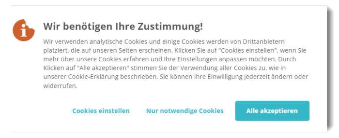
Making It Easy to Accept or Decline Cookies
When it comes to cookie consent banners, the goal is to make it as simple and unobtrusive as possible for users to either accept or decline cookies. A well-crafted cookie banner not only adheres to legal requirements but also enhances user experience. Here are some essential elements to consider:
- Clear Language: Use straightforward language that visitors can easily understand. Avoid jargon and technical terms.Instead of saying “We use cookies to enhance your experience”, try “We use cookies to remember your preferences and improve your browsing experience.”
- Prominent Buttons: Make sure the accept and decline buttons are clearly visible and distinguishable. Use contrasting colors to help them stand out. For example, a bold green for “Accept” and a muted gray for “Decline” can guide users effectively.
- Granular Control: Offer users the option to customize their cookie preferences. This transparency builds trust and makes it easier for users to engage with your site. Consider using a simple toggle system that allows them to opt in or out of specific categories.
To further simplify the decision-making process, you can incorporate a concise summary of what types of cookies you use and their purposes.Here’s a simple table that breaks it down:
| Cookie Type | Purpose |
|---|---|
| Essential Cookies | Necessary for the website to function properly. |
| Performance Cookies | Help us understand how visitors interact with our site. |
| Functional Cookies | Allow us to remember user preferences and provide enhanced features. |
| Targeting Cookies | Used to deliver advertisements relevant to you. |
Additionally, consider incorporating a brief sentence that reassures visitors about their privacy. Something like, “Your privacy matters to us, and we only use cookies to improve your experience.” This small touch can significantly reduce resistance toward cookie acceptance.
Lastly,ensure that your cookie banner is dismissible and does not reappear excessively once a user has made their choice. A persistent banner can quickly become irritating, detracting from the overall user experience. Keep it light, friendly, and non-intrusive for the best results.
Encouraging Trust with Privacy Policies
Building trust with your website visitors is essential, and a well-crafted privacy policy can play a significant role in that process. When incorporating a cookie banner,it’s vital to clearly communicate how you handle user data and what that means for their privacy. here’s how to make your privacy policy resonate with your audience:
- Transparency is Key: Ensure that your policy outlines exactly what types of cookies are used, how they are collected, and the purposes they serve. This openness helps visitors feel secure in their choices.
- Easy-to-Understand Language: Avoid legal jargon. Use simple terms that your visitors can easily grasp. As an example, instead of saying “personal identifiable information,” say “information that can identify you.”
- Customization Options: Allow users to customize their cookie preferences. Incorporating a straightforward mechanism for users to opt in or out of specific cookies can enhance their sense of control.
Additionally, consider positioning your privacy policy in a way that’s hard to overlook. A concise summary on the cookie banner itself can draw visitors in, encouraging them to read further. Here’s a simple layout suggestion:
| Cookie Type | Purpose | Duration |
|---|---|---|
| Essential Cookies | Required for site functionality | Session |
| analytics Cookies | Used for tracking site performance | 1 Year |
| Advertising Cookies | Personalized ads based on browsing behavior | 6 Months |
Moreover, keep your privacy policy easily accessible. Having a dedicated link in the footer of your website and in the cookie banner itself can encourage visitors to delve deeper without feeling pressured.This accessibility fosters a sense of trust, as users know they can always find detailed information regarding their privacy.
Lastly,consider updating your privacy policy as regulations change or as your practices evolve. Communicating these changes to your visitors can reinforce the idea that their privacy is a priority for you. Regular updates not only keep your content fresh, but they also show that you’re actively committed to protecting their information.
Using Humor to Lighten the Mood
Let’s face it, cookie banners are often more of a headache than a help. They pop up uninvited, like a relative at a family reunion who just won’t stop talking about their cat. but what if you could turn that annoyance into a chuckle? Using humor in your cookie banner can not only lighten the mood but also make your site feel more welcoming. Here are some playful ideas:
- “Cookies? We’re not talking about the chocolate chip kind, but those pesky data ones!”
- “We use cookies to make your experience sweeter! No baking required.”
- “Our cookies are like good friends – they help us remember you!”
- “Hurry! Accept our cookies before they crumble!”
humor can be a great icebreaker,especially when it comes to topics that might feel invasive,like data collection. A sprinkle of wit can help your visitors feel at ease.Imagine a banner that reads:
| Cookie banner Message | Potential Visitor Reaction |
|---|---|
| “We promise not to share your data… unless they have cookies!” | Laughs and feels less defensive |
| “Accepting cookies is like giving us a high-five!” | Feels good about engaging with the site |
| “if you accept our cookies, we’ll tell you a secret!” | Curiosity piqued, smiles all around |
Adding a dash of humor humanizes your brand and creates a memorable interaction.Your cookie banner could even mimic funny cookie-themed phrases, enticing visitors to click “Accept” instead of dismissing it as just another boring legal requirement. Puns like “We knead your acceptance!” or “don’t worry, we’re not cookie monsters!” can be irresistible.
Ultimately, the goal is to create a balance between compliance and charm. A cookie banner that evokes a smile will not only encourage acceptance but also enhance user engagement. So, go ahead—make your visitors chuckle, and they just might stick around a little longer!
testing and Optimizing Your Cookie Banner for Better Engagement
Creating a cookie banner that resonates with your audience is all about testing and optimizing. Start by assessing the current performance of your cookie banner through analytics tools. Look for metrics like click-through rates and user engagement. If visitors are dismissing your banner quickly, it’s a sign that something isn’t quite right.
to improve engagement, consider A/B testing different versions of your cookie banner. You can experiment with:
- Copy Variations: Test different messages that explain the purpose of cookies more clearly.
- Design Elements: Change colors,fonts,or sizes to see what grabs attention.
- Placement: Try positioning the banner at the top, bottom, or even as a pop-up to find the most effective spot.
Don’t forget to incorporate user feedback into your optimization efforts. You can create a simple feedback form to ask visitors what they think about the banner. use their insights to refine your copy and design further. Here’s an example of how to structure the feedback:
| Feedback Question | Response Options |
|---|---|
| Was the cookie banner clear? | Very Clear / Somewhat Clear / Not Clear |
| Did you find it intrusive? | Yes / No |
| Woudl you like to see more information? | Yes / No |
Additionally,consider the timing of your cookie banner. Avoid showing it immediately upon landing on your site; instead, wait until the visitor has engaged with your content for a few seconds. This not only reduces annoyance but also increases the chances of them accepting cookies willingly. You could also offer an incentive, like exclusive content or a discount, to encourage users to consent to cookies.
Lastly, keep your messaging transparent and concise. Clearly state what data you collect and how it will be used. Here’s a simple template you might use:
“We use cookies to enhance your experience. By clicking ‘Accept,’ you agree to our Privacy Policy and the use of cookies. you can manage your preferences anytime.”
By continuously testing and optimizing your cookie banner, you can strike the right balance between compliance and user satisfaction, leading to a more enjoyable experience for your visitors.
Frequently Asked Questions (FAQ)
Q&A: What to Put On A Cookie banner So Visitors Aren’t Annoyed
Q: Why do I need a cookie banner on my website?
A: Great question! A cookie banner is essential for compliance with privacy laws like GDPR and CCPA. It informs your visitors about data collection practices and ensures they have a choice in what they share.But remember, it’s not just about compliance; it’s also about building trust with your audience!
Q: What kind of language should I use on the cookie banner?
A: Keep it simple and conversational. Avoid legal jargon and use friendly, approachable language. Such as, instead of saying “We utilize cookies,” try something like, “We use cookies to make your experience better!” This makes it feel less like a legal obligation and more like a helpful feature.Q: Should I include options for visitors?
A: Absolutely! Giving visitors options is key to a user-friendly cookie banner. include clear choices like “Accept All,” “Reject All,” and “Customize Preferences.” This shows respect for their choices and allows them to control their experience on your site.
Q: How detailed should I be about what cookies I use?
A: Be transparent but concise. Provide a brief description of what cookies are and why you use them. As a notable example, “We use cookies to personalize content and analyze our traffic.” You can link to a more detailed cookie policy if visitors want to learn more, but keep the banner itself focused and easy to digest.
Q: What if my website only uses essential cookies?
A: If you only use essential cookies that are necessary for the website to function, it’s still good to inform your visitors. Try saying, “We only use essential cookies to ensure our site runs smoothly. No need to manage preferences here!” This gives reassurance and eliminates unnecessary fuss.
Q: How can I make the banner visually appealing?
A: Design matters! Use colors that align with your website’s theme but make sure it stands out enough to catch visitors’ attention. Consider adding a friendly graphic or icon that represents cookies. A visually appealing banner can make the experience feel more inviting rather than intrusive.
Q: How often should I show the cookie banner?
A: Ideally,you want to show the banner only once per visitor. Once they’ve made their choice, remember it for future visits. This minimizes annoyance and creates a smoother user experience. If they clear their cookies, you can show it again, but keep it to a minimum!
Q: What’s the best way to test my cookie banner?
A: Testing is crucial! Gather feedback from users about their experience with the cookie banner. Are they confused? Is it easy to navigate? Use A/B testing to try out different wording or designs and see what resonates best with your audience. Adjust based on their preferences to ensure satisfaction.
Q: Any final tips?
A: Yes! Always keep your audience in mind. Approach your cookie banner as an opportunity to engage rather than an obligation. by making it user-friendly, informative, and visually appealing, you’ll create a positive first impression that encourages visitors to explore the rest of your site!
closing Remarks
Wrapping It Up: Crafting the Perfect Cookie Banner
And there you have it! Creating a cookie banner that strikes the right balance between compliance and user-friendliness doesn’t have to be a daunting task.Remember, the goal is to inform your visitors without overwhelming them. By keeping your message clear, concise, and respectful of their choices, you can enhance their browsing experience while still adhering to regulations.
Take the time to personalize your cookie banner and make it an integral part of your website’s charm. After all, a little transparency goes a long way in building trust with your audience. So, why not give it a shot? Implement these tips, and watch your visitors appreciate your thoughtful approach.
If you found these insights helpful, share this article with your fellow webmasters or anyone interested in creating a better online experience. Let’s make the internet a friendlier place, one cookie banner at a time! Happy website designing! 🍪✨