
Are you ready to take your WordPress site to the next level? If you’ve ever glanced at your blog or website and thought, “Hmm, that column looks a bit cramped,” you’re not alone! Column width can have a huge impact on the way your content is displayed, influencing everything from readability to overall aesthetics. Whether you’re showcasing stunning images, writing engaging blog posts, or setting up an online store, having the right column width can make all the difference. In this beginner’s guide, we’ll walk you through the simple steps to change column width in wordpress, ensuring your site looks exactly how you envision it. So, roll up your sleeves, and let’s dive in—your website deserves to look its best!
Understanding the Importance of Column Width in WordPress
When designing your WordPress site, one aspect that frequently enough gets overlooked is the column width. The width of your columns can significantly impact not just aesthetics, but also user experience and functionality. A well-structured layout helps your content breathe, making it easier for visitors to read and navigate.
Consider the following key points:
- Readability: Wider columns can be harder to read, especially for large blocks of text. Aim for a balance that allows for comfortable reading without straining the eyes.
- Responsiveness: Your columns should adjust seamlessly across different devices. A fluid design enhances usability, ensuring your site looks great on desktops, tablets, and smartphones.
- Visual Hierarchy: Effective column width can definitely help establish a clear visual hierarchy. By varying widths, you can guide your readers’ attention to critically important content, such as calls to action or featured posts.
Choosing the right column width can also affect loading times. If your columns contain heavy media elements, an excessively wide layout might slow down your site. Remember, faster loading times lead to better user retention and improved SEO rankings.
To illustrate the impact of column width, here’s a simple comparison of common layouts:
| Layout Style | Column Width | best For |
|---|---|---|
| Single Column | Full Width | Long-form articles or blogs |
| Two Columns | 50% width Each | Product showcases or galleries |
| Three Columns | 30% Width Each | service comparisons or portfolios |
Experimenting with different column widths can lead to surprising results. Tools like the WordPress block editor allow you to easily adjust and preview these changes in real-time, ensuring you find the perfect balance for your site’s unique requirements.
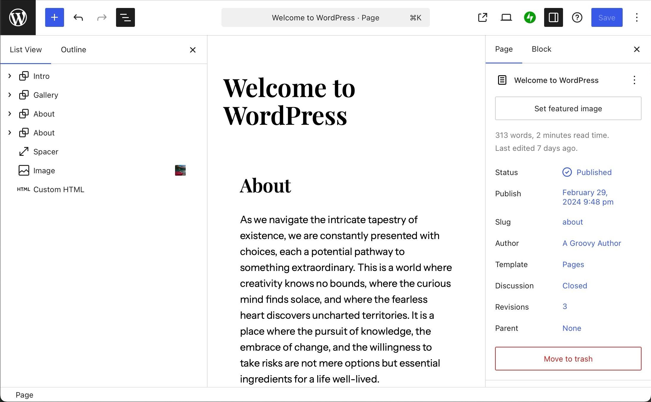
Getting Started with the WordPress Editor for column Adjustments
When you’re ready to dive into the WordPress editor for your column adjustments, it’s easier than you might think! The block editor (Gutenberg) provides a user-kind interface that simplifies the process of changing column widths, allowing you to create a layout that best fits your content needs.
First, ensure you have added a Columns block to your post or page. Once you’ve done that, you can begin to adjust the widths of your columns:
- Click on the Columns block to select it.
- In the right sidebar, you’ll see options to adjust the width. You can choose between predefined column layouts or go for a custom setup.
- For custom proportions, simply drag the handles that appear between the columns to resize them as desired.
If you want a more precise control over your columns, you can utilize the settings panel that appears on the right side of the editor. Here, you can manually adjust the width by using percentage values, which can be notably useful for creating balanced layouts:
| Column Width Percentage | Layout Example |
|---|---|
| 50% | Two equal columns |
| 70% / 30% | One wide column, one narrow column |
| 25% / 25% / 50% | Two narrow columns with one wide column |
After setting your desired widths, don’t forget to preview your changes.Click on the Preview button to see how your columns look on different devices. Responsive design is crucial, and ensuring that your columns adjust beautifully on both mobile and desktop views will improve user experience significantly.
Another great tip is to utilize spacing settings within the block editor. You can add padding and margins to your columns for a more polished look. It helps to have enough space between your content elements so they don’t feel cramped. A little breathing room can go a long way when it comes to visual appeal!
Lastly, remember to save your changes frequently. WordPress autosaves, but it’s always good practice to hit that Update button to ensure your adjustments are securely saved. Experiment with different layouts and find what works best for your content style.
Exploring Different Layout Options for Your WordPress Site
when it comes to designing your WordPress site, the layout can make or break the user experience. The flexibility of WordPress allows you to customize your column widths, giving you control over how your content looks and how it’s presented to your audience.Whether you’re running a blog, an online store, or a portfolio site, understanding how to manipulate column widths is essential for achieving the perfect layout.
To modify the width of your columns in WordPress, you can use various methods depending on your theme and preferences. Here are some common approaches:
- Custom CSS: This method allows you to fine-tune your layout by adding custom styles directly into your theme’s stylesheet. By targeting specific classes, you can control the width of your columns with precision.
- Page Builders: Plugins like Elementor or Beaver Builder provide intuitive drag-and-drop interfaces that let you adjust column widths visually. This is particularly helpful for those who prefer a more hands-on approach without delving into code.
- Theme Options: Many modern themes come with built-in customization options that let you change column widths easily through the WordPress Customizer. This is a user-friendly approach that doesn’t require any coding knowledge.
Here’s a speedy CSS example to get you started:
/ Adjusting column widths /
.column {
    width: 50%; / Change this percentage according to your needs /
    float: left;
    padding: 10px;
}
If you’re using a page builder and want to explore different column configurations, consider the following popular layouts:
| Layout Type | Column Structure | Best For |
|---|---|---|
| Single Column | 1 Column | Blogs, Articles |
| Two Columns | 50/50 split | Product Listings, News |
| Three Columns | 33/33/33 Split | Gallery, Portfolios |
| Custom Columns | Variable Widths | Creative Layouts |
Choosing the right layout not only enhances the aesthetic appeal of your site but also improves usability. Test different configurations to see how they affect the flow of your content. Remember, the ultimate goal is to create a layout that is visually engaging while guiding your visitors seamlessly through your site.
Don’t hesitate to experiment with different column widths and layouts. After all, adjusting the visual elements of your site can significantly impact user engagement and conversion rates. So, dive in and unleash your creativity!
Using the Block Editor to Change Column Width Effortlessly
Changing column widths in the Block Editor is straightforward and empowers you to create dynamic layouts with ease. Whether you’re designing a blog post, a landing page, or a portfolio, having control over the width of your columns allows you to highlight content effectively.
To get started, simply add a Columns block to your post or page.You’ll find this option in the block inserter. Once you’ve added the block, you can choose between different column configurations, such as two or three columns.This initial setup gives you a great foundation to start from.
Adjusting the width of your columns is a breeze. Select the Column block you want to customize, and look for the Block settings panel on the right side. Here you’ll see an option to adjust the width of the column using a simple slider or by entering specific values. This flexibility means you can create a variety of layouts to suit your content’s needs.
another handy feature is the ability to set different widths for each column. This is especially useful when you have text and images that require varying amounts of space. Imagine wanting your text column to take up 70% of the space while your image takes up the remaining 30%. With just a few clicks, you can achieve this and create a visually appealing layout.
For those who love precision, using custom CSS can further enhance your column styling. You can add CSS classes to your columns for more control over their appearance, including padding, margins, and background colors. This is where you can really let your creativity shine, making your content stand out.
Here’s a quick overview of how to modify your column widths:
| Step | Description |
|---|---|
| Add Columns block | Choose the number of columns you need. |
| Select Column | click on the specific column you want to modify. |
| Adjust Width | Use the Block settings to set the desired width. |
| Customize Further | Apply CSS for unique styling and layout. |
With these simple steps, you can effortlessly change column widths in the Block Editor, allowing you to create layouts that are not only functional but also engaging. This level of customization empowers you to present your content in the best light, ensuring that your readers have a seamless experience.
Tips for Adjusting Column Width in Classic Editor
Adjusting column widths in the Classic editor of WordPress can significantly enhance the layout of your posts and pages. here are some practical tips to help you master this skill effortlessly:
- Use the Table Block: Tables offer a straightforward way to create columns. Simply insert a table block and customize the widths by dragging the borders of each column. This allows for precise control over the layout.
- Customize with HTML: If you’re comfortable with a little code, switch to the Text editor. You can manually adjust column widths using inline CSS. For example, using
style="width: 50%;"can split your content evenly. - Utilize Shortcodes: Some themes or plugins come with built-in shortcodes to create columns. Check your theme documentation to see if there are any specific shortcodes for columns that you can use.
- Preview Your Changes: Always preview your changes before publishing. The Classic Editor allows you to see how your adjustments look on the front end, making it easier to fine-tune column widths as needed.
Here’s a simple example of a table with customized columns that you can create in the Classic Editor:
| Column 1 | Column 2 |
|---|---|
| Content for column one. | Content for column two. |
| More content here. | And some here too! |
Another tip is to leverage CSS classes available in your theme. You can add classes to your columns that are predefined in your stylesheets, allowing for consistent widths and styles across your site. For example, using a class like text-align-center can help align your content beautifully.
Lastly, don’t hesitate to experiment! While it’s important to have a structured layout, creativity can lead to stunning results. Play around with different widths and configurations until you find the perfect look for your content. happy editing!
Leveraging Page Builders for Custom Column Widths
When it comes to creating visually appealing layouts in WordPress, page builders are your best friend. These intuitive tools offer a range of customization options, allowing you to define custom column widths that can make your site stand out. Whether you’re using popular plugins like Elementor, WPBakery, or Beaver Builder, adjusting column widths can enhance the organization of your content, making it more accessible and engaging for your visitors.
One of the major advantages of page builders is their drag-and-drop interface, which simplifies the process of adjusting column widths. Here’s how you can leverage these features effectively:
- Visual Editing: As you drag the sliders or input values, you can see the changes in real-time, allowing for quick adjustments.
- Predefined Layouts: Many page builders come with tailored column presets that you can modify, giving you a solid starting point.
- Responsive Controls: Be sure to check how your custom widths appear on different devices. Most builders offer options to set different widths for mobile,tablet,and desktop views.
Here’s a quick look at how different page builders handle column width customization:
| Page Builder | Column Customization | Responsive Options |
|---|---|---|
| Elementor | Drag to adjust or enter values | Yes, separate settings for each device |
| WPBakery | Select from predefined ratios or custom widths | Yes, with visibility toggles |
| Beaver Builder | Flexible grid system with adjustable widths | Yes, with specific breakpoints |
Customizing column widths isn’t just about aesthetics; it also plays a critical role in user experience. Properly sized columns can lead to better readability and help guide your visitors through your content seamlessly. Consider the type of content you are displaying. As a notable example, if you’re showcasing a gallery alongside a text block, wider columns for the gallery can allow for larger images, while narrower text columns can enhance readability.
Moreover, remember to maintain a balance. Overly wide columns can overwhelm the reader, while too narrow ones may create a fragmented look.Strive for harmony in your layouts to ensure that both text and visuals complement each other effectively.
Lastly, don’t forget to test your designs thoroughly. Preview your page on multiple devices and screen sizes to confirm that your custom widths translate well across all platforms. This attention to detail will not only improve your site’s appearance but also enhance user engagement and retention.
Best Practices for Responsive Column Widths on Mobile Devices
When designing a website, especially for mobile devices, achieving a responsive layout is crucial. This ensures that your content looks good and is easily navigable across various screen sizes. Here are some best practices to consider for responsive column widths:
- Use Percentage-Based Widths: Instead of fixed pixel widths, opt for percentage-based widths for your columns. This allows columns to resize dynamically based on the screen size. For example,setting a column width to
width: 50%ensures it will take up half the available space,nonetheless of the device. - Implement CSS Flexbox: Using Flexbox can greatly enhance your layout’s responsiveness. This modern CSS layout module makes it easier to arrange columns in a flexible way.As an example,by using
display: flex; on the parent container,you can achieve a smooth alignment and distribution of space among your columns. - Utilize Media Queries: Media queries allow you to apply different styles based on the viewport size. By defining breakpoints, you can modify column widths at specific screen resolutions. Such as:
@media (max-width: 600px) {
    .column {
        width: 100%;
    }
}
This CSS rule will stack your columns vertically on screens smaller than 600 pixels, providing a cleaner look on mobile devices.
Another effective technique is to leverage the grid system provided by frameworks like Bootstrap. Here’s a simple table that outlines how you can define different column sizes across various screen sizes:
| Device Size | Column Class | Column Width |
|---|---|---|
| Extra Small | .col-12 | 100% |
| Small | .col-6 | 50% |
| Medium | .col-4 | 33.33% |
| Large | .col-3 | 25% |
Lastly, don’t forget to test your layout on real devices. Emulators can give you an excellent idea of how your website will look, but nothing beats checking it on actual mobile devices. This way, you can ensure that the user experience is seamless and visually appealing, regardless of the screen size.
Troubleshooting Common Issues When Changing Column Width
Changing column widths in WordPress can occasionally lead to unexpected issues. Here are some common problems you might encounter while adjusting your layout, along with helpful suggestions to resolve them.
Column Width Not Responding: One of the most frustrating issues can be when your column adjustments aren’t reflected in the visual editor. If this happens, try clearing your browser’s cache or refreshing the editor. Sometimes, a simple reload can fix temporary glitches.
Content Overflowing: If you notice that text or images are spilling out of the designated column after adjusting the width, it might be due to fixed widths set in your CSS. Check your theme’s CSS settings and ensure that the `max-width` or `overflow` properties are set correctly. To fix it, you may need to adjust your CSS code like this:
.my-column {
        max-width: 100%;
        overflow: hidden;
    }
Inconsistent Column Sizes: If your columns look uneven, double-check that you’re using the same unit of measurement (pixels, percentages, etc.) across all columns. Inconsistent measurements can lead to a jarring layout.Here’s a simple table to illustrate this:
| Column | Width |
|---|---|
| Column 1 | 50% |
| Column 2 | 50% |
| Column 3 | 33.33% |
| Column 4 | 66.67% |
responsive Issues: ensure your columns are responsive across different devices. If your layout breaks on mobile, consider using CSS media queries to set different column widths based on screen size.As a notable example:
@media (max-width: 768px) {.my-column {
            width: 100%;
        }
    }
By addressing these common issues, you can achieve a well-structured and visually appealing layout in your WordPress posts and pages!
Enhancing User Experience with Smart Column Adjustments
When it comes to creating an engaging website, column adjustments can play a crucial role in enhancing the overall user experience. By fine-tuning column widths, you can ensure that your content is displayed in a way that is both visually appealing and easy to navigate.Here are some effective strategies to consider:
- Prioritize Readability: Wider columns can make text harder to read, especially for long paragraphs. Aim for a balanced layout where the column width allows for comfortable reading without straining the eyes.
- Visual Hierarchy: Use varying column widths to establish a hierarchy in your content. Such as, a wider column for main text and narrow columns for sidebars can guide users’ attention effectively.
- Responsive Design: Ensure your columns adapt elegantly on different devices. Test how they resize on mobiles and tablets, and adjust widths accordingly for a seamless experience.
One way to implement these adjustments is through WordPress’ built-in editor capabilities. The Gutenberg editor provides a straightforward way to modify column widths, allowing you to drag and drop to your desired specifications. This flexibility not only saves time but also empowers you to experiment with layouts without needing extensive coding knowledge.
If you want to take it a step further, consider using CSS to achieve more precise control over column widths. Here’s a simple example of how to set different widths for columns:
        .my-column {
            width: 50%; /* Adjust as needed */
            float: left;
            padding: 10px;
        }
Additionally, leveraging plugins that specialize in layout customization can be a game changer. Popular options like Elementor or WPBakery allow you to visually adjust columns and see results in real-time, making the process intuitive.
| Column Type | Best Use Case | Recommended Width |
|---|---|---|
| Main Content | Articles and Blogs | 70% – 80% |
| Sidebar | Additional Resources | 20% – 30% |
| Footer | Contact Info and Links | 100% |
By focusing on smart column adjustments, you’re not just changing the look of your website; you’re optimizing it for better engagement and retention. Remember, a well-structured layout invites users to explore more, turning casual visitors into loyal followers.
Previewing Changes Before Publishing Your WordPress Post
Before hitting the publish button, it’s crucial to preview how your changes will appear to your readers. WordPress makes this process straightforward, allowing you to see your adjustments in a live environment without making them public just yet. Here’s how you can effectively preview your updates.
When you’re editing your post, look for the “Preview” button located in the top-right corner of the editor. Clicking this will open a new tab showing exactly how your post will look once published. This is your chance to catch any potential issues and fine-tune elements such as:
- Images: Ensure they are displayed correctly and have appropriate alignment.
- Formatting: Check that headings,bullet points,and text styles appear as intended.
- Links: Test hyperlinks to confirm they lead to the correct destinations.
- Responsiveness: Verify how the post looks on different devices, like smartphones and tablets.
Another handy feature is the ability to see your post in different formats. Use the “Preview as” option to check how the post looks to different user roles, such as a logged-in user versus a guest. This ensures that all your readers will have a seamless experience, no matter how they access your content.
If you’re making significant layout changes, consider using the Custom CSS option available in the editor. This allows you to apply specific styles to your columns and other elements. Previewing these changes in real-time can help you visualize how they enhance your post’s overall appeal.
| Aspect | Preview Tip |
|---|---|
| Text Alignment | Make sure it’s easy to read; adjust as necessary. |
| Column Layout | View on mobile and desktop for optimal spacing. |
| Call to Action | Ensure it stands out and prompts action effectively. |
don’t forget to check your SEO settings before finalizing everything. Preview how your meta description and title will appear in search engine results. A compelling preview can significantly affect your click-through rates once the post is live.
Maintaining Consistency Across Your Websites Columns
When designing your website, maintaining a cohesive look across all columns is essential for a seamless user experience. In WordPress, there are several methods to ensure your columns not only look great but also align perfectly with your overall branding. Here are some key tips to achieve that uniformity:
- Use a Consistent Grid System: Implement a grid system that defines the column width across all your pages. This can easily be achieved through CSS frameworks such as Bootstrap or via WordPress themes that support grid layouts.
- Set Fixed Widths: While responsive design is crucial, sometimes you may want to fix the width of your columns for specific elements. From your theme’s customizer,you can input specific pixel values or percentages to standardize the look.
- Test on Multiple Devices: Ensure your columns maintain their integrity across various screen sizes. Utilize WordPress’s responsive preview tools or simply resize your browser to see how your columns adapt.
Another effective way to maintain consistency is by utilizing CSS classes. By defining styles for your columns, you can easily apply the same look throughout your site. Here’s an example of CSS that can definitely help in achieving uniformity:
.column {
    width: 30%; /* Adjust according to your layout */
    float: left;
    margin: 0 1.5%; /* Provides space between columns */
    box-sizing: border-box; /* Ensures padding and border are included in total width */
}
Additionally, if you’re using a page builder like Elementor or WPBakery, leverage their built-in options to set column widths. These tools offer visual interfaces that make tweaking dimensions a breeze, allowing you to see changes in real-time without delving into code.
| Column Setting | Description |
|---|---|
| Equal Widths | Distribute columns evenly for a symmetrical look. |
| Variable Widths | Adjust widths for emphasis, such as highlighting a main content area. |
| Mobile First | Start with narrow widths and adjust for larger screens to improve responsiveness. |
Ultimately, taking the time to fine-tune the widths of your columns not only enhances your site’s aesthetic appeal but also boosts usability. Visitors are more likely to stay on a site that is visually appealing and easy to navigate. Remember, consistency is key, so keep experimenting until you find the perfect balance for your website!
Final Thoughts on Mastering Column Width in WordPress
As you delve into the nuances of adjusting column widths in WordPress, it becomes evident that mastering this skill can significantly enhance your site’s visual appeal and user experience. the layout of your content not only affects aesthetics but also plays a crucial role in readability and engagement. When visitors arrive at your site, the first thing they notice is the layout, and a well-organized structure can keep them coming back for more.
Understanding how to effectively change column widths can lead to:
- Improved readability: Wider columns can enhance text legibility, while narrow columns can create a more dynamic visual flow.
- Better content organization: Properly adjusted columns allow for a more logical arrangement of information,helping users find what they need quickly.
- Increased engagement: A visually appealing layout can captivate visitors, encouraging them to explore your content further.
When experimenting with column widths, consider the following strategies:
- Responsive design: Ensure your column widths are adaptable to different screen sizes. This will create a seamless experience for users on both desktop and mobile devices.
- A/B testing: Try different column widths and layouts to see what resonates best with your audience. tools like Google Analytics can help you measure user interaction.
- CSS Customizations: Don’t hesitate to dive into the custom CSS to fine-tune your column widths even further. A bit of coding knowledge can go a long way in achieving the desired layout.
To illustrate how simple changes can make a big difference, let’s consider a quick comparison of typical column setups:
| Column Setup | Width | Best For |
|---|---|---|
| Single Column | 100% | Long-form articles or blogs |
| Two Columns | 50% Each | Comparative content or side-by-side images |
| Three Columns | 33.33% each | Portfolios or product showcases |
Ultimately, the key to success lies in the balance between aesthetics and functionality. By adjusting column widths thoughtfully, you can create an engaging and user-friendly experience that encourages visitors to explore your content further. Remember, this small detail can significantly impact how your audience interacts with your site, leading to greater satisfaction and loyalty.
Frequently Asked Questions (FAQ)
Q&A: How to change Column Width in WordPress (Beginner’s Guide)
Q1: Why would I want to change column width in WordPress?
A1: Great question! Changing column width can significantly enhance the appearance of your content. A well-structured layout makes your website more visually appealing and improves readability. It helps emphasize important information, making it easier for your visitors to engage with your content.
Q2: is changing column width difficult for beginners?
A2: Not at all! We designed this guide specifically with beginners in mind. With a few simple steps, you’ll be able to adjust column widths without any coding knowledge. Trust me, once you get the hang of it, you’ll feel more confident in customizing your site!
Q3: What tools or plugins do I need to change column widths?
A3: You can do it with just the built-in WordPress editor! Additionally, page builder plugins like Elementor or WPBakery Page Builder offer intuitive drag-and-drop features to adjust column widths easily. If you prefer a more hands-on approach, you might consider using custom CSS for finer control.
Q4: Can you walk me through the process of changing column width using the Block Editor?
A4: Absolutely! Here’s a quick rundown:
- Open a post or page in the Block Editor.
- Select the columns block where you want to adjust the width.
- Click on the ‘Block Settings’ on the right sidebar.
- Use the ‘Column Width’ slider to adjust the size of individual columns.
And there you go! Your columns will resize instantly.
Q5: What if I’m using a theme that doesn’t support column adjustments?
A5: Don’t worry! Many themes come with built-in options for column layouts. if your theme is restrictive, consider switching to a more flexible theme or using a page builder plugin. There are plenty of options out there that will give you the freedom you need to create the perfect layout!
Q6: Will changing column widths affect my site’s mobile responsiveness?
A6: it can! That’s why it’s essential to preview your changes on mobile devices. Most page builders and themes are designed to be responsive, but always double-check to ensure that your content looks great on all screen sizes. A little adjustment might be needed for mobile views!
Q7: What are some design tips for setting column widths effectively?
A7: Keep it simple! Use contrasting widths to create a visual hierarchy—narrow columns for quotes or sidebars and wider columns for main content. Also, consider white space; it enhances readability and creates a clean, organized look.Your visitors will appreciate the thought you put into your layout!
Q8: I’m still unsure. Is there a way I can practice before making changes to my live site?
A8: Absolutely! The best way to practice is by creating a staging site. Many hosting providers offer this feature, allowing you to experiment with changes without affecting your live site.It’s a safe space for you to play around and build your confidence!
Q9: Any final advice for someone new to changing column widths?
A9: Don’t be afraid to experiment! Play around with different layouts and widths until you find what feels right. The more you practice, the better you’ll become at creating stunning, user-friendly designs. And remember, your website is a reflection of your brand—make it shine!
Feel free to ask more questions if you’re curious about anything else related to WordPress design or functionality! We’re here to help you succeed in your journey!
Wrapping Up
And there you have it! Changing the column width in WordPress is easier than you might have thought, right? With just a few simple steps, you can enhance the layout of your posts and pages, making them not only more visually appealing but also easier for your readers to navigate.Remember, a well-structured layout can significantly improve user experience, keeping your audience engaged and coming back for more. So don’t hesitate to play around with those column widths until you find the perfect fit for your content.
If you found this guide helpful, share it with fellow WordPress users who might be struggling with the same issue! And of course, feel free to drop any questions or thoughts in the comments below—we love hearing from you! Now, go ahead and let your creativity flow as you design your WordPress site just the way you envision it. Happy blogging!