In today’s digital landscape, a well-designed website is more than just a pretty face—it’s your online calling card. Whether you’re a small business owner, a passionate blogger, or a creative agency, the aesthetics of your website can make or break your frist impression. Have you ever clicked away from a site simply because it looked cluttered or hard to read? You’re not alone! The truth is, the right background, font choice, and other visual elements can transform a good website into a great one. In this article,we’ll dive into the essentials of web design aesthetics,exploring why these choices matter and how they can elevate your site’s appeal.By the end, you’ll be equipped with the insights needed to create a visually stunning and user-kind website that captures your audience’s attention and keeps them coming back for more. So, let’s get started on this journey to design greatness!
Understanding the Impact of Color Choices on User Experience
When it comes to designing a website, the colors you choose are more than just aesthetics—they can profoundly influence user behavior and emotions. Color has the remarkable ability to evoke feelings and set the tone for your brand, ultimately guiding users through their journey on your site. Here’s how different colors can affect user experience:
- Red: Often associated with urgency and excitement,it can be effective for calls to action.Think sale banners or “limited time offer” messages.
- Blue: This color evokes feelings of trust and calm, making it a popular choice for financial and healthcare websites. It helps users feel secure in their decisions.
- Green: Linked to nature and tranquility, green is perfect for brands focusing on health, sustainability, or environmental concerns.
- Yellow: Bright and cheerful, yellow can capture attention but should be used sparingly, as too much can overwhelm users.
Beyond individual colors,the overall color scheme plays a crucial role.A well-thought-out palette can create a cohesive experience that resonates with your audience. Consider using a combination of contrasting colors to enhance visibility and readability. as an example, dark text on a light background is often easier to read than the reverse. Here’s a simple table that illustrates effective color combinations:
| Background Color | Font Color | effect |
|---|---|---|
| White | Black | High readability,professional |
| Light Gray | Dark Blue | Modern and sophisticated |
| Soft Green | Dark Brown | Earthy,organic feel |
| Peach | Deep Red | Warm and inviting |
It’s also essential to consider accessibility when choosing your color scheme. Ensure that there’s enough contrast between your text and background colors so that users with visual impairments can easily read your content. Tools like the WebAIM Contrast Checker can help assess your color combinations.
Lastly, remember that your color choices should align with your brand identity. Consistency across your website’s colors reinforces brand recognition and can create a more memorable user experience. A unified color palette not only enhances visual appeal but also helps convey your message more effectively.
Choosing the Right font: Why it Matters More than You Think
When it comes to website design,the font you choose plays a pivotal role in shaping the user experience. It’s more than just aesthetics; it influences readability, accessibility, and even the emotional response of your audience. Selecting the right typeface can enhance your message, establish brand identity, and create a cohesive visual style that resonates with visitors.
Consider the following points when choosing a font:
- Readability: A font may look stunning, but if users struggle to read your content, they will quickly lose interest. Aim for fonts that are easy on the eyes, especially for body text.
- Brand Identity: Fonts carry personality. A playful font may work for a children’s toy store, while a serif font conveys professionalism for a law firm. Your font should reflect your brand’s mission and values.
- Consistency: Maintain a consistent typography hierarchy throughout your site. This means using different font sizes and weights to distinguish headings,subheadings,and body text,which helps guide the reader’s attention.
Additionally, contrast matters. A well-contrasted font against the background enhances visibility. Dark text on a light background is typically easier to read. But don’t stop there; consider the following:
| Background Color | Font Color | Contrast Ratio |
|---|---|---|
| White | Black | 21:1 |
| Light Gray | Dark Gray | 5.6:1 |
| Navy | Light Blue | 4.5:1 |
Don’t forget mobile users! Ensure that your chosen font is legible on all devices, irrespective of screen size. A font that looks great on a desktop may not translate well to a smartphone. Test your typography across different devices to guarantee a seamless experience.
embrace the power of pairing fonts. Using a combination of fonts—such as a sans-serif for headings and a serif for body text—can create visual interest and enhance readability. Just ensure they complement each other and maintain consistency in tone and style.

The Psychology of Backgrounds: Setting the Right Mood for Your Site
When designing a website, the background plays a crucial role in shaping user experience and conveying the right message. The psychology of colors and textures can substantially influence how visitors perceive your brand. A bold, vivid background can evoke excitement and energy, while softer tones frequently enough promote relaxation and calm. Choosing the right background isn’t just about aesthetics; it’s about creating an atmosphere that resonates with your audience.
Consider the following elements when selecting a background:
- Color Psychology: Different colors evoke different emotions. For instance, blue often instills trust, while red can create a sense of urgency.
- Texture: Smooth gradients can create a modern feel, while textured backgrounds add depth and character.
- Imagery: A well-chosen image can tell your story at a glance, but make sure it doesn’t overpower your content.
Adding to this,the choice of font interacts with your background to enhance or detract from the overall vibe. Fonts should complement your background,ensuring readability and enhancing your message. Consider pairing a simple sans-serif font with a vibrant background for a modern look, or a classic serif font on a muted background for a more customary feel.
Optimal font choices can include:
- Sans-serif fonts: Great for readability on digital screens.
- Serif fonts: Ideal for conveying a sense of tradition and reliability.
- Display fonts: Perfect for headlines,but should be used sparingly.
| Font Type | Best Use | Example |
|---|---|---|
| Sans-serif | Web content | Arial |
| Serif | long-form articles | Times New Roman |
| Display | Headlines | Impact |
Lastly, don’t underestimate the power of negative space. A cluttered background can distract from your main content, while ample whitespace allows your design to breathe, guiding user focus where it matters most. the perfect combination of background, font, and layout contributes not just to aesthetics, but to user engagement and retention. By thoughtfully considering these elements, you can create a site that not only looks great but also communicates effectively with your audience.
Creating Visual Hierarchy: How Aesthetics Guide User Attention
When it comes to web design, aesthetics are not merely about looking good; they’re about guiding your users through an experience. Visual hierarchy plays a crucial role in determining what catches a visitor’s eye first, and how they navigate your content. Think of it as a map that directs attention where you want it to go.
One of the most impactful elements in establishing this hierarchy is the background. The choice of background color or image can set the mood and tone of your website.Here are some key points to consider:
- Contrast: Ensure there’s enough contrast between the background and foreground elements to maintain readability.
- Consistency: Stick to a limited color palette that aligns with your brand identity to foster a cohesive look.
- Texture & Patterns: Use subtle textures or patterns sparingly to add depth without overwhelming the content.
next up is font selection. The typography you choose can significantly affect user perception and engagement. Consider the following:
- Readability: Choose fonts that are easy to read across different devices and screen sizes.
- Hierarchy: Use different font sizes and weights to differentiate headings, subheadings, and body text, making it easier for users to skim content.
- Personality: Select fonts that reflect your brand’s personality—be it professional, playful, or innovative.
Another crucial aspect is the use of white space.Often underestimated,white space (or negative space) is the area that surrounds elements on your page. It plays a vital role in:
- Emphasizing Content: It can make crucial details stand out by providing breathing room.
- Improving Navigation: Adequate spacing helps guide users from one section to another without feeling overwhelmed.
- Creating Balance: A well-balanced design with appropriate white space leads to a more aesthetically pleasing layout.
| Design Element | Impact on user Experience |
|---|---|
| Background Color | Sets the mood, enhances readability |
| Font Choice | Influences perception, aids navigation |
| White Space | Improves focus, creates balance |
don’t forget about visual elements like images and icons. These should complement your text and reinforce the message you want to convey. Incorporating visuals that align with your content helps in:
- Capturing Attention: eye-catching visuals can draw users in and encourage them to engage further.
- Breaking up text: Images can make dense content more digestible and inviting.
- Supporting Content: Opt for visuals that enhance understanding or evoke emotion, supporting the narrative you’re presenting.
Responsive Design: Making Aesthetics work Across All Devices
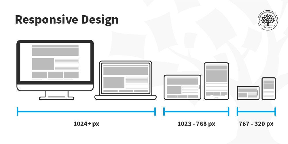
In our digital landscape, where browsing occurs on an array of devices, from smartphones to large desktop monitors, ensuring your website’s aesthetics translate seamlessly across screens is crucial.A well-crafted design not only enhances user experience but also boosts your brand’s credibility. Here’s how to make your website visually appealing,regardless of the device.
To start with, backgrounds play a pivotal role in setting the mood of your website. Consider the following tips:
- Use high-resolution images: Ensure backgrounds remain crisp and clear on any screen size.
- Opt for subtle patterns: They can add depth without distracting from your content.
- Utilize color gradients: These can create a modern feel and provide a visually striking effect on various displays.
Next up is font selection. typography can make or break your site’s readability. Here are some essential pointers:
- Choose web-safe fonts: Stick to fonts that are easily accessible across all devices.
- Consider font size: Ensure text is legible on small screens; a minimum of 16px is recommended.
- Maintain a clear hierarchy: Use different font sizes and weights to guide users through your content effortlessly.
Another critical aspect is spacing and layout. A responsive layout should adapt fluidly to various screen sizes.
| Device Type | Recommended Layout Style |
|---|---|
| Mobile | Single-column layout |
| Tablet | Two-column layout |
| Desktop | Multi-column layout |
Lastly, make sure to test your designs extensively. Use tools that simulate different devices to ensure your aesthetics are spot on.Remember, a stunning design achieves its true potential when it remains functional and user-friendly across all platforms. By prioritizing responsive design, you’re not just creating a website; you’re enhancing the overall user experience and ensuring your brand resonates with every visitor.

Balancing Aesthetics and Functionality: Finding the Sweet Spot
When it comes to web design, the interplay between aesthetics and functionality is crucial. A visually stunning website can capture attention, but if it lacks usability, users will quickly abandon it. Striking the right balance ensures that your site not only looks great but also serves its purpose effectively.
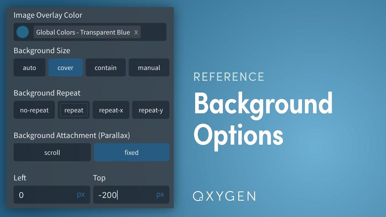
Choosing the Right Background: The background of your website sets the overall mood.It’s essential to select a background that complements your content while enhancing readability. Consider the following options:
- Solid Colors: Simple yet effective, solid colors can create a clean look that highlights your content.
- Gradients: these offer a modern touch, adding depth without overwhelming the user.
- Images: A well-chosen image can create an emotional connection but be cautious of distractions.
Remember, whatever background you choose, it should align with your brand identity and encourage user engagement. A busy background can detract from your message, so opt for designs that enhance rather than obscure.
Font selection: Font choice is another pivotal element in web design that marries aesthetics with functionality. The right font can convey your brand’s personality while ensuring readability. Here are some tips for selecting the perfect font:
- Readability First: Your font should be easy to read across all devices, especially on mobile.
- limit Your Choices: Stick to two or three fonts to maintain coherence and avoid visual clutter.
- Pairing Fonts: Use contrasting fonts for headings and body text to create a hierarchy without losing harmony.
Consider creating a typography scale to establish a clear visual hierarchy. This will guide users through your content more effectively, enhancing their overall experience.
| Font Type | Use Case |
|---|---|
| Serif | Ideal for traditional or formal sites,like blogs or educational platforms. |
| Sans-serif | Great for modern,clean designs. Popular for corporate and tech sites. |
| Display | Best for headings and logos. Use sparingly. |
Along with background and font, consider other aesthetic elements such as white space, color schemes, and visual hierarchy. White space can significantly enhance readability and overall design by preventing clutter. Aim for a balance that allows users to navigate your site intuitively while enjoying its visual appeal.
Incorporating these elements thoughtfully will not only enhance the beauty of your website but also boost its functionality. A seamless blend of aesthetics and utility can lead to higher user retention, increased engagement, and ultimately a accomplished online presence. Remember, a site should look good and work well—finding that sweet spot will set you apart in the digital landscape.

Accessibility in Design: Ensuring Everyone Can Enjoy Your Site
Creating an inviting and inclusive website goes beyond just appealing aesthetics.It’s essential to consider how background colors,font choices,and other design elements impact user experience,especially for individuals with disabilities. By prioritizing accessibility, you ensure that everyone can navigate and enjoy your content seamlessly.
When selecting a background color, remember the importance of contrast. A high contrast between text and background enhances readability for users with visual impairments. Here are some tips to guide your color choices:
- use contrasting colors: Ensure that your text stands out against the background.
- Avoid overly bright colors: They can be harsh on the eyes and create discomfort.
- Test color combinations: Use tools like contrast checkers to confirm accessibility standards.
In terms of font selection, opting for legible and simple typefaces can make a world of difference. Here’s what to consider:
- Choose sans-serif fonts: They are usually easier to read on screens.
- Maintain adequate size: Use a minimum of 16px for body text to improve legibility.
- Limit font styles: Use no more than two or three different fonts to maintain clarity.
Incorporating option text for images is another important aspect of accessible design. This allows screen readers to convey information to users who cannot see the visual elements. make sure your alt text is descriptive but concise, ensuring that it conveys the same meaning as the image itself.
| Design Element | Accessibility Consideration |
|---|---|
| Background color | Use high contrast for readability |
| Font Choice | Opt for sans-serif, simple styles |
| Image Descriptions | Include descriptive alt text |
| Link Colors | Ensure differentiation from regular text |
Lastly, don’t overlook the importance of responsive design. Users may access your site from various devices, so it’s vital to ensure that your design adapts well across all screen sizes. This adaptability not only enhances the visual appeal but also improves usability for individuals with disabilities who may rely on specific assistive technologies.

The power of White Space: Less is Often More
In the world of web design, the beauty of simplicity cannot be overstated. When you embrace the concept of minimalism,you allow each element on your page to breathe. White space, or negative space, serves as a powerful design tool that enhances user experience and guides the viewer’s eye to the most important content.
Why Use White Space? Here are a few compelling reasons:
- Improves Readability: Ample white space around text makes it easier for users to digest information. It helps to reduce cognitive overload by allowing the reader to focus on one section at a time.
- Enhances Visual Hierarchy: By strategically placing white space, you can create a clear visual hierarchy. This hierarchy directs users towards calls to action, ensuring that they don’t miss critical information.
- Increases Engagement: A clean layout with adequate white space invites users to explore your site further. It creates a sense of sophistication and professionalism that can lead to longer visit durations.
When designing your website,think about how you can incorporate white space effectively. here are some tips to consider:
- Margin and Padding: Ensure that you use generous margins and padding around text blocks, images, and buttons. This prevents elements from feeling cramped and makes your content more approachable.
- Limit Content Density: Avoid overloading your pages with too much text or too many images. Aim for balance; allow for breathing room so that each element has its own space.
- Consistent Layout: Use a consistent layout across your website.This uniformity creates predictability, making it easier for users to navigate your site while still enjoying the aesthetic qualities of your design.
Consider the impact of white space in your typography choices as well. The right font combined with appropriate spacing can make a world of difference. Here’s a simple comparison to illustrate how font choice and spacing can affect perception:
| Font Style | Line Height | Readability |
|---|---|---|
| Serif | 1.5 | High |
| Sans-serif | 1.2 | Medium |
| Monospace | 1.4 | Low |
don’t overlook the potential of white space in your website design. By using it thoughtfully, you enhance not just the aesthetic appeal of your site but also its functionality and user engagement. Remember, in design, sometimes less truly is more.
Incorporating Brand Identity: Aligning Aesthetics with Your Message
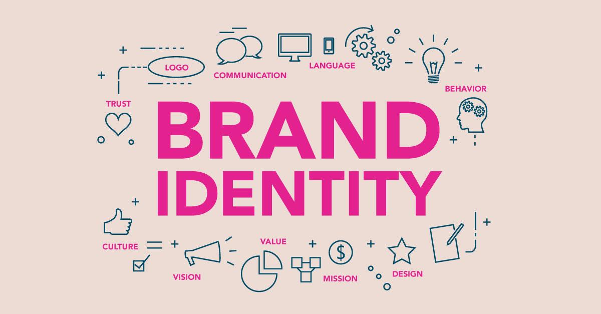
When designing a website, the visual elements you choose play a pivotal role in conveying your brand’s essence. This is not merely about picking pretty colors or trendy fonts; it’s about crafting a cohesive visual language that resonates with your audience. Every aspect of your design—from backgrounds to typography—should reflect the core values and personality of your brand.
Backgrounds are often the canvas of your website, setting the mood and context for what visitors can expect.Consider these options:
- Solid Colors: A minimalistic approach that can highlight your content.
- Gradients: These can add depth and dynamism,making your site feel modern.
- Images: Full-sized images can create an immersive experience but choose them wisely to avoid overwhelming users.
- Patterns and Textures: Subtle patterns can create visual interest without distracting from your message.
Equally critically important is the choice of fonts. Typography is more than just text; it shapes the readability and perceived professionalism of your website. Here are a few tips for selecting the right fonts:
- consistency: Use a maximum of two to three font families to maintain visual harmony.
- Readability: Ensure your fonts are legible in all sizes, especially on mobile devices.
- Brand Voice: choose fonts that match the tone of your brand. A tech company might opt for sleek sans-serifs, while a luxury brand might lean towards elegant serifs.
To illustrate the impact of color and typography, here’s a simple table comparing different styles and their potential brand messages:
| Style | Brand Message |
|---|---|
| Bold Colors + Sans-Serif | Modern, energetic, Youthful |
| Soft Pastels + Serif | Elegant, Sophisticated, Trustworthy |
| Monochrome + Minimalist | Professional, Clean, Focused |
don’t forget about visual balance. Your design should flow naturally, guiding users through your content without confusion. Aim for a layout that offers a seamless experience; use whitespace effectively to highlight key areas and prevent overcrowding. Remember, the goal is to create an environment where your message can shine through without distraction.
By thoughtfully aligning these aesthetic choices with your brand identity, you’re not just designing a website; you’re creating an engaging experience that speaks directly to your audience. Your website becomes a powerful reflection of who you are, fostering connection and loyalty with every visitor.
Practical Tips for Creating Cohesive Aesthetic Elements
When it comes to designing a website, the details matter. To create an inviting and professional look, you must carefully choose elements that work harmoniously together. Here are some practical tips to help you achieve that cohesive aesthetic.
Choose a Color Palette: Start by selecting a color palette that reflects your brand identity. Aim for a combination of 3 to 5 colors that complement each other well. This will be the foundation of your site’s visual appeal.
- Use one primary color that captures your brand essence.
- Add two to three accent colors for buttons, links, and highlights.
- Incorporate a neutral background color to allow your content to stand out.
Font Selection: Typography plays a crucial role in your website’s aesthetics. Choose fonts that are not only stylish but also legible. Consider using:
- A serif font for headings to convey elegance.
- A sans-serif font for body text for easy readability.
- A maximum of two different font families to maintain uniformity.
Additionally, pay attention to the size and spacing of your fonts. Consistent font sizes and line spacing can make content easier to digest and enhance the visual flow of your site.
Background Choices: The background of your website is like the canvas of a painting. A well-chosen background can enhance the overall aesthetic. Here are some options to consider:
| Background Type | Use Cases |
|---|---|
| Solid Color | Great for clean,modern designs. |
| Gradient | Adds depth and interest. |
| Image | Best for creating a mood or theme. |
| Pattern | Ideal for adding texture without overwhelming content. |
remember to ensure that your background doesn’t clash with the text. Aim for contrast that makes your content easily readable, using light text on dark backgrounds and vice versa.
Incorporating all these elements thoughtfully will not only elevate your website’s aesthetic but also create a seamless user experience. The key is to keep experimenting until you find the perfect balance that resonates with your audience.

Testing and Iterating: How User Feedback Can Shape Your Design
When it comes to designing a website, the aesthetic choices you make are crucial. But how do you know if your choices resonate with your audience? This is where testing and iterating come into play. Gathering user feedback can provide invaluable insights that can transform your design from average to remarkable.
Start by collecting feedback on key design elements, such as:
- Background Colors: Are your choices visually appealing and easy on the eyes?
- Fonts: Is the text legible, and does the style reflect your brand’s personality?
- Layout: Does the arrangement of elements facilitate an intuitive user experience?
implementing a feedback loop can guide your design decisions more effectively.Consider conducting usability tests, where real users interact with your site. Observe their reactions and ask pointed questions, such as:
- What do you think about the overall aesthetic?
- Is there anything confusing or overwhelming?
- how does the design make you feel?
It’s critically important to remember that feedback isn’t just about criticism; it’s a tool for growth. A feedback table could help you organize and analyze responses:
| User Feedback | Design Element | Suggested Change |
|---|---|---|
| The background feels too dark. | Background Color | Consider a lighter shade. |
| The font size is too small. | Font | Increase to improve readability. |
| The layout is cluttered. | Page layout | Streamline elements for clarity. |
Once you’ve gathered feedback, it’s time to iterate. Make adjustments based on what users have shared and test again. This process creates a cycle of continuous advancement. Remember, design is not a one-and-done deal; it’s a journey that evolves with your audience.
don’t shy away from showcasing your changes based on user feedback. Transparency builds trust and shows your audience that their opinions matter. By actively involving users in the design process, you create a more engaging and user-friendly website that stands out in a competitive digital landscape.
Staying Ahead of Trends: Keeping Your Design Fresh and Engaging
In the ever-evolving landscape of web design, staying relevant means embracing the latest trends while ensuring your website reflects your unique brand identity. when considering backgrounds, fonts, and other aesthetic elements, it’s essential to strike a balance between modernity and timelessness. Here are some key aspects to keep in mind:
- Experiment with Backgrounds: Gone are the days of plain white backgrounds. Now, you can incorporate gradients, textures, or even video backgrounds to create a more dynamic visual experience.Remember, a well-chosen background can enhance readability and draw attention to key content.
- Font Choices Matter: Typography can set the mood for your entire site. Opt for fonts that align with your brand’s personality.For instance, a tech company might go for sleek, sans-serif fonts, while a boutique might choose elegant serif fonts. Don’t forget to consider font hierarchy to guide visitors through your content.
- Color Schemes that Pop: Color isn’t just about aesthetics; it evokes emotions. Use color psychology to your advantage. Blues can instill trust, while reds can create urgency. Consider a cohesive palette that resonates with your audience while staying true to your branding.
To help visualize your design choices, consider the following table outlining popular background and font combinations:
| Background Style | Font Type | best For |
|---|---|---|
| Video Background | Sans-serif | Tech Companies |
| Gradient | Serif | Fashion Brands |
| Solid Color | Handwritten | Creative Portfolios |
Additionally, consider the use of whitespace in your design. A well-spaced layout provides clarity and focuses the viewer’s attention on essential elements. Overcrowding your site with text or images can detract from your message; less is often more in modern design.
Lastly, keep your audience in mind. Trends can change rapidly,but understanding your target demographic can guide your design choices. A website aimed at millennials might benefit from bold colors and playful fonts, whereas a site for professionals may favor a more understated aesthetic. Regularly solicit feedback and stay engaged with design communities to ensure your work is fresh and relevant.
Frequently Asked Questions (FAQ)
Q&A: The Need to know About Background, Font, and Other Aesthetic Options When Designing a Website
Q: Why is the aesthetic design of a website so important?
A: Great question! Aesthetics are crucial because they create the first impression for your visitors. A well-designed website can engage users, enhance readability, and convey professionalism. If your site looks appealing, users are more likely to stick around, explore, and convert.it’s like dressing your brand in its best outfit!
Q: What role does background play in website design?
A: The background is the canvas of your website—it sets the mood and tone.A well-chosen background can complement your content,reinforce your brand identity,and improve readability. Whether you opt for a solid color, a gradient, or an image, the background should enhance the overall experience, not distract from it. Remember,less can often be more!
Q: How important are font choices in web design?
A: Fonts are like the voice of your website.They convey personality and tone, making it essential to choose wisely. A good font improves readability and can make your content more accessible. Aim for a clean, professional look with a mix of font styles (like headings versus body text) that aligns with your brand. Just avoid using too many fonts; it can create chaos!
Q: Can you explain the concept of visual hierarchy?
A: Absolutely! Visual hierarchy is about organizing elements on your page to guide the viewer’s eye. By using different sizes, colors, and placements, you can prioritize information and create a flow. For example, larger fonts for headings and contrasting colors for buttons draw attention and help visitors navigate your site intuitively. It’s all about making the experience effortless!
Q: Are there any common mistakes to avoid when choosing aesthetics?
A: Definitely! One common mistake is cluttering your design. Too many colors, fonts, or distracting backgrounds can overwhelm visitors. Stick to a cohesive color palette and limit your font choices. Also, ensure your design is responsive. Aesthetic choices should look great on all devices, from desktops to mobiles. Remember, simplicity often leads to clarity!
Q: What about color schemes? How should I choose one?
A: Color schemes are vital for branding and user experience. Start by identifying the emotions you want to evoke—different colors can trigger different feelings. Consider using a color wheel to find complementary colors, but don’t go overboard. A good rule of thumb is to choose one primary color, a secondary color, and an accent color. This creates harmony and keeps your design looking polished.
Q: How can I test if my aesthetic choices are working?
A: Testing is key! Gather feedback from users to see how they interact with your site. You can use tools like A/B testing to compare different designs. Look at analytics to see if aesthetic changes affect bounce rates or conversion rates. Remember, design is an ongoing process, and it’s okay to refine your choices based on real user experience!
Q: Any final tips for someone just starting with website aesthetics?
A: absolutely! Start by defining your brand and audience—this will guide your choices. Look for inspiration from successful websites in your industry, but always strive for a unique touch. Don’t be afraid to experiment, but keep the usability in mind. Lastly, keep learning! Aesthetic design trends evolve, so staying updated will keep your site fresh and engaging. Happy designing!
Key Takeaways
As we wrap up our dive into the world of website aesthetics, it’s clear that the choices you make about background, font, and other design elements can make or break the user experience. think of your website as a digital storefront – the right visuals not only attract visitors but also keep them engaged and encourage them to explore further. By carefully selecting backgrounds that complement your content,fonts that enhance readability,and cohesive color schemes that reflect your brand identity,you can create a welcoming online environment that resonates with your audience.
Remember, a well-designed website is more than just a pretty face; it’s a powerful tool that can shape perceptions, build trust, and drive action.So, as you embark on your design journey, keep these insights in mind. Don’t hesitate to experiment and iterate – after all, your website should evolve just as your business does. Ready to take your website to the next level? Let your creativity flow, and watch as your online presence transforms into something truly remarkable!

