

Creating a website that truly reflects your brand and engages your audience can feel like a daunting task, especially when it comes to crafting the perfect menu.If you’re using the Eduma theme, you’re in luck! This powerful and versatile theme is designed specifically for educational institutions, making it easier than ever to organize your content and guide your visitors seamlessly through your site. In this step-by-step guide, we’ll walk you through the process of creating a stunning menu that not only looks great but also enhances user experience. Whether you’re a seasoned developer or a complete beginner, by the end of this article, you’ll have a beautifully structured menu that highlights your offerings and keeps your visitors coming back for more. Let’s dive in and unlock the full potential of your Eduma theme together!
Understanding the Eduma Theme and its Menu Features
When diving into the Eduma theme, one of the standout features is its intuitive menu system. This allows users to easily navigate through various sections of their educational website. Understanding how to effectively utilize these menu features can considerably enhance the user experience and streamline content accessibility.
Eduma offers a versatile menu structure that can cater to different needs, whether you’re setting up a simple blog or a complete educational portal.Here are some key aspects to consider:
- Custom Menus: Create unique navigation menus tailored to your website’s specific needs. This allows you to highlight important sections, such as courses, events, or blog posts.
- Dropdown Menus: organize your content more efficiently with dropdown menus. This feature is especially useful for websites with multiple categories or subcategories.
- Mobile Responsiveness: Eduma’s menus are designed to be mobile-friendly, ensuring a seamless browsing experience across all devices.
- Menu Location: Choose from various menu locations that Eduma provides,allowing you to customize the appearance and functionality of your site.
To create a menu in Eduma, you can follow these straightforward steps:
- Navigate to Appearance > Menus in your WordPress dashboard.
- click on Create a New Menu and give your menu a name.
- Begin adding items from the left-hand side by selecting pages, posts, or custom links.
- Arrange your menu items by dragging and dropping them in your desired order.
- Don’t forget to assign your new menu to a specific theme location.
Additionally, Eduma allows for easy customization of menu styles. You can adjust colors,fonts,and spacing through the theme’s customization options. This not only enhances the aesthetic appeal of your site but also ensures that your menu aligns with your brand identity.
Consider this table as a rapid reference for the benefits of using menus in the Eduma theme:
| Feature | Benefit |
|---|---|
| Custom Menus | Personalized navigation tailored to user needs. |
| Dropdown Menus | Organized content for better accessibility. |
| Mobile Responsiveness | Seamless experience across all devices. |
| Style Customization | Aligns menu design with brand identity. |
By mastering the menu features within the Eduma theme, you open the door to a more user-friendly and visually appealing website. Take the time to experiment with different configurations and watch as your site transforms into a hub of knowledge that keeps your visitors coming back for more.
Getting Started with Your Eduma Theme setup
Creating a menu in the Eduma theme can elevate the navigation experience of your website, making it easier for your visitors to find important content. The process is relatively straightforward, and with a little guidance, you’ll have a fully functional menu in no time. Let’s dive into the steps!
Step 1: Access the WordPress Dashboard
first things first, log in to your WordPress dashboard. This is your control center for managing everything related to your website. Once you’re in, look for the “Appearance” tab on the left-hand side. Click on it to reveal a dropdown menu.
Step 2: Navigate to Menus
Within the Appearance section,you’ll see an option labeled “Menus.” Click on it to access the menu management area. Here, you can create new menus or edit existing ones. If you’re starting fresh, click on “create a new menu.”
Step 3: Set Up Your Menu
Now it’s time to give your menu a name and hit the “Create Menu” button. After that, you can add items to your menu from the options available. Consider including:
- Pages: Include critically important pages like Home, About, Courses, and Contact.
- Categories: If your site has various categories, this is a good place to showcase them.
- Custom Links: Direct visitors to specific URL addresses,such as social media or external resources.
Step 4: Organize Your Menu Items
Once you’ve added your desired items, you can drag and drop them to arrange them in the order you prefer. You can also create sub-menus by indenting items below the main menu items—this is particularly useful for organizing content effectively.
Step 5: Assign the Menu Location
After organizing your menu, scroll down to the “Menu Settings” section. Here, you can assign your newly created menu to a specific location. Most themes, including eduma, will have locations like “Primary Menu” or “Footer Menu.” Select your preferred location and save your changes.
Quick Tip: Always preview your changes to ensure everything looks good before you finalize! You can do this by clicking on the “view Site” option.
Table: Menu Item Types
| Menu Item Type | Description |
|---|---|
| Page | A standard page on your site, like About or Contact. |
| Category | A grouping of related posts or articles. |
| Custom Link | A link to an external site or resource. |
| Post | A specific blog post that you want to highlight. |
With these steps,you are well on your way to creating a navigation menu that enhances the user experience on your Eduma theme. Now, go ahead and make your menu shine!
navigating the WordPress dashboard for Menu Creation
Once you’ve successfully logged into your WordPress dashboard, the first step in creating a menu in the Eduma theme is to locate the appearance section. Here’s how to effortlessly navigate through the dashboard:
- On the left sidebar, find and click on Appearance.
- Select menus from the drop-down options that appear.
You will now be on the Menus page, where you can either create a new menu or edit an existing one. If you’re starting fresh, click on the Create a new menu link. Give your menu a descriptive name, like “Main Navigation” or “Footer Links” to help you easily identify it later.
Once you’ve named your menu, you’ll see several options for adding items. You can include:
- Pages — Link to your site’s pages.
- Posts — Add links to your blog posts.
- Custom links — Direct users to external sites.
- Categories — Organize your blog posts by category.
Simply check the boxes next to the items you want to include, and click on the Add to Menu button. This action will move them to the right side, where you can arrange them in the desired order. Drag and drop the menu items to position them as needed. You can even create submenus by slightly dragging an item below another item, which will create a nested structure.
After arranging your menu items, don’t forget to assign the menu to a specific location. In the Eduma theme, you might have multiple menu locations available. Look for the menu Settings section below the menu structure and choose where you want your menu to be displayed, such as the primary navigation or footer.
| Menu Item Type | Description |
|---|---|
| Page | Direct link to site pages like About or Contact. |
| Post | Links to your latest or most popular blog posts. |
| Custom link | Links to external resources or other websites. |
| Category | Groups related posts for easier navigation. |
don’t forget to hit the Save Menu button to apply your changes.That’s it! You’ve effectively crafted a menu tailored to your website’s needs, enhancing user experience and navigation.Take a moment to visit your website and see your newly created menu in action!
choosing the Right Menu Structure for Your Site
When setting up your site with the Eduma theme, selecting an appropriate menu structure is critical for enhancing user navigation and engagement. A well-organized menu not only makes it easier for visitors to find what thay’re looking for, but it also contributes to a more professional and polished look for your site.
Consider these key factors when determining your menu structure:
- Clarity: Ensure that each menu item clearly communicates what users can expect when they click on it.
- Hierarchy: Organize your items logically; main categories should be prioritized while subcategories can be nested underneath them.
- Accessibility: Remember to keep critically important pages within easy reach; users shouldn’t have to dig through multiple layers to find essential facts.
- Mobile Optimization: As more users access the web via mobile devices, ensure that your menu is responsive and easy to navigate on smaller screens.
Choosing between a horizontal and vertical menu can greatly impact user experience. A horizontal menu typically works best for sites with fewer main categories,while a vertical menu can be beneficial for larger sites with multiple subcategories. Here’s a quick comparison:
| Menu Type | Best For | Advantages |
|---|---|---|
| Horizontal Menu | Small to Medium Sites | Space-efficient,clean look,easy to access |
| vertical Menu | Large Sites | More visible categories,easier for complex structures |
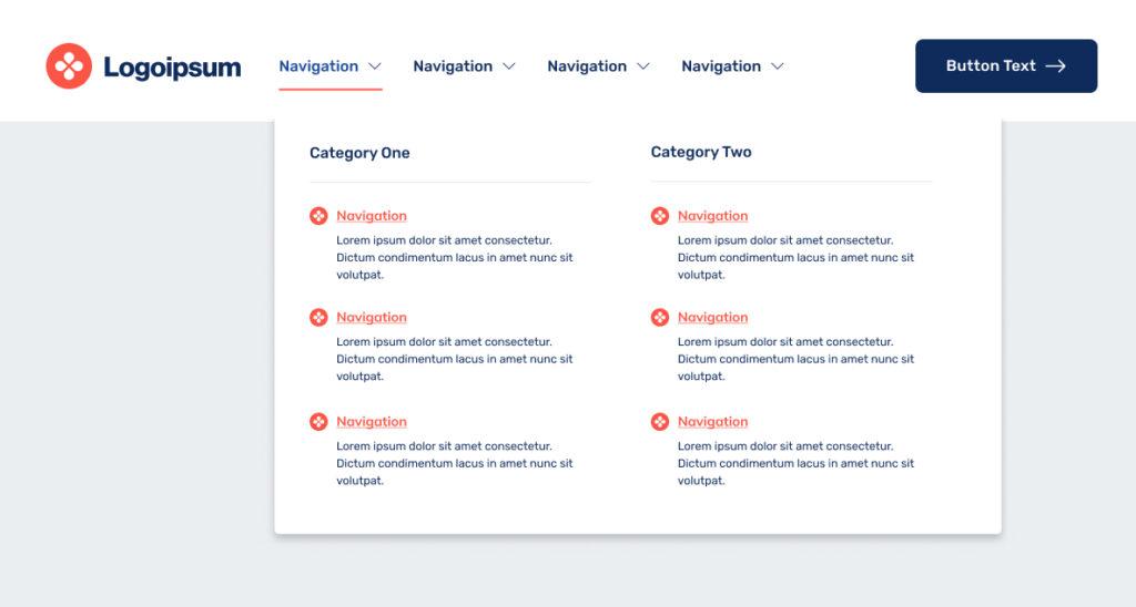
Another aspect to consider is the inclusion of dropdown menus.These allow for a more organized presentation of subcategories without cluttering your primary navigation. However,be cautious not to overwhelm your visitors with too many options at once. A good rule of thumb is to limit dropdown items to five or six to maintain clarity.
don’t forget about the importance of labels. Using familiar terms helps users navigate your site intuitively. Avoid jargon unless it’s common knowledge within your target audience. Testing your menu structure with real users can provide valuable insight into how effective your choices are.
By carefully considering these elements, you’ll be well on your way to creating a menu structure that not only looks great but also enhances the overall user experience on your Eduma-themed site.
adding Custom Links and Pages to Your Menu
Customizing your menu is a great way to improve navigation and enhance user experience on your site. With the Eduma theme, you have the adaptability to add various types of links and pages to your menu, allowing you to tailor it to the specific needs of your audience. Let’s dive into the process of adding custom links and pages.
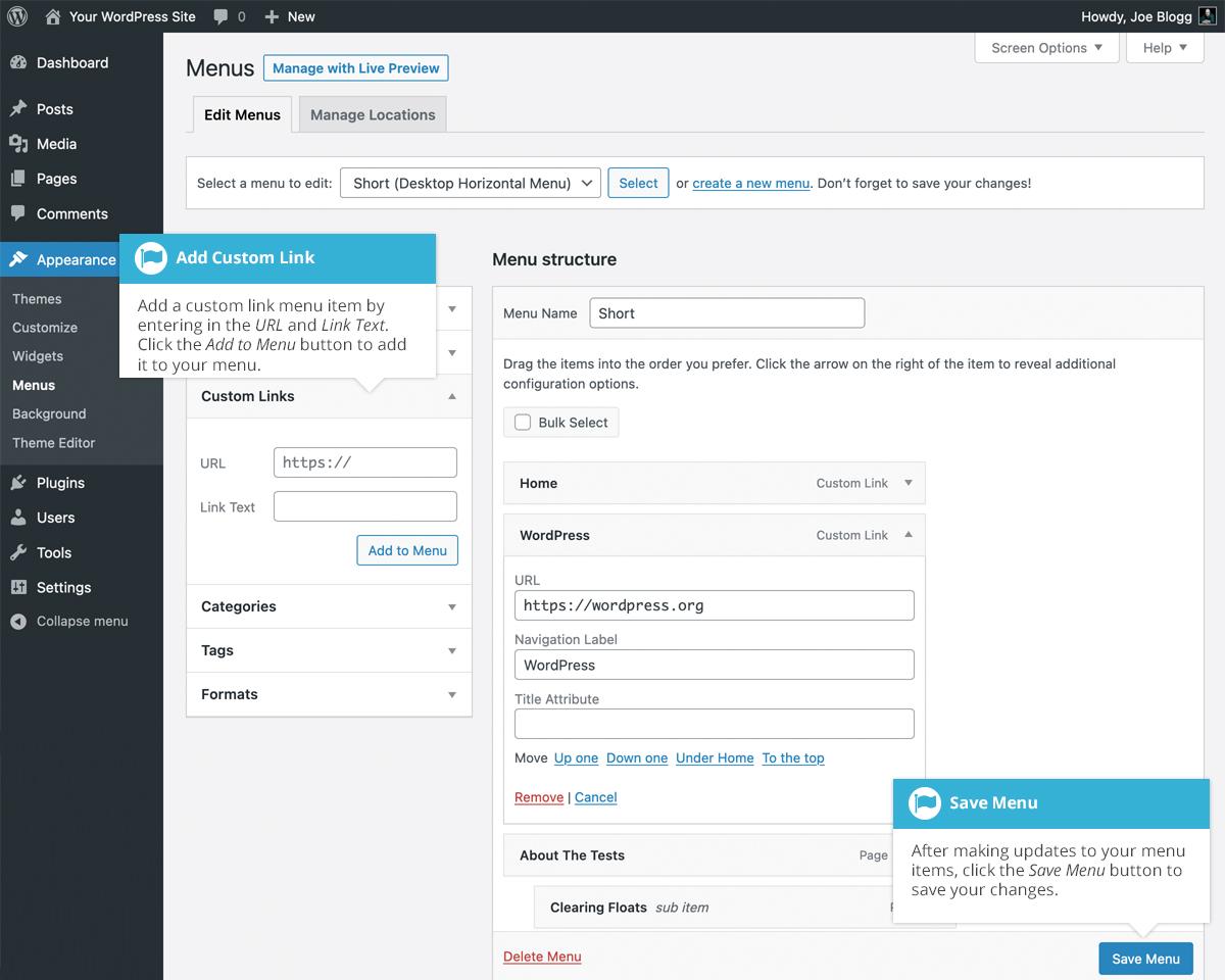
To start, navigate to the Appearance section in your WordPress dashboard and click on Menus.Here, you can create a new menu or edit an existing one. If you’re starting fresh, simply give your new menu a name and click Create Menu.
Once you’ve set up your menu, you can add pages, posts, and custom links.To add a page:
- select the pages you want to include from the left column.
- Click on the Add to Menu button.
- Drag and drop the items in the right column to arrange them as desired.
For adding custom links, which can be particularly useful for linking to external sites or specific sections of your website, follow these steps:
- Click on Custom Links in the left section.
- Enter the URL you want to link to in the URL field.
- Add the link text in the Link Text field.
- Hit Add to Menu when you’re done.
After adding your custom links, you can also use the Link Target option to decide whether the link opens in a new tab or the same window. This feature can significantly improve the user experience by keeping visitors on your site longer.
Don’t forget to save your changes by clicking the Save Menu button at the bottom of the page. If you’re curious about how your menu will look,you can preview it promptly on your site. Adjust as necessary until you’re satisfied with the final layout!
Here’s a quick reference table of menu items you might consider adding:
| Menu Item Type | Example |
|---|---|
| Page | About Us |
| post | Latest News |
| Custom Link | Contact Us |
| Category | Courses |
By adding personalized links and pages, you create a more engaging experience for your visitors. They can easily find what they’re looking for, helping you achieve your website’s goals more effectively. Happy customizing!
Utilizing Categories and Tags for a Dynamic Menu
Creating a dynamic menu is essential for enhancing user experience and improving site navigation.By utilizing categories and tags, you can organize your content effectively, making it easier for your visitors to find exactly what they’re looking for. Here’s how to make the most out of these features in your Eduma theme menu.
Categories serve as broad groupings of your content, while tags allow for more specific classifications. When setting up your menu,consider the following:
- Use Categories for Main Sections: Categories should represent the primary sections of your site—think of them as the chapters in a book. For example, if your site has content related to courses, events, and blogs, these coudl be your main categories.
- Incorporate Tags for Specific Topics: Tags should highlight the finer details within those categories.For instance, under the ‘Courses’ category, you might have tags like ‘Web Advancement’, ‘Graphic Design’, or ‘Marketing’. This allows users to drill down into their interests.
- Maintain a Logical structure: When adding categories and tags to your menu, ensure they follow a logical structure.This can be visualized in a hierarchy for easy comprehension.
To visually enhance your menu, you can create a table that outlines how your categories and tags will appear. Here’s a simple example:
| Category | Tags |
|---|---|
| Courses | Web Development, Graphic design, Marketing |
| Events | Webinars, Workshops, Conferences |
| Blog | Tips, Guides, News |
Incorporating categories and tags into your Eduma theme menu not only enhances navigation but also encourages users to explore more content. When users click on a category, they should feel like they have stepped into a space that is relevant to their interests, leading to longer site visits and increased engagement.
don’t forget to regularly update your categories and tags as your content evolves. This ensures that your menu remains relevant and effective,guiding users to the freshest content. A well-maintained menu can significantly improve your website’s usability and overall aesthetic, giving your visitors a reason to return time and again.
Designing a User-Friendly Menu with Submenus
When it comes to crafting a user-friendly menu, clarity and organization are key. A well-structured menu not only enhances the navigational experience but also makes it easier for your visitors to find what they’re looking for. In the Eduma theme, creating menus with submenus allows you to categorize content effectively, ensuring that your users can navigate effortlessly through your educational offerings.
To get started, you’ll want to consider the hierarchy of your menu items. Here are some critically important tips to structure your menu effectively:
- Prioritize key sections: Identify the most important pages of your site such as Courses, Instructors, and Blog.
- Group related items: Create categories that make sense, such as grouping all course subjects under a single parent menu item.
- Limit menu items: Aim for simplicity; a cluttered menu can overwhelm users. Ideally, keep it between 5-7 top-level items.
Once you have your items sorted,it’s time to create submenus. The Eduma theme allows for easy addition of sub-items under main menu categories. This feature is particularly useful for education-focused sites, where you may want to categorize courses by department or skill level. To add a submenu:
- Navigate to the Appearance > Menus section in your WordPress dashboard.
- Select the main menu item you want to modify.
- Drag the submenu items slightly to the right under the parent item. This indentation indicates a hierarchical relationship.
Here’s a quick breakdown of how your menu might look:
| Main Menu Item | Submenu Items |
|---|---|
| Courses | Math, Science, Language Arts |
| Instructors | Profile, Reviews, Contact |
| Resources | Articles, Webinars, E-books |
After setting up your menu, don’t forget to preview how it looks on both desktop and mobile devices.A responsive menu is essential,as many users may access your site from smartphones or tablets. The Eduma theme is designed to adapt, but always double-check to ensure your submenus are easily accessible on smaller screens. A smooth user experience can significantly reduce bounce rates and keep your audience engaged.
Lastly, consider incorporating visual elements into your menu design. Using icons or color coding can help emphasize different sections and make navigation more intuitive. Always remember that the ultimate goal of your menu is to guide users smoothly through your content without confusion.With careful planning and implementation, your menus will not only be functional but also visually appealing.
Enhancing Your Menu with Icons and Custom CSS
One of the best ways to make your eduma theme menu stand out is by incorporating icons and custom CSS. This not only enhances the visual appeal but also improves user experience by making navigation more intuitive.Here’s how you can effectively integrate these elements into your menu.
Start by selecting icons that resonate with your menu items. You can use libraries like Font awesome or Material Icons to find the perfect symbols. Simply add the icon classes to your menu items using WordPress’s built-in menu structure. Such as:
This approach not only makes your menu visually appealing but also helps visitors quickly identify sections. Here’s a quick list of icon ideas you might consider:
- Home: A house icon for the homepage
- Courses: A book or graduation cap icon
- Blog: A pencil or speech bubble
- Contact: An envelope or phone icon
Next, let’s talk about custom CSS.By adding your own styles, you can tailor the menu’s appearance to fit your brand’s identity. Here’s a simple CSS snippet to change the background color of your menu items:
nav ul li {
        background-color: #4CAF50; /* Green */
        color: white; /* Text color */
        padding: 15px; /* Spacing */
        border-radius: 5px; /* rounded corners */
    }
This code will give your menu items a fresh look.You can experiment with different colors, fonts, and hover effects to create a unique experience for your users. Consider using the following CSS properties:
- Color: Change text color on hover
- Font-size: Adjust sizes for better readability
- Transition: Smooth transitions for hover effects
If you want to avoid clutter and maintain a clean aesthetic, consider using a table to organize your menu items. Here’s a simple example:
| Menu Item | Icon | Description |
|---|---|---|
| Home | Return to the main page | |
| Courses | Explore our educational offerings |
By adopting these strategies, you’ll not only enhance the aesthetic of your menu but also improve its functionality. A well-designed menu can significantly impact user engagement and satisfaction, so take the time to make it shine!
Testing and Adjusting Your Menu for Optimal Usability
Once you’ve created your menu in the Eduma Theme,the next crucial step is to ensure it effectively works seamlessly for your users. A well-structured menu enhances navigation and significantly improves the overall user experience on your site.Here are some effective strategies for :
- Conduct User Testing: Engage a small group of users who represent your target audience. Ask them to navigate your site using the menu. observe their interactions, noting any areas of confusion or difficulty.
- Check for Clarity: make sure all menu items are clearly labeled.Names should be intuitive and convey the content they link to.Avoid jargon or overly complex terms that might alienate users.
- Mobile Responsiveness: Test the menu on various devices, including tablets and smartphones. A notable portion of web traffic comes from mobile users, and a responsive design is essential for a positive experience.
- Gather Feedback: After your initial tests, solicit feedback from your users. Use surveys or feedback forms that can definitely help you understand their navigation experiences and any suggestions they might have.
Adjusting your menu based on user feedback can be invaluable. Here are some common adjustments to consider:
- Reorganizing Menu Items: If users are struggling to find specific sections, consider rearranging items to place frequently accessed pages at the top or in more visible spots.
- Dropdown Menus: If your menu has multiple subcategories, ensure dropdowns are functional and easy to navigate. Test them to see if users can access sub-items without frustration.
- Highlight Active Pages: Use CSS styles to highlight active or selected menu items. This visual cue helps users keep track of where they are on your site.
To further illustrate how to analyze your menu’s effectiveness, here’s a simple table you can use to track feedback and changes:
| Feedback Type | Suggestion | Status |
|---|---|---|
| Confusing Label | Change “Resources” to “learning materials” | Implemented |
| Hard to find | Move “Contact Us” to the top menu | In Progress |
| Dropdown Issues | Make dropdown menus appear faster | Pending |
By regularly testing and adjusting your menu, you create a user-friendly experience that keeps visitors returning to your site. Remember, usability is an ongoing process, and staying attuned to your audience’s needs will lead to continuous improvement.
Tips for maintaining an organized and Updated Menu
Keeping your menu organized and updated is crucial for providing a seamless experience for your visitors. Here are some handy tips to ensure your menu stays fresh and user-friendly:
- Regular Reviews: Schedule periodic reviews of your menu to check for outdated items or broken links. This practice will help maintain the relevance of your content.
- utilize Categories: Group similar items under headings or categories to simplify navigation. For example, you might have sections like “Courses,” “Desserts,” and “beverages” to enhance clarity.
- Highlight New Items: Consider using a ‘New’ badge or a separate section for newly added items. This not only draws attention but also encourages visitors to try something different.
- Incorporate Feedback: Listen to user feedback regarding the menu’s usability. If visitors find certain items hard to locate, make adjustments based on their suggestions.
To keep your menu visually appealing, consider using consistent styling and formatting. Here’s a simple table structure that can help you organize your offerings:
| Menu Item | Description | Price |
|---|---|---|
| Spaghetti Carbonara | A classic Italian pasta dish with creamy sauce | $12.00 |
| Chocolate Lava Cake | Rich chocolate cake with a molten center | $7.50 |
| Lemonade | Freshly squeezed, served chilled | $3.00 |
Additionally, leverage the power of visuals. Use high-quality images for your menu items to make them more appealing.Visual representation can significantly impact a visitor’s decision to explore your offerings further.
- Seasonal Updates: Refresh your menu with seasonal items to keep it exciting and relevant. This not only showcases your creativity but also aligns with current trends.
- Mobile Optimization: Ensure that your menu is responsive and easy to navigate on mobile devices. A significant portion of users access websites through their phones, so a mobile-friendly menu is essential.
Lastly, integrate search functionality within your menu to help users quickly find what they’re looking for. users appreciate the ability to search for specific items rather than scrolling through the entire menu. This feature enhances user experience and keeps visitors on your site longer.

Troubleshooting Common Menu Issues in Eduma Theme
When using the Eduma theme,you might encounter some common menu issues that can be quite frustrating. However, troubleshooting these problems can often be straightforward with a few simple steps. Here are some tips to help you resolve menu-related challenges effectively.
First and foremost, ensure that you have assigned the menu to the correct location. The Eduma theme typically has designated areas for menus,and if your menu isn’t appearing where you expect it to be,it might not be set in the right place. To check this:
- Navigate to Appearance > Menus in your WordPress dashboard.
- Select your desired menu from the dropdown.
- Look for the Menu Settings section and confirm the appropriate display location is selected.
Another common issue involves menu items not linking correctly. This can happen if the URL set for a menu item is incorrect or broken.To fix this:
- Go to the Menus section under Appearance.
- Edit each menu item and ensure the urls are correct and functional.
- Check for any typos or missing components in the URLs.
Sometimes, styling issues may cause menu items to appear misaligned or not display at all. This often happens due to conflicting CSS. Here are a few ways to troubleshoot this:
- Inspect the menu using your browser’s developer tools to identify any conflicting styles.
- Clear your site’s cache if you are using a caching plugin to ensure the latest CSS changes are reflected.
- Consider adding custom CSS in Appearance > Customize > Additional CSS to adjust the menu styling if necessary.
If you’ve made changes but don’t see any updates, it might be time to refresh your permalinks. This can be done easily:
- Go to Settings > Permalinks.
- Simply click on the Save Changes button without altering any settings. This refreshes the permalinks and can resolve menu display issues.
Lastly, if you’re still facing issues, consider checking for plugin conflicts. Deactivate any recent plugins one by one to identify if a particular one is causing your menu problems.remember to always backup your site before making significant changes to prevent data loss.
Final Touches for a Polished Menu Experience
As you finalize your menu setup in the Eduma theme, it’s essential to ensure every detail contributes to a seamless and engaging user experience.A polished menu not only captures attention but also enhances navigation for users exploring your educational offerings. Here are some final touches to elevate your menu presentation:
- Consistent branding: Ensure that your menu aligns with your overall branding. this includes using the same color scheme,fonts,and style as the rest of your website. Your menu should feel like an extension of your site, creating a cohesive look.
- Clear labeling: Use straightforward and descriptive labels for each menu item. Avoid jargon or overly complex terms that might confuse visitors. Think about how your audience searches for content and make it easy for them to find.
- Dropdown Menus: If you have multiple categories or subcategories, consider implementing dropdown menus.This helps keep your main navigation clean while still providing access to more detailed content without overwhelming users.
- Highlight Active items: Make sure the current page is highlighted in the menu. This gives users a sense of place and helps them understand where they are within your site.
Another excellent way to enhance your menu experience is through responsive design. With more users accessing websites via mobile devices, ensuring your menu is mobile-friendly is crucial. Test how your menu appears on various devices:
| Device type | Menu Style | Notes |
|---|---|---|
| Desktop | Horizontal | Show all options clearly |
| Tablet | Collapsible | Ensure easy touch navigation |
| Mobile | Hamburger Menu | Prioritize essential items for quick access |
Lastly, consider adding a search bar within your menu for enhanced functionality. This allows users to quickly find specific courses or information without having to navigate through multiple pages. Make sure it’s prominently placed and visually accessible.
By incorporating these final touches, you’ll not only enhance the visual appeal of your menu but also significantly improve user engagement and satisfaction. A well-curated menu experience invites users to explore more of what you have to offer, making their journey through your educational content enjoyable and efficient.
Frequently Asked Questions (FAQ)
Q&A: How To Create a Menu In Eduma Theme: A Step-by-Step Guide
Q1: What is the Eduma theme,and why should I use it for my website?
A1: The eduma theme is a versatile and user-friendly WordPress theme designed specifically for educational websites.Whether you’re running a school, a tutoring service, or an online course platform, Eduma provides all the tools you need to create a professional online presence. Its sleek design and robust features make it a top choice for educators looking to engage their students effectively.
Q2: Why is having a well-structured menu important for my site?
A2: A well-structured menu is crucial because it’s the navigation backbone of your website.It helps visitors find information quickly and easily, enhancing their overall experience. A clear menu not only keeps users engaged but also encourages them to explore more of your content, which can lead to higher enrollment rates or more inquiries.
Q3: how do I create a menu in the Eduma theme?
A3: Creating a menu in the Eduma theme is simple and straightforward! Here’s a quick step-by-step guide:
- Log into your WordPress dashboard.
- Navigate to Appearance > Menus.
- Create a new menu by entering a name and clicking “Create Menu.”
- Add items to your menu from the left-hand side: choose from Pages,Posts,Custom Links,or Categories.
- Once you’ve added your desired items, drag them into your preferred order.
- Assign your menu to a location (like the primary menu area).
- Don’t forget to click “Save Menu”! Now your new menu is live!
Q4: Can I customize the menu’s appearance?
A4: Absolutely! The Eduma theme offers multiple customization options. You can adjust colors, fonts, and even add icons to your menu items through the WordPress Customizer.Plus, if you’re comfortable with custom CSS, you can further tweak the styles to align perfectly with your brand.
Q5: What if I want to add dropdown menus or submenus?
A5: Great question! Dropdown menus can enhance your site’s organization. To create a submenu in Eduma, simply drag a menu item slightly to the right under another item in the menu structure. This creates a hierarchy, and when visitors hover over the parent item, the submenu will appear. It’s a fantastic way to keep your main menu clean while still providing access to more content.
Q6: Can I remove or rearrange menu items later?
A6: yes, you can easily remove or rearrange menu items at any time! Just go back to the Appearance > Menus section, and you can drag and drop items to reorder them or click to remove any item you no longer want.
Q7: What if I run into issues while creating my menu?
A7: Don’t worry! If you encounter any issues, the Eduma theme has a robust support system. You can check their documentation, visit the support forums, or reach out to their support team for assistance.There are also plenty of online tutorials and videos that can guide you through common problems.
Q8: how will a well-structured menu impact my visitors?
A8: A well-structured menu enhances user experience,making it easier for visitors to find the information they need. This not only keeps them on your site longer but also increases the likelihood they’ll take action—like signing up for a course or contacting you for more information. In essence, a good menu can lead to better engagement and conversions!
Q9: Is there anything else I should consider when designing my menu?
A9: Yes! Keep your menu simple and intuitive. Prioritize the most important pages, and limit the number of items to avoid overwhelming your visitors. also, consider mobile responsiveness; ensure your menu looks good and is easy to navigate on all devices. A clean,user-friendly menu can make all the difference in your website’s success!
Q10: Ready to create your menu?
A10: Absolutely! Follow the steps above,make it visually appealing,and watch how it transforms your Eduma site. Don’t underestimate the power of a well-designed menu—your visitors will thank you, and so will your conversion rates! Let’s get started!
To Wrap It Up
And there you have it! Creating a menu in the Eduma theme is not just a straightforward process; it’s the key to unlocking a seamless navigation experience for your users. By following these simple steps, you’ve taken a significant leap towards enhancing the usability and functionality of your website.
Remember,a well-structured menu not only guides your visitors but also improves their overall experience,making it easier for them to find the information they need. So, don’t hesitate—put your newfound skills to work and craft a menu that reflects your brand and serves your audience effectively.
If you encounter any hiccups along the way or have questions, feel free to reach out in the comments below. We’re all in this together,and I’m here to help! Happy menu building,and here’s to creating a stunning,user-friendly website with the Eduma theme!