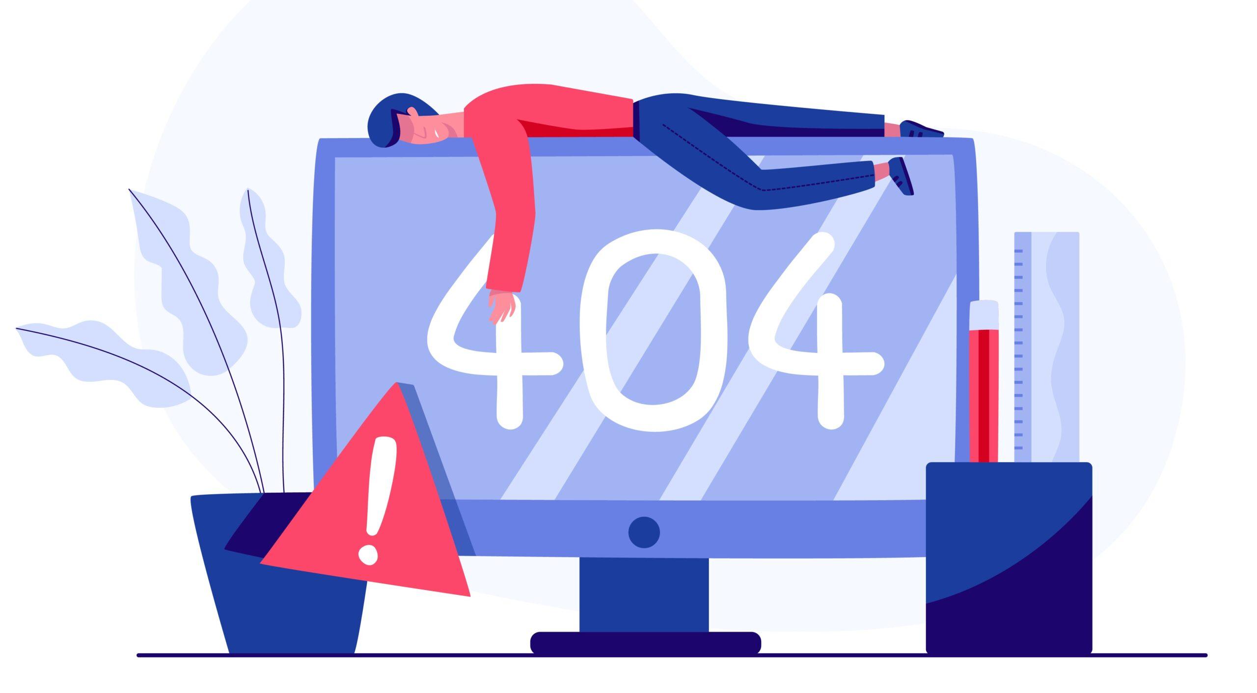
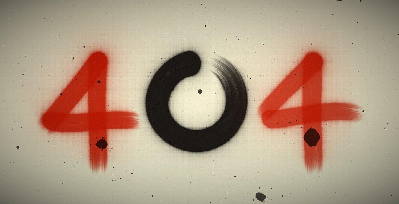
Introduction
We’ve all been there—browsing a website, eager to find that perfect piece of details, only to be met with the dreaded “404 Error: Page Not Found.” It’s frustrating, right? But what if I told you that a 404 page doesn’t have to be a dead end? In fact, it can be a golden chance to engage your visitors, showcase your brand’s personality, and even guide them back to the content they were searching for.
In this article, we’re diving into the 7 best 404 page examples that not only mitigate user frustration but also transform a negative experience into a delightful one. We’ll explore the clever design elements, witty copy, and strategic redirects that make these pages stand out. Whether you’re a seasoned web designer or a business owner looking to enhance your site, you’ll discover actionable best practices that can turn your 404 page into a powerful tool for user retention.so, let’s get inspired and see how we can turn those “oops!” moments into “aha!” moments!
Choosing the Right tone to Connect with Your Visitors
When users land on your 404 page, they’re already feeling a bit frustrated or confused. This is your chance to turn that experience around and connect with them. Choosing the right tone can transform a possibly negative encounter into a memorable one. Here are some effective strategies:
- empathetic Language: Acknowledge the user’s frustration. Phrases like “We’re sorry for the inconvenience” or “Oops! It looks like something went wrong” can make visitors feel understood.
- Light-hearted Humor: A sprinkle of humor can lighten the mood. Consider using playful messages or funny illustrations that relate to the error.This shows that your brand doesn’t take itself too seriously and can create a pleasant atmosphere.
- Conversational Tone: Write as if you’re speaking directly to the visitor. Using a conversational tone makes your message feel more personal and inviting, encouraging users to stay on your site longer.
- Clear Guidance: Provide clear next steps. Use phrases like “Here are some helpful links to get you back on track” to guide users in a friendly manner, making them feel supported rather than abandoned.
Consider the following elements when crafting your message:
| Element | Impact |
|---|---|
| Visuals | Create engagement and reduce frustration |
| Call-to-Action (CTA) | Encourage users to explore other pages |
| Brand Voice | Builds trust and recognition |
Ultimately, the right tone is about making your users feel seen and valued. Whether you choose to be empathetic, humorous, or straightforward, ensure that your 404 page reflects your brand’s personality and encourages users to continue their journey on your site. By doing so, you not only mitigate their frustration but also enhance their overall experience with your brand.
Crafting a clear and Helpful Message for Lost Users
When users stumble upon a 404 error page, it’s essential to transform their frustration into a more positive experience. The right message can not only alleviate their disappointment but also guide them back to your website’s valuable content. Here are some practices that can considerably enhance your 404 page messaging:
- Empathy is Key: Acknowledge the user’s frustration. A simple phrase like “Oops! We couldn’t find that page” can make users feel understood.
- Clear Direction: Provide clear instructions on what they can do next. offer links to popular pages or a search bar to help them navigate effectively.
- Create a Friendly tone: Use a conversational tone that reflects your brand personality. Humor can be effective here, but make sure it aligns with your overall voice.
- Visual Appeal: Pair your message with engaging visuals or illustrations. A creative design catches the eye and helps convey your message more effectively.
Consider incorporating a table that lists choice resources or pages that might interest users. This not only provides options but also keeps them engaged with your site:
| Helpful Links | Description |
|---|---|
| Home | Return to the main page for easy navigation. |
| Blog | Explore our latest articles and insights. |
| Contact Us | Need help? Get in touch with our team. |
encourage users to share their experience. A gentle nudge like, “Let us know what you were looking for!” not only shows you care but also provides you with valuable feedback to improve your site. By crafting a helpful and clear message for those who land on your 404 page, you can turn a potential negative into a positive interaction, ultimately keeping users engaged with your brand.

Incorporating Eye-Catching Visuals to Enhance Engagement
When users land on a 404 page,they frequently enough feel lost and frustrated. This is where the power of visuals comes into play. By incorporating striking imagery, witty illustrations, or captivating animations, you can transform a mundane error message into an engaging experience that retains user interest and encourages exploration of your site. Here are some effective strategies for using visuals to enhance your 404 pages:
- Bold Graphics: A well-chosen graphic can capture attention immediately. Consider using unique artwork or illustrations that reflect your brand’s personality. This can lighten the mood and make the experience less jarring.
- Humor and Wit: A funny image or meme relevant to the situation can bring a smile to a user’s face. Humor creates a memorable experience, making users more likely to share their encounter with others.
- Interactive Elements: Adding interactive visuals like animations or clickable elements can invite users to engage further. For example, a small game or a fun quiz can distract users from their initial frustration.
- Consistent Branding: Ensure that any visuals used align with your brand’s style and tone. Consistency in colors,fonts,and imagery promotes brand recognition and fosters trust,even in error scenarios.
Incorporating a search bar prominently within the visual layout can also help guide lost users back on track.Consider embedding it within an eye-catching graphic, making it easily noticeable while still providing a pleasing aesthetic. This dual-purpose visual can serve to both engage users and offer a solution to their problem.
Another effective approach is to create a visual narrative around the 404 error. Think of it as storytelling—design a visual sequence that illustrates how one might “get lost” in the digital landscape, then guide them back with clear navigation options. This not only entertains but also provides a pathway forward.
| Visual Element | benefit |
|---|---|
| Bold Graphics | Captures Attention |
| Humorous Images | lightens Mood |
| Interactive Features | Encourages Engagement |
| Consistent Branding | Builds Trust |
| Clear Navigation | Guides Users |
Ultimately, the goal is to turn a potential negative experience into a positive interaction. By utilizing eye-catching visuals thoughtfully, you can not only mitigate frustration but also enhance overall user engagement, leaving visitors with a memorable impression of your brand—even when they hit a bump in the road.
Adding Navigation Options to Guide Users Back
When users land on a 404 page,it’s crucial to provide them with easy navigation options to guide them back to relevant content.A well-designed 404 page doesn’t just inform users that the page they were looking for is missing; it also serves as a navigational hub that encourages them to explore other areas of your site. Here are some effective strategies to implement:
- Search Bar: Including a search bar is a simple yet powerful way to empower users to find what they were initially looking for. Make it prominent and easy to use, so they can quickly navigate to their desired section.
- suggested Links: Curate a list of popular or relevant pages. this could include links to your latest blog posts, top-selling products, or most visited services, enticing users to click thru and continue their journey on your site.
- Main Navigation Menu: Ensure that your main navigation remains visible. This keeps the user aware of where they can go next and helps them easily get back on track.
- Category links: If applicable, link to various categories on your site. This gives users a broad overview of your offerings and might lead them to discover new interests.
- Contact Options: Sometimes, users may have questions or need assistance. Providing options to contact support or chat with a representative can help them feel supported,even when they hit a dead end.
To visualize these options effectively, consider using an organized layout such as a table. Here’s a small example of what you might include:
| Navigation Option | description |
|---|---|
| Search Bar | Allows users to directly search for content on your site. |
| Popular Pages | Links to frequently visited or highlighted content. |
| Contact Support | Options to reach customer service for assistance. |
By thoughtfully integrating these navigation options, you can transform a potentially frustrating experience into a more positive one. It not only enhances user satisfaction but also decreases bounce rates, leading to better overall engagement with your site.
Using Humor or Creativity to lighten the Mood
When users stumble upon a 404 page, it’s often a moment of confusion and frustration. though, the clever request of humor or creativity can transform this experience into something memorable. Instead of merely stating that a page doesn’t exist,a well-crafted 404 page can engage users and encourage them to explore the site further. Here’s how various brands have successfully used humor and creativity to lighten the mood and keep users entertained.
Why Humor Works
Humor has a unique ability to break the ice. When users encounter a 404 error, they might feel lost, but a funny message can instantly lighten the atmosphere. It creates a connection by showing that the brand understands the user’s frustration. Here are a few strategies that some of the best examples use:
- Playful Language: A witty tagline can turn a frustrating moment into a laugh. Think puns, clever quips, or even a humorous take on why the page is missing.
- Funny Visuals: Incorporating playful illustrations or animations can keep users engaged. A quirky character or a silly graphic can draw attention away from the error.
- Relatable Scenarios: Sharing a humorous scenario about getting lost on the internet can resonate with users and provide a moment of levity.
Creative Elements to Consider
Beyond humor, creativity can also make a 404 page stand out. Unique designs or interactive elements can make the experience more enjoyable. Here’s what to consider:
- Custom Artwork: A visually stunning, custom-designed page that reflects the brand’s personality can engage users while they reorient themselves.
- Interactive Features: Adding games, quizzes, or fun facts can keep users entertained while they navigate back to the main content.
- Helpful Redirects: Providing links to popular pages or a search bar can guide users back to the site, showing that the brand cares about their experience.
Engaging examples
Here’s a rapid look at some brands that have nailed the art of the 404 page with humor and creativity:
| Brand | 404 Page Feature | Why it effectively works |
|---|---|---|
| GitHub | Funny cat illustrations | Appeals to the tech community with humor |
| Airbnb | creative imagery of “lost” locations | Engages users with stunning visuals |
| Netflix | Witty quotes from movies | Connects with fans through relatable humor |
integrating humor and creativity into a 404 page doesn’t just mitigate frustration; it can also elevate the user experience. By transforming a mundane error into a delightful distraction, brands can leave a lasting impression, encouraging users to continue exploring rather of abandoning the site. Use these insights to craft a 404 page that not only informs but entertains!
Highlighting Your Brand Personality Through Design
When it comes to a 404 page, it’s not just a dead end; it’s an opportunity to showcase your brand personality in a way that resonates with users. A well-crafted 404 page can turn frustration into a memorable experience, showcasing your brand’s voice and creativity. Think of it as a digital handshake, inviting your visitors to explore further and see the lighter side of your brand.
To effectively convey your brand personality,consider integrating the following elements:
- Humor: A clever or funny message can ease the disappointment of encountering a broken link.Brands like Example Co. use witty one-liners that keep users chuckling.
- Visuals: Engaging graphics or animations can enhance user experience. Consider illustrations or fun images that align with your brand’s aesthetic.
- Navigation: provide clear pathways back to the main areas of your site. Including buttons that lead to popular pages or a search bar can help retain visitors.
Additionally, your brand’s tone should shine through in the copy. Whether it’s friendly and approachable or sleek and professional, consistency is key. Take a cue from brands that have successfully aligned their 404 pages with their overall identity. For instance, a tech company might use sleek design and technical jargon, while a lifestyle brand might opt for casual language and vibrant visuals.
Here are some best practices to consider:
| Best Practice | Description |
|---|---|
| Unique CTA | Encourage users to explore with a call-to-action that reflects your brand’s voice. |
| Engaging Copy | Write a message that reflects your brand’s personality and makes users smile. |
| Branded Design | Use your brand colors and fonts to maintain a cohesive look. |
| Fun Quirks | Add interactive elements or easter eggs that surprise and delight users. |
Ultimately, a 404 page should not only prevent users from bouncing off your site but also reinforce your brand identity. By embracing creativity and humor, you can transform a potentially negative experience into a lasting impression. So, don’t shy away from showcasing your personality – it’s your chance to stand out in a crowded digital landscape!
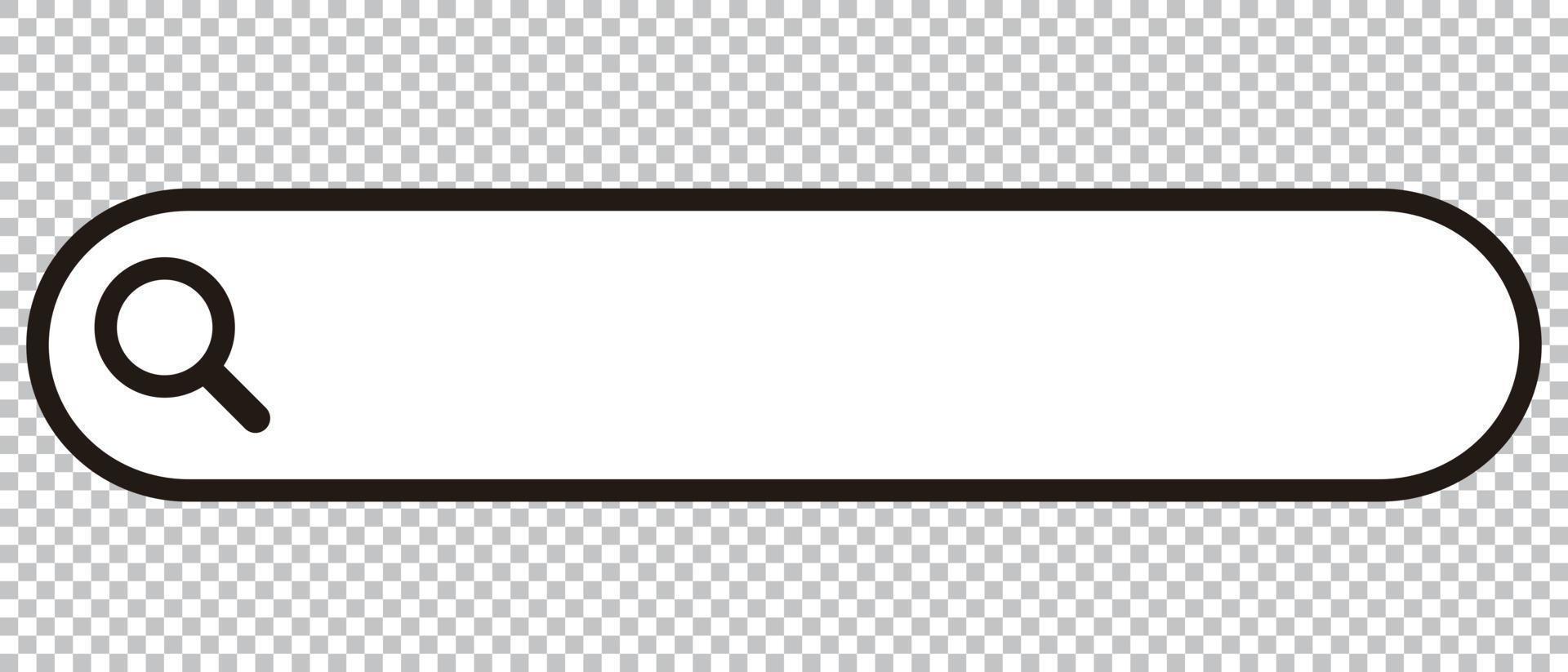
Including a Search Bar for Quick Resolutions
When users land on a 404 page, their immediate need is to find what they were looking for.This is where a well-placed search bar becomes a game changer. Including a search bar not only aids in navigation but also enhances user experience by providing a quick resolution to their queries.
Imagine a frustrated visitor who clicks away from your site after hitting a dead end. Now, picture the same scenario where that visitor sees a prominent search bar. They can type in what they were looking for and continue their journey on your site. This simple addition can significantly reduce bounce rates and keep users engaged.
Here are some best practices for implementing a search bar on your 404 page:
- Visibility: Place the search bar at the top or center of the page to ensure it captures the user’s attention immediately.
- Placeholder text: Use descriptive placeholder text like “What were you looking for?” to guide users on how to use the search functionality.
- Suggestions: Consider incorporating autocomplete suggestions to speed up the search process and help guide users to relevant content.
Additionally, you can enhance the search experience by integrating some visual elements. for instance, style the search bar to match your website’s branding, ensuring it’s not just functional but also visually appealing. A search bar that looks good will naturally draw more users to engage with it.
To illustrate the impact of a search bar, let’s look at a comparison of 404 pages with and without search functionality:
| 404 Page Feature | with Search Bar | Without Search Bar |
|---|---|---|
| User Engagement | Higher, as users can quickly find content | Lower, as users may leave the site |
| Bounce Rate | Reduced significantly | Increased due to frustration |
| User Satisfaction | Improved, leading to repeat visits | Decreased, users may not return |
Ultimately, incorporating a search bar is not just a nice-to-have feature; it’s a necessity for any effective 404 page. by providing an avenue for users to find the information or products they need,you create a more user-centric experience that encourages exploration and loyalty.So, why leave your visitors stranded when a simple search bar can lead them back to the content they desire?

Showcasing Popular Content to Keep Users Interested
When a user stumbles upon a 404 error page, it can be a frustrating experience. Though, the way you present this error can turn a frustrating moment into an opportunity for engagement. Here are some effective strategies to showcase popular content right from your 404 page, keeping users interested and encouraging them to stay on your site:
- Highlight Trending Articles: Display a list of your most popular articles or posts. This can give users immediate access to content they might enjoy, reducing the chance they’ll leave your site.
- Include a Search Bar: A prominently placed search bar allows users to quickly find what they were looking for, making it easier to navigate your site.
- Feature a Newsletter Signup: Capture the interest of users with a simple signup form for your newsletter. If they can’t find what they’re looking for, they might appreciate regular updates from you.
- Showcase Related Categories: Introduce users to different categories or sections of your site.This can prompt them to explore areas they hadn’t considered before.
Incorporating visuals can significantly enhance the appeal of your 404 page. Images, animations, or even creative illustrations can capture users’ attention and enhance their experience. Consider adding:
- fun Graphics: Lighthearted or humorous graphics can convey that while the page is missing, your site is still a fun place to be.
- Interactive Elements: Quizzes or polls related to your site’s content can engage users and keep them on your page longer.
Lastly, consider utilizing a structured layout to guide users effectively. Here’s a simple HTML table layout showcasing popular content that can be easily integrated into your 404 page:
| Article title | Category | Published Date |
|---|---|---|
| Understanding SEO Basics | SEO Tips | Jan 5, 2023 |
| 10 Ways to Boost Engagement | Marketing | Feb 12, 2023 |
| Essential Web Design Principles | Design | Mar 15, 2023 |
By implementing these strategies, you can turn a potentially negative experience into a positive one, keeping users engaged and encouraging them to explore more of what your site has to offer.

Encouraging Social Media Interaction for Broader Engagement
Creating an engaging 404 page is just the first step; the real magic happens when you encourage social media interaction. By inviting users to share their experiences, brands can turn a potentially frustrating moment into a fun interaction. This not only helps in retaining their attention but also expands outreach as users share their quirky encounters with their networks.
Here are some effective strategies to boost social media interaction from your 404 page:
- Encourage Sharing: Include a call-to-action inviting visitors to share their experience on social media. Phrases like “share your favorite 404 moment with us!” can pique interest.
- Offer Social Media Links: Add icons linking to your social media pages. This encourages users to explore your profiles. Make these buttons prominent and visually appealing.
- Incorporate Hashtags: Create a unique hashtag related to your brand or specific campaign. Encourage visitors to use this hashtag when sharing their 404 experiences.
Moreover,consider implementing interactive elements on your 404 page. Fun quizzes, polls, or even games can keep visitors entertained. If they engage with your 404 page, they are more likely to share it on their social platforms, driving traffic back to your site.
To help you visualize the potential benefits of these strategies, here’s a simple comparison table:
| Strategy | Potential Benefits |
|---|---|
| Encourage Sharing | Increases brand visibility and engagement |
| Offer Social Media Links | Boosts followers and brand loyalty |
| Incorporate Hashtags | Creates a community around your brand |
| Interactive Elements | Enhances user experience and retention |
Lastly, don’t forget to monitor the feedback you receive through social media. Engaging with users who share their experiences can turn a one-time visitor into a loyal follower. Ask questions, respond to comments, and express appreciation for their interaction. This fosters a sense of community and encourages others to join the conversation.
Testing and Analyzing Your 404 Page Performance
Once you’ve crafted an engaging 404 page, the next step is to ensure it’s performing optimally. Analyzing how visitors interact with your 404 page can provide invaluable insights into user experience and content effectiveness. Here are some key metrics and methods to consider when :
- Track User Engagement: Monitor how long users stay on your 404 page. A long duration might indicate they’re exploring options, while a quick exit suggests frustration.
- Evaluate Bounce Rates: High bounce rates on your 404 page can signal that visitors are not finding the information they need. Use tools like Google Analytics to track these rates.
- Click-through Rates: if you include links to popular pages or a search function, monitor the click-through rates.This will help you determine if users are finding alternative paths.
- Feedback Forms: Incorporate a simple feedback mechanism to gather user opinions about the 404 experience. A quick “Was this helpful?” can yield direct insights.
Utilizing A/B testing is another effective way to measure the performance of your 404 page. By creating two different versions of the page, you can compare user interactions and determine which design or content resonates better. Here’s a quick overview of how to set it up:
| Version A | Version B |
|---|---|
| Includes humorous text and visuals | Focuses on a more serious tone with direct navigation |
| Links to social media profiles | Offers a search bar for user convenience |
| Displays recent blog posts | Suggests popular products/services |
Regularly revisiting analytics data is crucial. Look for trends over time to see if changes you implemented have positively impacted user behavior. If the bounce rate decreases or click-through rates improve, you’re on the right track!
Lastly, remember that a 404 page is not static. Continuous testing and optimization are key to keeping your site user-friendly. Iterating based on user feedback and performance metrics will ensure that your 404 page remains effective, even as your website evolves.

Ensuring Mobile Responsiveness for All Devices
In today’s digital landscape, ensuring that your 404 error pages are mobile-responsive is crucial. With a meaningful portion of web traffic coming from mobile devices, a seamless experience can make all the difference in retaining users.A well-designed 404 page not only informs users that they’ve hit a dead end but also guides them back to a positive browsing experience.
When crafting these pages,consider implementing the following best practices:
- Fluid Layouts: Use CSS to create fluid layouts that adapt to various screen sizes. This ensures that your page looks great whether viewed on a smartphone, tablet, or desktop.
- Readable Fonts: Choose font sizes and types that are easy to read on smaller screens. A good rule of thumb is to keep body text at least 16px, ensuring legibility across devices.
- Touch-Friendly Buttons: Make sure call-to-action buttons are large enough for easy tapping. A recommended size is at least 44×44 pixels to enhance the user experience.
- Optimized Images: Utilize responsive images that load quickly and adjust for different resolutions. This helps maintain fast loading times, particularly on mobile networks.
To further enhance mobile responsiveness, consider using media queries in your CSS. This allows you to specify different styles for various screen sizes,ensuring that your 404 page maintains its integrity and usability across devices. For example:
        @media (max-width: 600px) {
            .error-message {
                font-size: 20px;
            }
        }
Incorporating elements like a search bar and links to popular pages can also help mitigate the frustration of landing on a 404 page. Users should be able to quickly navigate to relevant content, which can turn a negative experience into a positive one.
| Element | purpose |
|---|---|
| Fluid Layout | Adapts to various screen sizes |
| Readable Fonts | Enhances legibility |
| Touch-Friendly Buttons | Improves navigation |
| Optimized Images | Speeds up loading times |
Ultimately, the goal is to create a 404 error page that not only informs but also provides a pathway back into your website. By focusing on mobile responsiveness, you can ensure that every user, irrespective of device, has a consistent and enjoyable experience.
learning from the Best: Key takeaways for Your 404 Page
When it comes to designing a memorable 404 page, there’s much to learn from the trailblazers in the industry. Here are some golden nuggets that can elevate your own 404 page and turn a frustrating experience into a delightful surprise:
- Maintain Your Brand Voice: A well-crafted 404 page reflects your brand’s personality. Whether it’s humorous, quirky, or professional, your tone should resonate with your audience.
- Clear Navigation Options: Provide users with easy-to-find links to return to the homepage or other popular sections of your site. This minimizes frustration and helps guide them back to valuable content.
- Engaging Visuals: Use eye-catching graphics or animations to make the page visually appealing. A splash of creativity can turn a negative experience into a memorable one.
Moreover, consider adding a search bar directly on the 404 page. This allows users who land there to search for what they originally intended to find,keeping them engaged with your site rather than bouncing away.
| Best Practice | Description |
|---|---|
| Humor | Lighten the mood with clever jokes or puns related to the error. |
| Helpful Links | Direct users to your most popular pages or recent articles. |
| Contact Info | Offer users a way to reach out if they need further assistance. |
Another tactic is to incorporate user-generated content or testimonials. Showcasing positive experiences can create a sense of community and encourage users to stay engaged with your brand.
don’t underestimate the power of analytics. Regularly review your 404 page performance and identify common paths that lead users there. This insight can help you refine both your website structure and your 404 page.
Frequently Asked Questions (FAQ)
Q: What is a 404 page, and why is it important?
A: A 404 page is what users see when they try to access a page on your website that doesn’t exist. It’s important because it’s often the first impression users have of your site if they hit a dead end. A well-designed 404 page can turn a frustrating experience into a positive one, keeping visitors engaged and guiding them back to your content.
Q: What makes a great 404 page?
A: A great 404 page is engaging,informative,and helpful.It should clearly communicate that the page isn’t found while also providing options for users to navigate elsewhere. Elements like humor,creativity,and a touch of personality can also make a big difference in how users perceive your site.
Q: Can you share some examples of effective 404 pages?
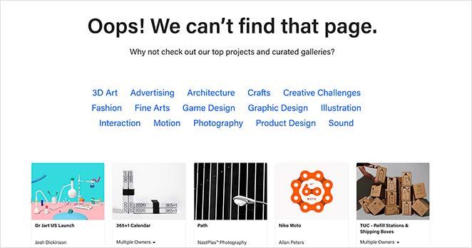
A: Absolutely! Some of the best 404 pages creatively use design and messaging to engage users. As a notable example, GitHub uses a playful message and a cute illustration, while 500px features stunning photography to keep visitors interested. these examples show how leveraging creativity can turn a frustrating moment into a delightful one.
Q: What are some best practices for designing a 404 page?
A: Here are a few best practices to consider:
- Clear messaging: Let users know they’ve hit a dead end.
- Visual Appeal: Use eye-catching design to maintain interest.
- Navigation Options: Offer links to popular pages or a search bar to help users find what they’re looking for.
- Branding: Use your brand’s voice and style to reinforce familiarity.
- Humor: A light-hearted touch can lighten the mood and enhance user experience.
- Contact Information: If they’re really lost, provide a way for users to reach out for help.
Q: Why should brands invest time in creating a custom 404 page?
A: Investing in a custom 404 page is all about user experience. A thoughtful design can reduce bounce rates, retain visitors, and even convert frustrated users into customers. Plus,it reflects well on your brand,showing that you care about your audience’s journey,even when things go wrong.
Q: How can a 404 page impact SEO?
A: A poorly designed 404 page can lead to high bounce rates, which can negatively impact your SEO rankings. On the other hand, a well-crafted 404 page can encourage users to stay longer and explore more of your site, signaling to search engines that your content is valuable.
Q: Any final tips for creating an outstanding 404 page?
A: Sure! Test your 404 page regularly to ensure all links are functional and the design is responsive across devices. Consider gathering feedback from users to continually improve it. Remember, a 404 page is not just a ‘dead end’—it’s an opportunity to engage, guide, and even entertain your visitors!
Wrapping Up
And there you have it—our roundup of the 7 best 404 page examples and the essential best practices they embody. Whether you’re looking to add a touch of humor, provide helpful navigation, or reinforce your brand identity, there’s plenty of inspiration to be found in these standout pages.
Remember, a 404 error doesn’t have to be a dead end. Instead, it can be an opportunity to engage your visitors and guide them toward a more rewarding experience on your website. so, why not take a page from these examples and transform your own 404 error page into something truly memorable?
With just a bit of creativity and attention to detail, you can turn what is frequently enough seen as a setback into a unique chance to connect with your audience. Dive into your design process, implement these best practices, and watch how a simple error page can enhance user experience and keep your visitors coming back for more.Happy designing!