How to Add a Hero Image With CSS: Elevate Your Web Design Game
Hey there, web design enthusiasts! If you’re looking to captivate your visitors from the moment they land on your site, there’s no better way to do it than with a stunning hero image. You know, that eye-catching visual that sets the tone for your entire page and draws people in like a moth to a flame? in today’s digital landscape, a well-placed hero image isn’t just a nice touch; it’s a must-have component of effective web design. But fear not! You don’t need to be a coding wizard to master this technique. In this article, we’ll walk you through the simple steps to add a hero image using CSS, making your website not only more visually appealing but also more engaging for your audience. Whether you’re building a personal blog, an online portfolio, or a buisness landing page, let’s dive in and transform your web space into something truly stunning! Ready to get started? Let’s go!
Understanding the Importance of a Hero Image in Web Design
When it comes to web design, a hero image serves as a powerful visual statement that can captivate your audience right from the first glance. this large, attention-grabbing image is typically placed prominently at the top of a webpage, often accompanied by a headline or call to action. Its role is not just to beautify a site; it can considerably impact user engagement and conversion rates.
Here are a few reasons why incorporating a hero image is crucial:
- First Impressions Matter: A striking hero image can instantly convey the essence of your brand or message, creating a lasting impression.
- Emotional Connection: Images can evoke feelings more effectively than text. A well-chosen hero image can resonate with visitors on an emotional level.
- Visual Hierarchy: By dominating the visual space, a hero image helps guide users’ attention to key content and actions, promoting better navigation.
To get the most out of your hero image, consider the following elements:
- Relevance: Ensure the image aligns with your brand identity and the message you want to communicate.
- Quality: Use high-resolution images that maintain clarity across devices.
- accessibility: Include alt text descriptions to enhance accessibility for screen readers.
here’s a simple example of how to style a hero image using CSS:
.hero {
    background-image: url('path/to/your/image.jpg');
    height: 60vh;
    background-size: cover;
    background-position: center;
    display: flex;
    align-items: center;
    justify-content: center;
    color: white;
    text-shadow: 2px 2px 4px rgba(0, 0, 0, 0.5);
}
This CSS snippet ensures your hero image is visually appealing and responsive, adjusting to various screen sizes while keeping the focal point centered. By leveraging these design principles, you can enhance user experience and increase the likelihood of conversions.
| Element | Purpose |
|---|---|
| Image Quality | High resolution ensures clarity. |
| Text Contrast | enhances readability against the image background. |
| Call to Action | Directs users to the next step. |
by prioritizing these aspects in your design process, you will not only create a visually stunning hero image but also a strategic tool that drives user interaction and enhances overall site performance.
Choosing the Right Image for Your Hero Section
When it comes to designing your hero section, the image you choose can make or break the first impression of your site. A well-selected hero image serves as a powerful visual anchor, drawing users in and encouraging them to explore your content further. So, how do you pick the perfect image?
First and foremost, consider the message you want to convey. Your hero image should align with your brand identity and the emotions you want to evoke in your visitors. As an example, if you’re running a travel blog, an awe-inspiring landscape will resonate well with your audience. On the other hand, a corporate website might thrive on a professional image of a team at work. Think about the mood and atmosphere that best represent your brand.
Next, quality is key.Opt for high-resolution images that won’t pixelate on larger screens. A blurry or poorly composed photo can detract from the professionalism of your site.it’s frequently enough best to use images that are at least 1920×1080 pixels for full-screen backgrounds. Don’t forget to check the licensing—ensure you have the rights to use the image, whether it’s sourced from a stock site or taken in-house.
Also, consider the composition of your image. The placement of focal points within the photo should complement your text and other elements in the hero section. Use the rule of thirds to guide your choices. Ideally, your main subject should be positioned where it grabs attention without overshadowing your message.
Think about the color scheme as well. The colors in your hero image should harmonize with your overall website palette. This creates a cohesive look that enhances user experience. If your site is vibrant and playful, choose images that reflect that energy. Conversely, if your site is minimalist, opt for simple, clean images that don’t overwhelm the visitor.
| Image Type | Best Use Cases | source Suggestions |
|---|---|---|
| Landscape | Travel, Nature | Unsplash, Pexels |
| People | Corporate, Community | Shutterstock, iStock |
| Abstract | Art, technology | Adobe Stock, Pixabay |
Lastly, think about responsiveness. Ensure that the image scales well on different devices. A hero image that looks great on a desktop might not have the same impact on a mobile device if it isn’t optimized. Use CSS properties like background-size: cover; to make sure your image adapts seamlessly to various screen sizes.

Setting Up Your HTML Structure for a Hero image
Creating a stunning hero image begins with a well-structured HTML layout. This foundational step allows for smooth integration with CSS, ensuring your hero image shines on any device. Here’s how to set up your HTML structure effectively:
Your Attention-Grabbing Headline
Engage your visitors with a compelling subheading that draws them in.
Your hero section can be nested within a
- An image background: Use a high-quality image that resonates with your brand.
- A headline: This should be bold and prominent to capture attention immediately.
- A subheading: Provide additional context or data that encourages further reading.
- A call-to-action button: Create a sense of urgency and guide visitors towards the next step.
Here’s an example of a simple table to outline the key components of your hero image setup:
| HTML Element | Description |
|---|---|
| Wraps the entire hero section. | |
| Defines the area for the background image. | |
| Holds the text elements and button. | |
| Link to direct users to an action. |
Once you’ve structured your HTML properly, you’re ready to dive into the CSS styling. This is where you can add flair and ensure your hero image looks fantastic across various screen sizes. Remember,responsive design is crucial,so keep that in mind as you move forward!
Mastering CSS Techniques for Responsive Hero Images
Creating a Captivating Hero Image
To truly make your website stand out, a hero image can set the tone and grab attention instantly. With CSS, you can ensure that your hero images are not only stunning but also responsive, adapting beautifully across various screen sizes. Here are some techniques to help you achieve that:
- Use Background Images: This is a popular method. Set your hero image as a background image in CSS. It allows for more flexibility in positioning and scaling.
- Cover and Contain Properties: Utilize the
background-sizeproperty.background-size: cover;ensures that your image covers the entire area, whilebackground-size: contain;maintains the aspect ratio without cropping. - media Queries: Implement media queries to change the hero image or its properties based on the viewport size. This way, you can serve high-resolution images to larger screens and optimized images to smaller devices.
- Overlay Effects: Adding a subtle overlay to your hero image can enhance readability for any text you place over it. Use a semi-transparent color with the
rgbafunction for a stylish effect.
Example CSS for a Hero Image
Here’s a simple CSS snippet to get you started:
.hero {
    background-image: url('your-image-url.jpg');
    background-size: cover;
    background-position: center;
    height: 100vh;
    position: relative;
}

.hero::after {
    content: '';
    position: absolute;
    top: 0;
    left: 0;
    right: 0;
    bottom: 0;
    background: rgba(0, 0, 0, 0.5); /* overlay */
}
Considerations for Accessibility
When choosing a hero image, it’s crucial to consider accessibility. Here are some best practices:
- Alt Text: Always provide descriptive alt text for images for screen readers.
- Contrast: Ensure there’s enough contrast between the text and the image background for readability.
- Responsive Design: Test your hero image on multiple devices to ensure it remains visually appealing and functional.
Table of Responsive Image Techniques
| Technique | Description |
|---|---|
| Fluid Images | Use percentages for width to ensure images scale with the viewport. |
| CSS grid & Flexbox | Utilize modern layout techniques to align and size images dynamically. |
| Picture Element | Serve different images based on device capabilities. |
By mastering these techniques,you’ll not only enhance the visual appeal of your website but also improve user experience across devices. A well-implemented hero image can communicate your brand’s message instantly, making it an essential element of modern web design.

Enhancing Visual Appeal with Background Properties
When it comes to creating an engaging web experience, the background properties in CSS play a pivotal role. Utilizing these properties effectively can transform a simple webpage into an eye-catching masterpiece that captures visitors’ attention from the moment they land on your site.
One of the most impactful ways to enhance your site’s visual appeal is by implementing a hero image. This large, prominent image frequently enough serves as the first visual cue that users encounter, setting the tone for their experience. To achieve this, you can use the following CSS properties:
- background-image: sets the image you want to display.
- background-size: Controls how the image fits within its container.
- background-position: Adjusts the starting position of the image.
- background-repeat: Prevents the image from repeating across the background.
Here’s a simple example to illustrate how you can incorporate a hero image:
    .hero {
        background-image: url('path/to/your/image.jpg');
        background-size: cover;
        background-position: center;
        background-repeat: no-repeat;
        height: 100vh; /* Full viewport height */
        display: flex;
        justify-content: center;
        align-items: center;
        color: white;
        text-align: center;
    }
By using this CSS class, you ensure that the hero image covers the entire height of the viewport, creating an immersive experience. Coupled with text elements, such as headlines or calls to action, you can direct your viewers’ attention where you want it:
| Element | Purpose |
|---|---|
| Background Image | Visual impact & branding |
| Text Overlay | Information & navigation |
| Call to Action | Encourage interaction |
Additionally, consider adding a subtle overlay to your hero image. This can enhance text readability while maintaining the visual impact of the image. A semi-transparent black or white overlay can do wonders to make your text pop without detracting from the image’s beauty:
    .hero::after {
        content: '';
        position: absolute;
        top: 0;
        left: 0;
        width: 100%;
        height: 100%;
        background-color: rgba(0, 0, 0, 0.5); /* 50% black overlay */
        z-index: 1;
    }
incorporating these CSS background properties not only beautifies your website but also enhances user engagement. With a captivating hero image and strategic design choices, you can create a lasting impression that resonates with your audience.

Creating an Engaging Overlay with Text and Colors
One of the most eye-catching ways to enhance your hero image is by creating an overlay that combines text and colors. This not only adds depth but also ensures your message stands out against the background. Here’s how you can achieve that vibrant look using some clever CSS.
Start by adding a div overlay on top of your hero image. This overlay will serve as a canvas for your text and colors. Here’s a simple structure you can use:

Next, style your overlay with CSS to ensure it covers the hero image and creates that dramatic effect:
.hero-image {
    position: relative;
}

.hero-image img {
    width: 100%;
    height: auto;
}

.overlay {
    position: absolute;
    top: 0;
    left: 0;
    right: 0;
    bottom: 0;
    background-color: rgba(0, 0, 0, 0.5); /* semi-transparent black */
    display: flex;
    flex-direction: column;
    justify-content: center;
    align-items: center;
    color: white;
    text-align: center;
    padding: 20px;
}
With this setup,your text will be easily readable against the image,thanks to the overlay’s color and opacity.You can experiment with different background colors and opacity levels to find the perfect balance between visibility and aesthetics.
Don’t forget that typography plays a crucial role in creating an engaging experience. choose fonts that complement your image and resonate with your audience. Here are some tips:
- Contrast: Ensure your text color contrasts well with the overlay color.
- Size: Use larger font sizes for headlines to grab attention.
- Spacing: Make sure there’s enough padding to avoid a cramped look.
To take things a step further, you can also create a CSS animation for your overlay. A subtle fade-in effect can make the text appear more dynamically, enhancing user engagement. Here’s a simple example:
@keyframes fadeIn {
    from { opacity: 0; }
    to { opacity: 1; }
}

.overlay {
    animation: fadeIn 1s ease-in-out;
}
By combining these elements, you’re not just adding an overlay; you’re crafting an inviting space that invites users to engage with your content. Experiment with different settings and watch how your hero images transform into stunning visual statements!

Optimizing Hero Images for Faster Load times
when it comes to enhancing the user experience on a website, the hero image plays a critical role, not only in aesthetics but also in performance. An optimized hero image can significantly reduce load times, ensuring that visitors stay engaged rather than bouncing off to find faster alternatives. Here are some effective strategies to optimize your hero images:
- Choose the Right Format: JPEG and PNG are popular formats, but for photographs, JPEG is generally preferred due to its smaller file size. For images requiring clarity, consider using PNG, but keep an eye on the file size.
- Compress Your Images: Use tools like tinypng or ImageOptim to reduce file sizes without sacrificing quality. This simple step can drastically decrease loading times.
- Utilize Responsive Images: implement the “ element or `srcset` attribute in your `
` tags. This allows browsers to select the optimal image size based on the user’s device, ensuring fast loading on mobile and desktop alike.
Additionally, take advantage of modern image formats like WebP, which provide superior compression. they can offer a reduction in file size up to 30% compared to traditional formats, while maintaining high quality. Though, always include fallback options for browsers that do not support WebP.
| Image Type | Best Use | File Size |
|---|---|---|
| JPEG | Photographs | Smaller than PNG |
| PNG | Images with transparency | generally larger |
| WebP | Both photos and graphics | Up to 30% smaller |
Lastly, consider lazy loading your hero images.This technique defers the loading of images that aren’t immediately visible on the screen, only fetching them as users scroll down. Not only does this improve initial load times, but it also enhances perceived performance, making your website feel snappier to the user.
By implementing these optimization techniques, you can transform your hero images into powerful tools for engagement while ensuring your website remains fast and responsive. After all, a stunning image is only effective if it doesn’t slow down your visitor’s experience.
Ensuring Accessibility in Your Hero Image Design
When designing a hero image, ensuring accessibility is paramount. A well-crafted hero image should not only captivate but also be inclusive for all users,including those with disabilities. Here are some vital considerations to keep in mind:
- Use descriptive alt text: Every hero image should have alt text that accurately describes what’s in the image. This helps screen reader users understand the visual content. Rather of generic phrases,opt for specific descriptions that convey the image’s purpose.
- Mind the color contrast: It’s essential to choose colors that offer sufficient contrast between the text and the background. This ensures readability for users with visual impairments. Tools like the webaim Contrast Checker can help you determine if your color choices meet accessibility standards.
- Consider text overlay: If you’re adding text over your hero image, make sure the text is legible. Avoid busy backgrounds that can distract from or obscure the information. Utilize text shadows or semi-transparent overlays to enhance readability.
- Responsive design: Ensure your hero images are responsive and look good on all devices. This includes testing how images display on smaller screens and ensuring that content remains accessible regardless of screen size.
To illustrate how to implement accessibility in your hero image design, consider the following table that outlines best practices:
| best Practice | Description |
|---|---|
| Alt Text | Provide clear and concise descriptions for images. |
| Color Contrast | Ensure high contrast ratios for readability. |
| Text Overlays | Use legible fonts and consider background clarity. |
| Responsive Layout | Test across devices for consistent accessibility. |
always prioritize user testing. Engaging with real users, including those with disabilities, can provide invaluable feedback on the effectiveness of your hero image design. Accessibility isn’t a one-size-fits-all approach, and direct input can help you make informed adjustments that enhance the user experience for everyone.
Using Media Queries for a Perfectly Responsive Look
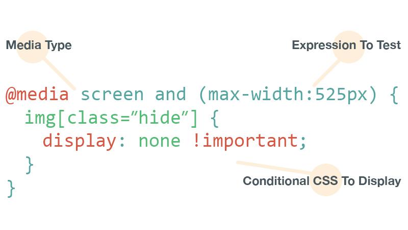
Creating a visually appealing hero image that maintains its integrity across various devices is essential for a seamless user experience. Media queries are your best friend when it comes to ensuring that your hero image adapts perfectly to different screen sizes. By utilizing media queries, you can tailor the styling of your hero image to look stunning whether it’s on a desktop, tablet, or mobile phone.
To get started, you’ll first want to define your hero image in CSS. Here’s a basic example:
.hero {
    background-image: url('your-image.jpg');
    height: 100vh; /* Full viewport height */
    background-size: cover; /* Cover the entire area */
    background-position: center; /* Center the image */
}
Once you have your hero section set up, you can implement media queries to adjust the hero image properties for different devices.Here’s how you might structure your CSS:
@media (max-width: 768px) {.hero {
        height: 50vh; /* Reduce height for smaller screens */
        background-image: url('your-image-mobile.jpg'); /* Optional: different image for mobile */
    }
}
Using media queries effectively allows you to:
- Change image sizes: Use smaller images on mobile to enhance loading speed.
- Adjust layout: Modify padding and margins for a better fit.
- Control text size: Ensure any text overlay is legible on all devices.
| Device Type | Image Size | Height (vh) |
|---|---|---|
| Desktop | 1920 x 1080 | 100 |
| Tablet | 768 x 1024 | 75 |
| Mobile | 375 x 667 | 50 |
By implementing these adjustments, your hero image will not only look great but will also contribute to a better overall user experience. Don’t hesitate to experiment with different styles and settings to discover the perfect balance that works for your unique design!
Incorporating Animation and Effects for Stunning Impact
When it comes to creating a memorable hero image, the addition of animation and effects can elevate your design from ordinary to extraordinary. By thoughtfully integrating these elements, you can engage your audience and draw them into your content. Here’s how you can achieve that stunning impact with just a sprinkle of creativity.
Fade-In Effects: A simple yet effective way to add depth to your hero image is through fade-in animations. This creates a smooth and visually appealing transition that captures the viewer’s attention. Here’s a swift CSS snippet to get you started:
.hero-image {
    opacity: 0;
    animation: fadeIn 1.5s forwards;
}

@keyframes fadeIn {
    to {
        opacity: 1;
    }
}
Consider pairing the fade-in effect with a slight zoom to create a dynamic visual experience. You can achieve this with the following CSS:
.hero-image {
    animation: zoom 1.5s forwards;
}

@keyframes zoom {
    0% {
        transform: scale(1);
    }
    100% {
        transform: scale(1.05);
    }
}
Another fantastic technique is to use parallax scrolling. This effect creates a sense of depth and movement as users scroll down the page. implementing parallax can effectively highlight your hero image while keeping the viewer engaged. Here’s a basic structure to incorporate parallax:
.parallax {
    background-image: url('your-image-url.jpg');
    height: 500px;
    background-attachment: fixed;
    background-position: center;
    background-repeat: no-repeat;
    background-size: cover;
}
Lastly, don’t forget to add subtle hover effects to your hero image. A shift in brightness or a slight overlay can make the image pop when users interact with it. Here’s a quick example:
.hero-image:hover {
    filter: brightness(1.1);
}
To summarize,here are some effective techniques to incorporate animation and effects into your hero image:
- Fade-In and Zoom: Create an engaging entrance for your image.
- Parallax Scrolling: Add depth and texture to your page.
- Hover Effects: Enhance user interaction and experience.
With these techniques at your disposal, you can transform your hero image into a captivating focal point that not only grabs attention but also complements the overall design of your website.

Testing and Tweaking Your Hero Image for Cross-Browser Compatibility
When you’re ready to showcase your hero image, it’s essential to ensure that it looks stunning across all major browsers. Variations in how browsers interpret CSS can lead to discrepancies in your design. To ensure consistency, consider the following strategies:
- Use CSS Resets: A CSS reset can definitely help eliminate browser inconsistencies in default styling. By resetting margins,paddings,and other properties,your hero image will start from a clean slate.
- Test in Multiple Browsers: always check how your hero image appears in popular browsers like Chrome, Firefox, Safari, and Edge. Each browser may render your styles differently, so it’s crucial to catch any discrepancies early.
- Utilize Vendor Prefixes: To ensure that CSS properties work seamlessly across different browsers, incorporate vendor prefixes in your CSS code. As an example, use `-webkit-`, `-moz-`, and `-ms-` for properties that may not be universally supported.
Additionally, keep an eye on the image formats you use. While JPEG and PNG are widely supported, consider leveraging modern formats such as WebP for better compression and quicker loading times. Here’s a quick comparison table to illustrate different image formats:
| Image Format | Quality | Browser Support |
|---|---|---|
| JPEG | High | All major browsers |
| PNG | Very High | All major browsers |
| WebP | High (with compression) | Chrome, Firefox, Edge, Safari (partial) |
In addition to testing across browsers, ensure that your hero image is responsive. Use CSS media queries to allow your image to adapt to different screen sizes. This way, your hero image will look great on both desktop and mobile devices. A common practice is to set the `background-size` property to `cover`, ensuring that your image fills the container without losing its aspect ratio.
Lastly,remember to optimize your images for faster loading times. Large images can significantly slow down your page, affecting user experience and SEO. Consider using tools like ImageOptim or TinyPNG to compress your images without sacrificing quality.

Final Thoughts on Crafting the Perfect Hero Image with CSS
When it comes to making a memorable first impression on your website, the hero image is paramount. It’s not just about grabbing attention; it’s about conveying your brand message effectively.A well-crafted hero image can enhance usability, draw users in, and create an emotional connection with your audience.
Here are some essential tips to consider when crafting your hero image using CSS:
- Focus on Quality: Always use high-resolution images. Pixelated images can detract from your website’s professionalism.
- Responsive Design: Ensure your hero image adapts seamlessly to different screen sizes. Use CSS properties like
background-size: cover;to maintain visual integrity. - Text overlay: If you’re adding text to your hero image,make sure it’s legible. Use contrasting colors and sufficient padding to enhance readability.
- Subtle Animation: Consider adding a gentle animation effect to engage users without overwhelming them. CSS animations can give life to your hero image, creating a more dynamic experience.
To illustrate the impact of these elements, here’s a simple CSS example showing how to set up a hero image:
.hero {
    background-image: url('your-image.jpg');
    height: 100vh;
    background-size: cover;
    background-position: center;
    position: relative;
    display: flex;
    align-items: center;
    justify-content: center;
    color: white;
}
.hero h1 {
    font-size: 3rem;
    text-shadow: 2px 2px 4px rgba(0, 0, 0, 0.5);
}
Don’t forget about the importance of accessibility. Ensure that your hero image does not obscure any critical information. You can also use aria-label attributes for assistive technologies to describe what the image represents. This step not only helps your SEO but also ensures a broader reach for your content.
| Element | Best Practices |
|---|---|
| Image Quality | Use high-resolution images (at least 1920px wide). |
| Text Readability | Choose contrasting colors and appropriate font sizes. |
| Animation | Use subtle effects to enhance, not distract. |
| Responsiveness | Implement media queries for different screen sizes. |
creating the perfect hero image is about balancing aesthetics and functionality. Test different layouts and designs to see what resonates with your audience. The right combination will not only captivate visitors but also encourage them to explore further into your site.
Frequently Asked Questions (FAQ)
Q&A: How to Add a Hero Image With CSS
Q: What exactly is a hero image?
A: Great question! A hero image is a large, eye-catching graphic that typically appears at the top of a webpage. It serves as a visual focal point and often includes text or a call to action. Imagine it as the welcoming mat of your website—a warm invitation for visitors to delve deeper into your content!
Q: Why should I use a hero image on my website?
A: Using a hero image can significantly enhance your website’s aesthetics and user engagement. It draws visitors in,establishes your brand’s visual identity,and can even help convey your message more effectively.Plus,a well-chosen hero image can evoke emotions and set the tone for the entire site. Who wouldn’t want to make a strong first impression?
Q: How do I add a hero image with CSS?
A: Adding a hero image is simpler than you might think! First,you’ll want to choose your image and ensure it’s of high quality. Than, you can use CSS to style a designated section of your webpage. You typically start with an HTML structure like a
background-image, height, and background-size. need a quick example? Here’s a snippet to get you going:
Welcome to Our Site
Your adventure starts here!
css
.hero {
  background-image: url('your-image-url.jpg');
  height: 100vh; / Full viewport height /
  background-size: cover; / Cover the whole div /
  color: white; / text color /
  display: flex; / Center content /
  align-items: center; / Vertical alignment /
  justify-content: center; / Horizontal alignment /
  text-align: center; / Center text /
}
Q: What should I keep in mind when choosing a hero image?
A: Choose an image that resonates with your brand and message. It should be high-quality, relevant, and not distract from your text. Additionally, consider the image’s aspect ratio and how it will look on different devices. Responsive design is key! You want your hero image to look fantastic on both desktop and mobile, right?
Q: Is there any way to make my hero image more dynamic?
A: Absolutely! You can add CSS animations or overlays to make your hero image more engaging. For instance, you could fade in text or apply a parallax effect as users scroll. These techniques can add a touch of modern flair and keep visitors intrigued. Just remember, while “extra” can be great, moderation is key—don’t go overboard!
Q: How do I ensure my hero image loads quickly?
A: Speed is vital for user experience! To ensure quick loading times, optimize your images before uploading. You can use online tools to compress the file size without losing quality. Consider using appropriate formats like JPEG for photos or PNG for images with transparency.And don’t forget to add alt attributes—these improve accessibility and SEO!
Q: Any tips for troubleshooting if my hero image isn’t displaying?
A: Definitely! First, double-check your image URL for any typos. Ensure that the image file is correctly linked in your CSS. If it’s still not showing up, check your browser’s developer tools for any errors in the console. Lastly, inspect the CSS styles to make sure your container has the right dimensions. A little troubleshooting can go a long way!
Q: What’s the bottom line? Should I use a hero image?
A: If you want to create an impactful first impression and engage your visitors right from the start, then yes! A hero image is a powerful tool in modern web design. With just a bit of CSS magic, you can elevate your website and guide your visitors toward action. So, what are you waiting for? Go ahead and make your website shine!
In Retrospect
As we wrap up our journey into the world of hero images with CSS, let’s take a moment to appreciate how a simple visual can transform your website from ordinary to extraordinary. by now, you should feel empowered to incorporate striking hero images that not only capture attention but also convey your brand’s message effectively.
Remember,the key to a compelling hero image lies in choosing the right image,optimizing it for performance,and ensuring it fits well within your design. With the techniques we’ve covered, you can elevate the aesthetics of any webpage and create a lasting impression on your visitors.
So why wait? Go ahead and start experimenting with your own hero images! Whether you’re sprucing up your personal blog or revamping a business site,implementing these CSS strategies will set you on the path to success. Your audience is just a stunning image away from falling in love with your content. Happy coding!

